Little White Duck Restaurant Branding
Branding & MarksPackaging, Print & Editorial
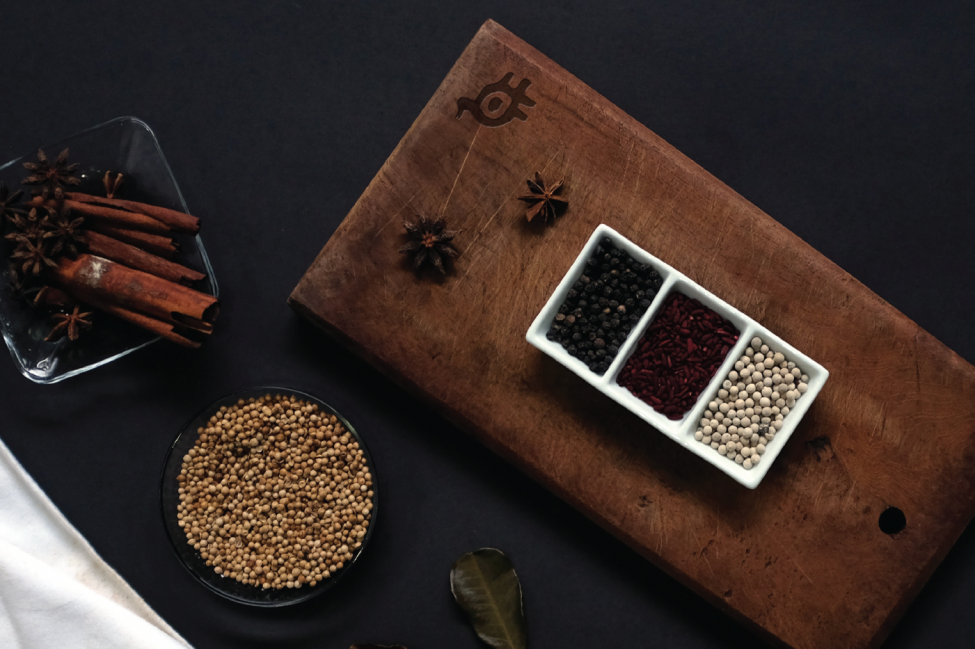
Don’t let the name fool you, Little White Duck is no small contender in modern Chinese cuisine. Serving a superbly authentic take on Chinese recipes, this quality eatery required a brand design that could keep up with its bold flavours. Together we created an identity that pays homage to heritage while propelling this crispy concept into the contemporary restaurant space.
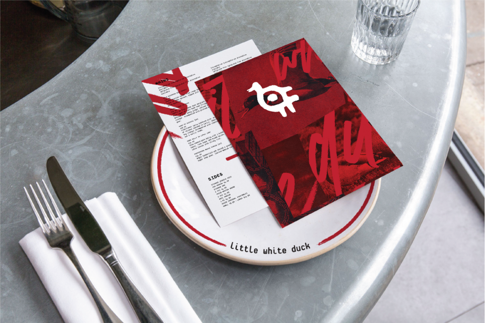
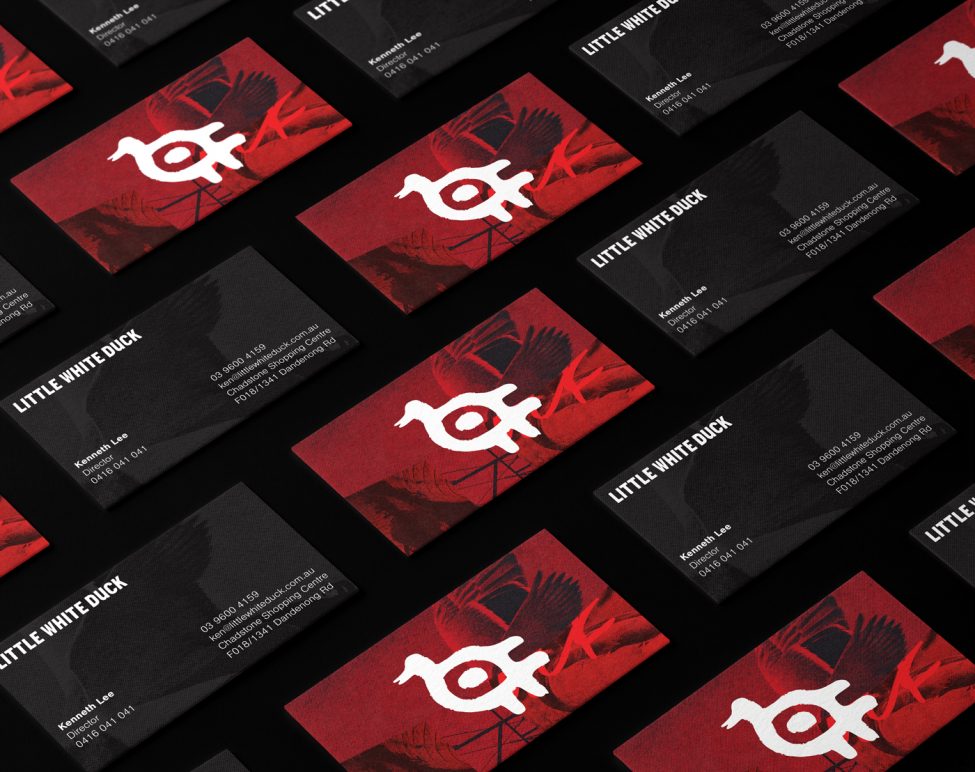
Looking to set themselves apart from the context of the shopping centre food court context, this new establishment in Chadstone approached Principle Design in need of a more refined, contemporary brand identity that suited their unique offering. With an established restaurant concept and a strong culinary foundation, they required a brand name and identity that captured their passion for serving up delicious modern Chinese dishes. Stemming from their infamous specialty, Peking Duck, we conducted a brand naming exercise that saw us generate a litany of options, finally settling on ‘Little White Duck’. The name evoked imagery that inspired the brand mark concepts that feature the restaurants namesake.
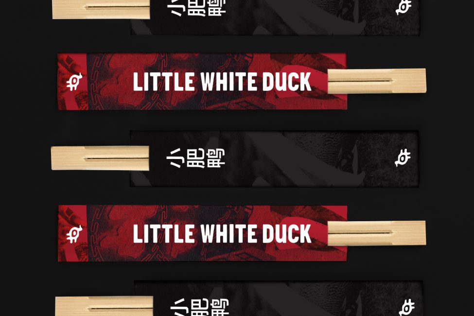
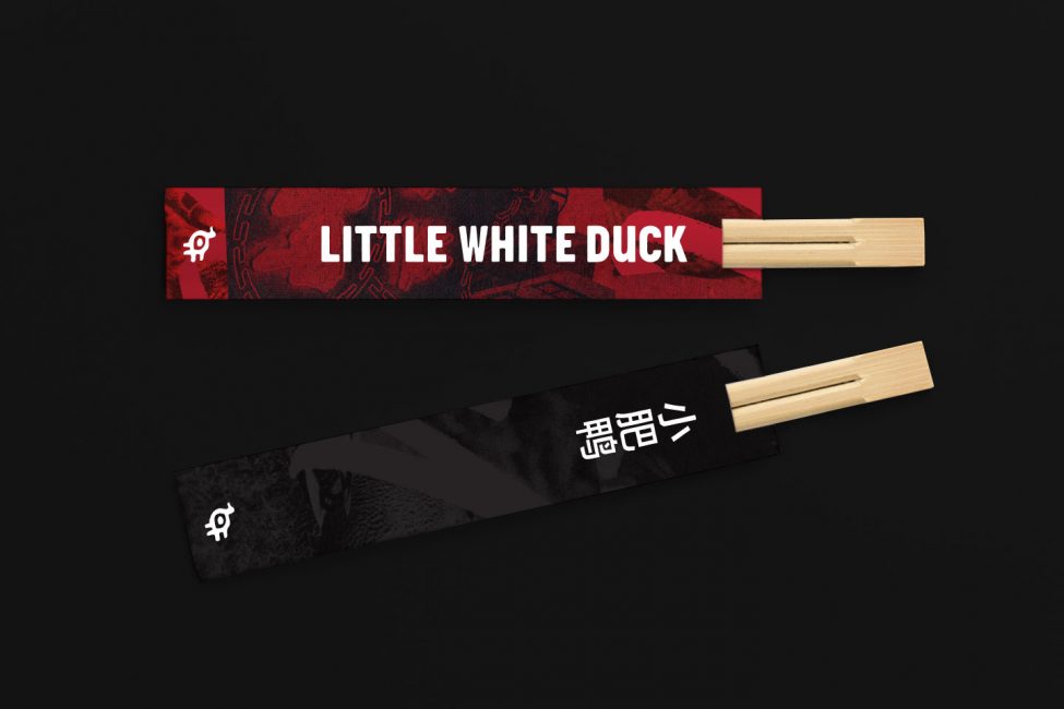
The dominant red colour palette infuses through the brand identity as an acknowledgment of the Chinese reverence of this symbolic hue. The dramatic combination of the restricted colour palette and the landscape imagery draws attention to the graphic murals across the restaurant fit out. Integrating black and white photography with a halftone overlay helped to create an authentic, evocative visual to enhance the interior design of the space.
Understanding the hospitality context, we applied the brand identity across a variety of restaurant pieces such a menus, coasters, napkins, apron, bag, bowl, hat and signage elements to create a consistent brand experience for diners as they tuck into their fresh Peking Duck pancakes and signature hand made dim-sum.