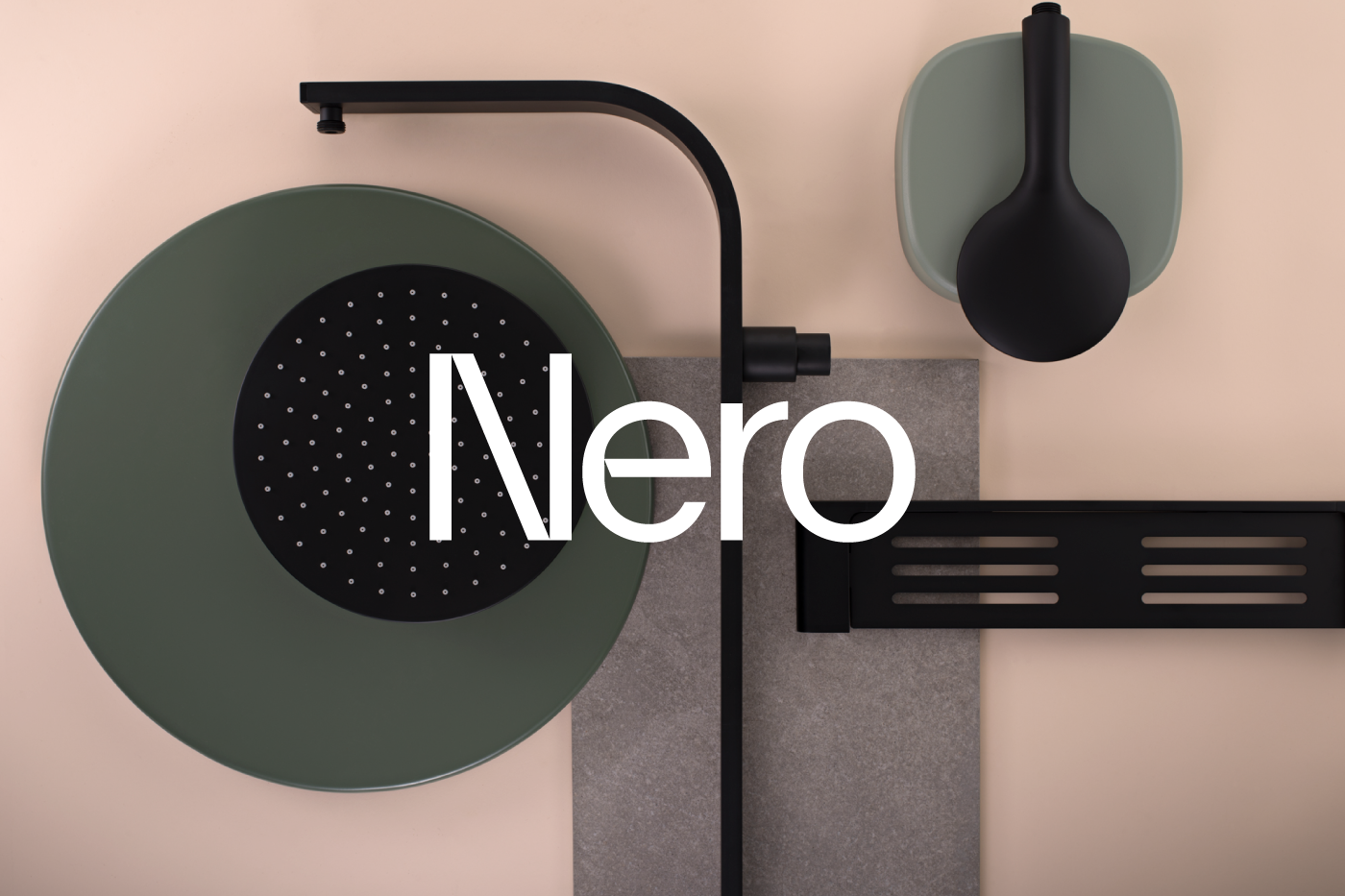
As one of Australia’s leading manufactures of tap ware, Nero is dedicated to creating beautiful, stylish and functional tap ware and fittings for your home. Thoughtfully designed, well crafted and of the highest quality, Nero’s on trend designs are not just stylish but robust and reliable making them a leading choice with Australian home owners.
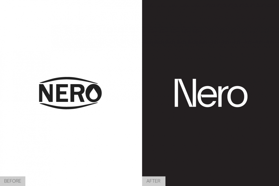
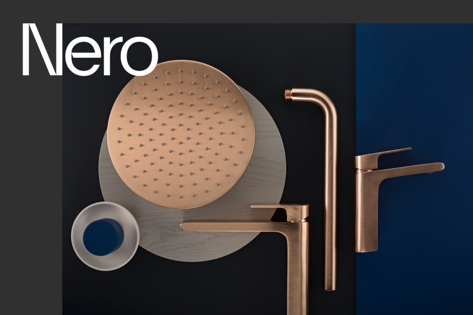
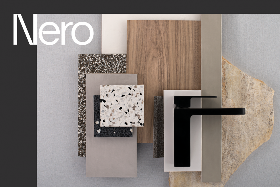
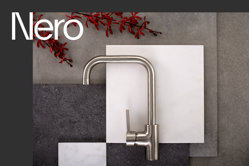
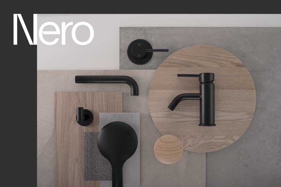
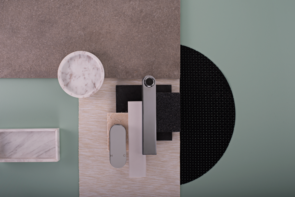
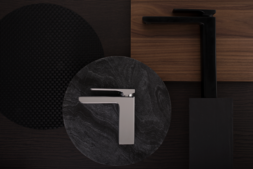
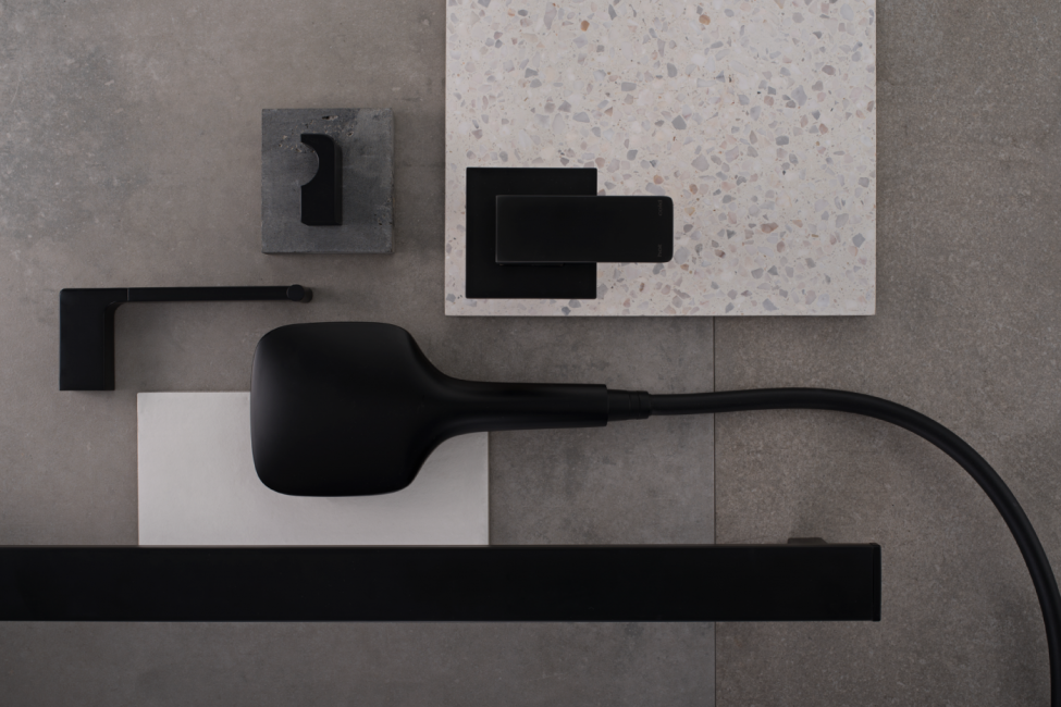
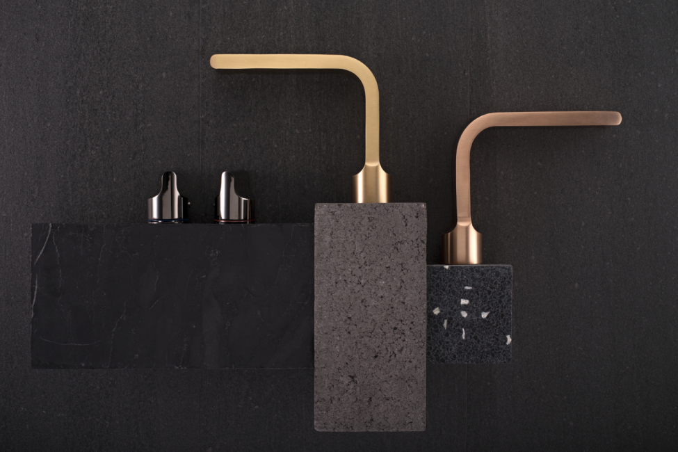
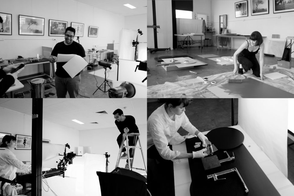
Our rebranding strategy with Nero resulted in a revitalised logo design as well as a collaborative art direction photo shoot to create a visual identity befitting their commitment to quality and style. Our creative direction drew on the materiality of natural materials with swatches of luxurious stone and wood with foliage accents that complimented Nero’s products as the hero of the arrangement.
Principle Design was able to assist Nero with the composition of striking and evocative visual assets for use in their print and online media. The expressive outcome helped to elevate their design aesthetic and bring their products to life. Through the layering of rich textures, we were able to create a luxurious, sophisticated feel that would appeal to customers and in turn, assist Nero in their aim to help homeowners create contemporary and stylish bathroom, kitchen and laundry spaces that they can be proud of.