Del Castillo Interior Design
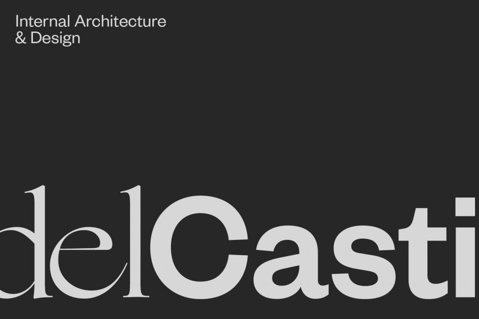
Branding & MarksDigital DesignPackaging, Print & Editorial
Penny Del Castillo is the creative mind behind Del Castillo, a multi-disciplinary, award-winning interior design studio based in Melbourne.
Del Castillo draws inspiration from eclectic cultures throughout the world, while meticulously maintaining the balance between style and function. This allows Penny and her team to create environments tailored to the multifaceted needs of each client.
The team approached us with a brief to elevate their evolving brand, In Design International. We were honoured to assist them in a brand refresh, to create an identity that aligned closely with their signature style and vision for the business.
Before we could start designing, we needed a firm understanding of the whole landscape of the business. We set to work defining the brand strategy, taking a deep dive into their brand identity. We examined Del Castillo’s values, how they communicate their services, as well as the emotional response they wish to evoke from those who engage with their brand. We wanted to unwrap what set them apart from their competitors and understand the core values of the business.
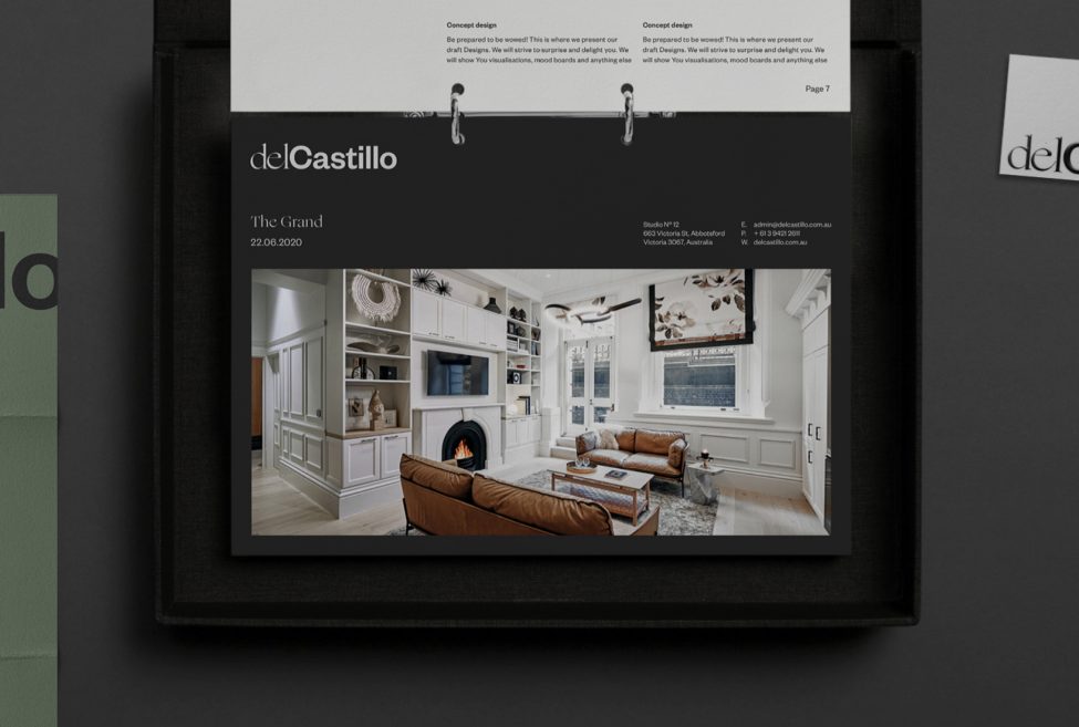
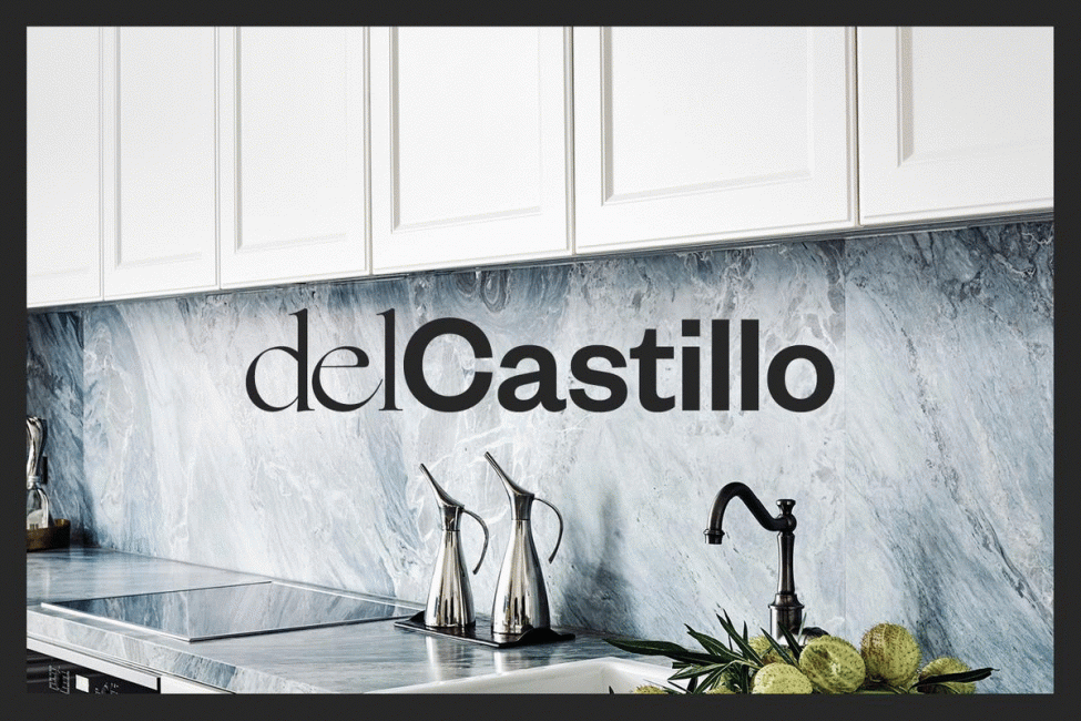
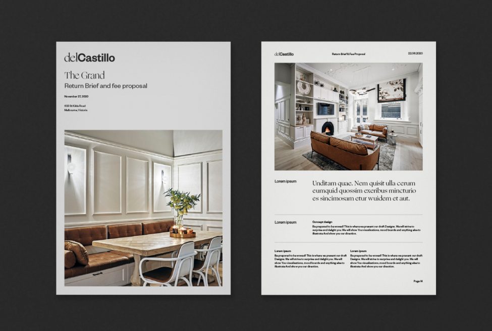
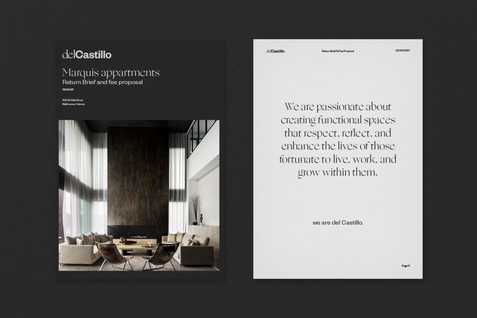
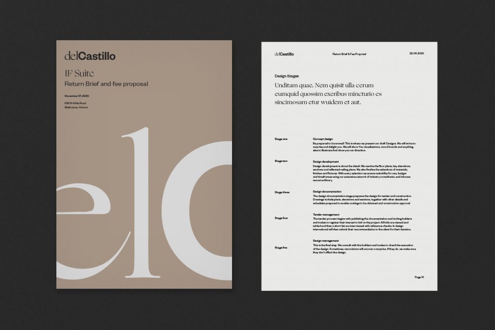
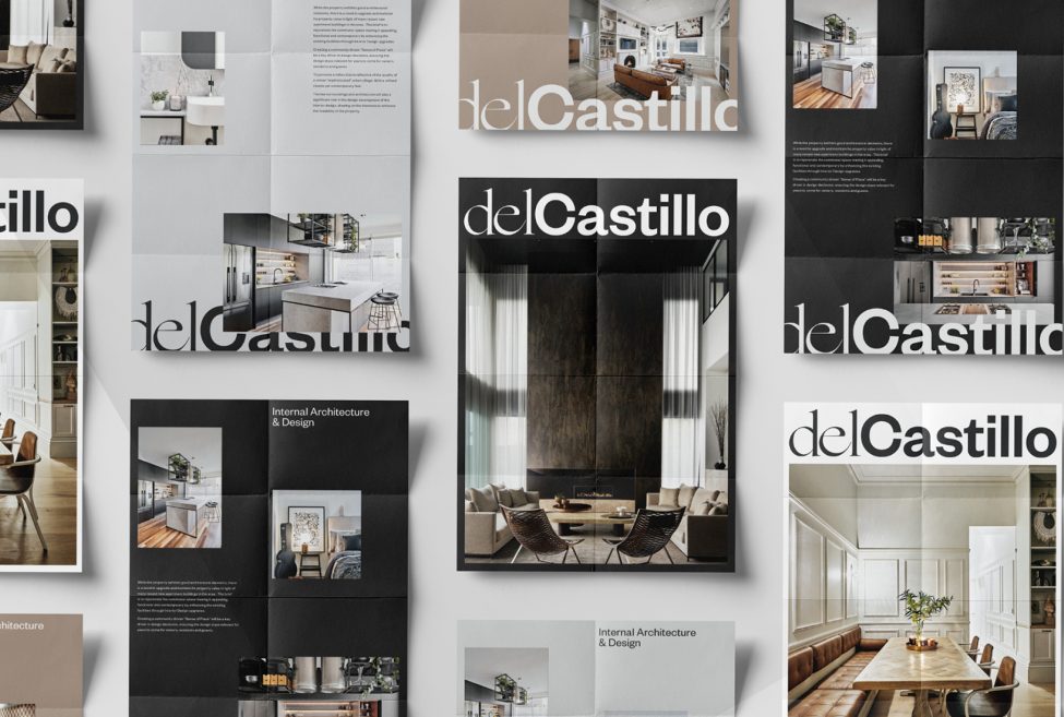
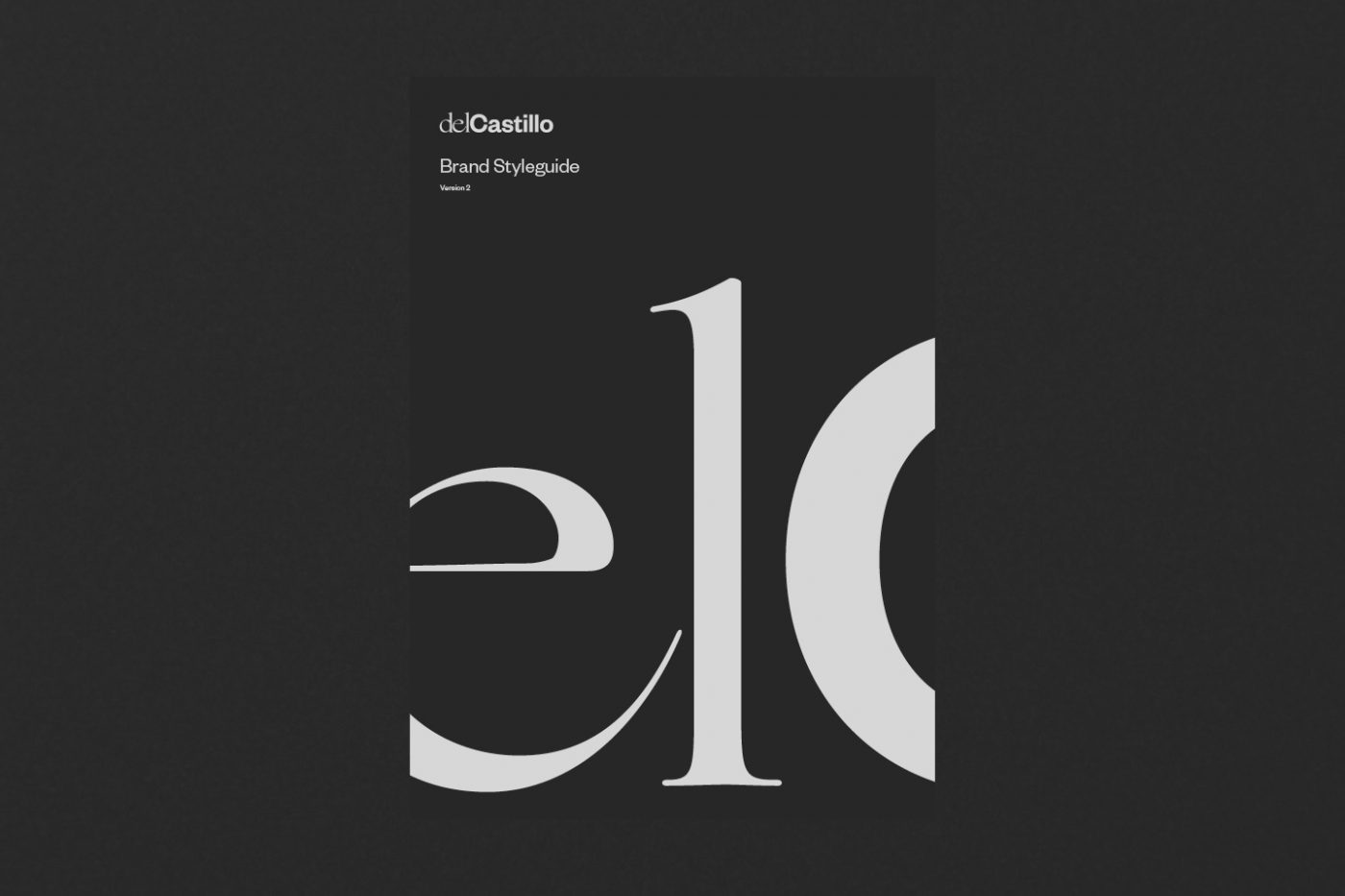
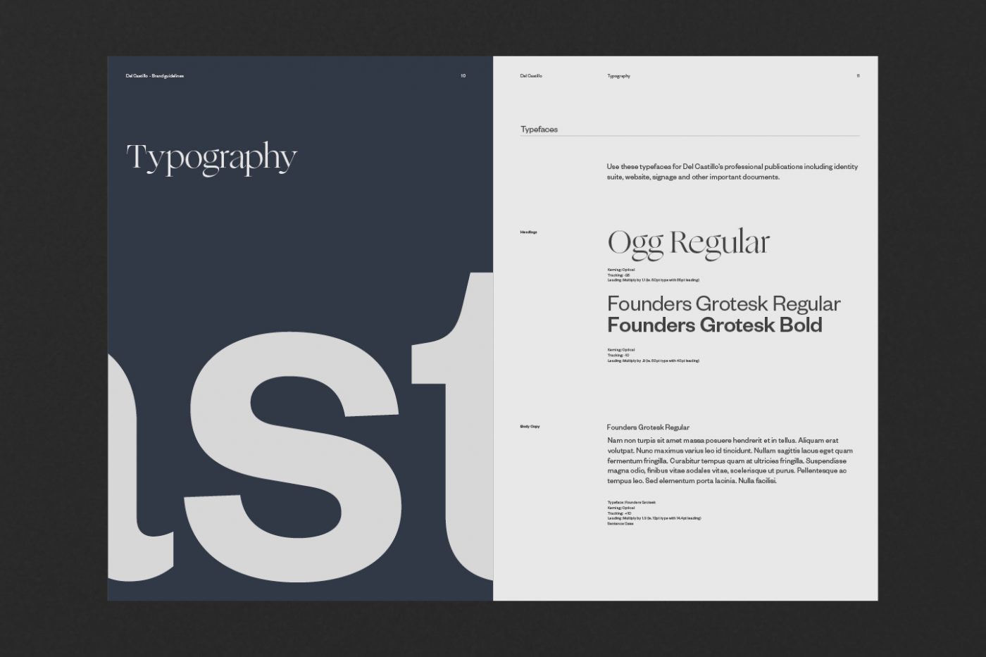
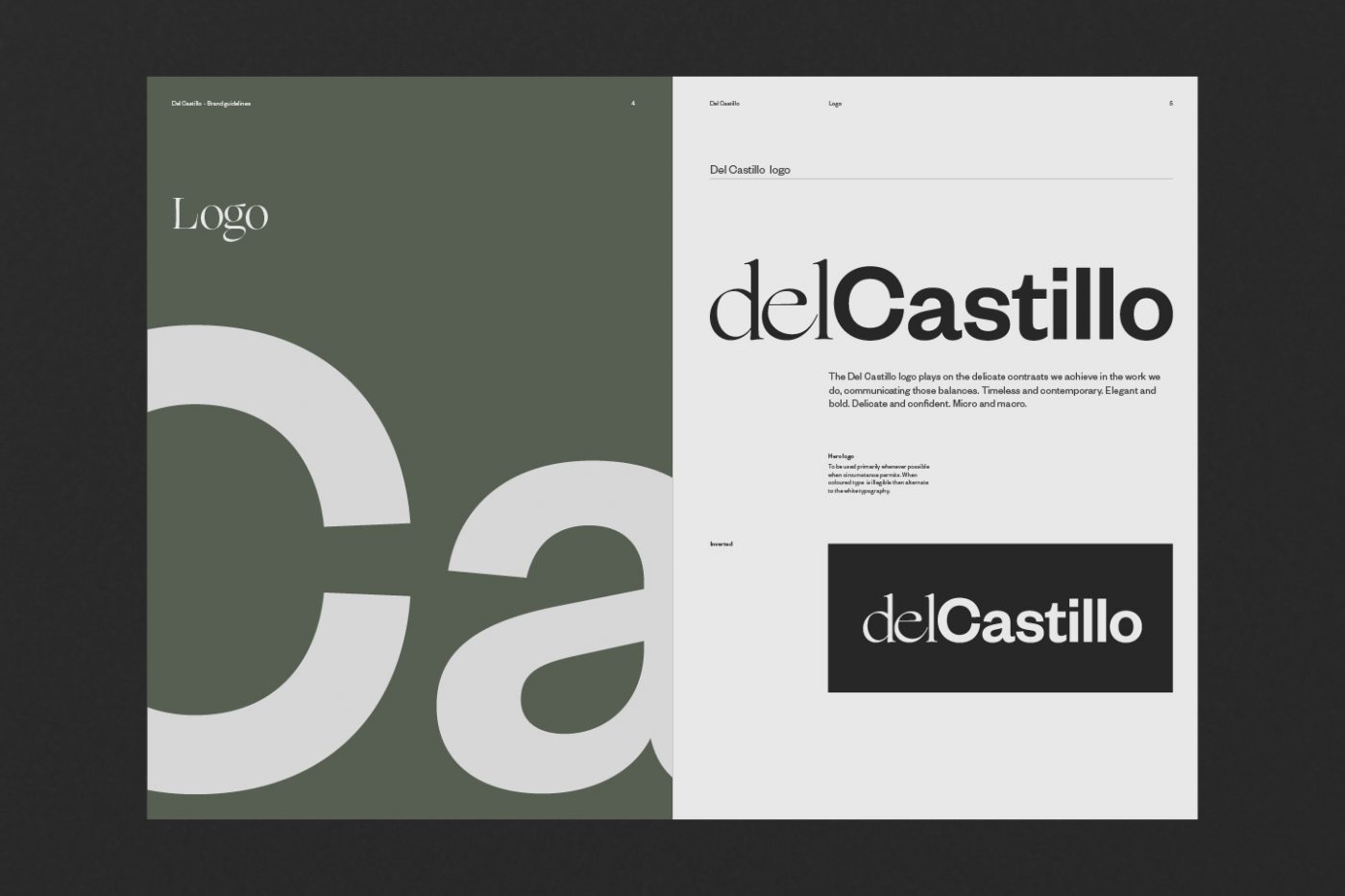
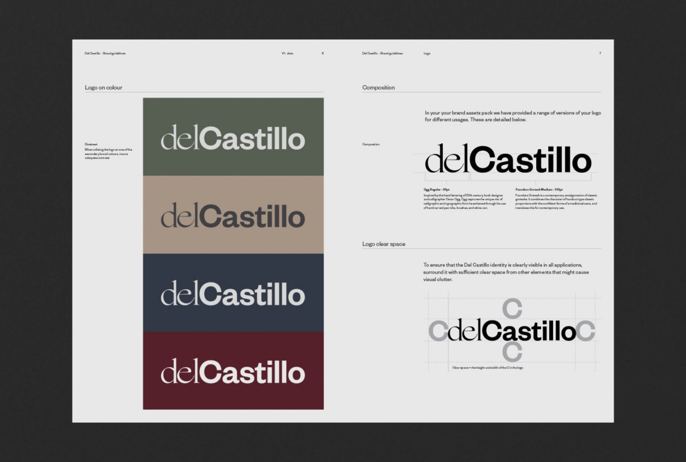
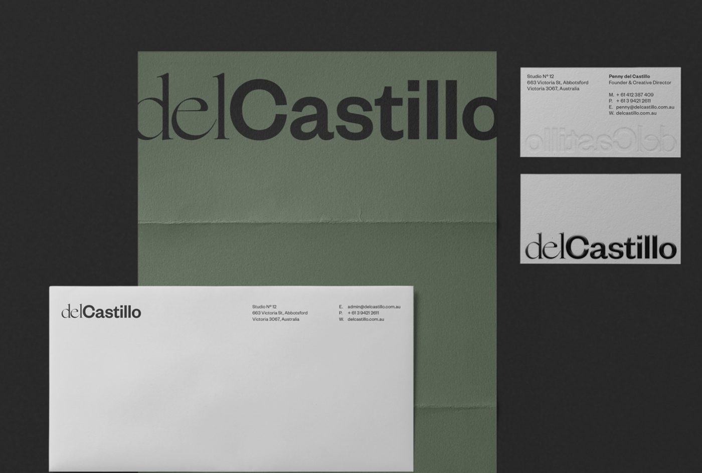
With Del Castillo’s point of difference in mind, and a staunch brand strategy in place, our creatives at Principle Design wanted to play with the idea of balance, through design — something that Del Castillo, seemingly effortlessly, masters. We chose to focus on the delicate pull between timelessness (the old) and modernity (the new). This was achieved, in part, by marrying two very different but equally striking fonts in creating the Del Castillo logo. The two opposing elements of this identity reside next to each other creating tension but also equilibrium.
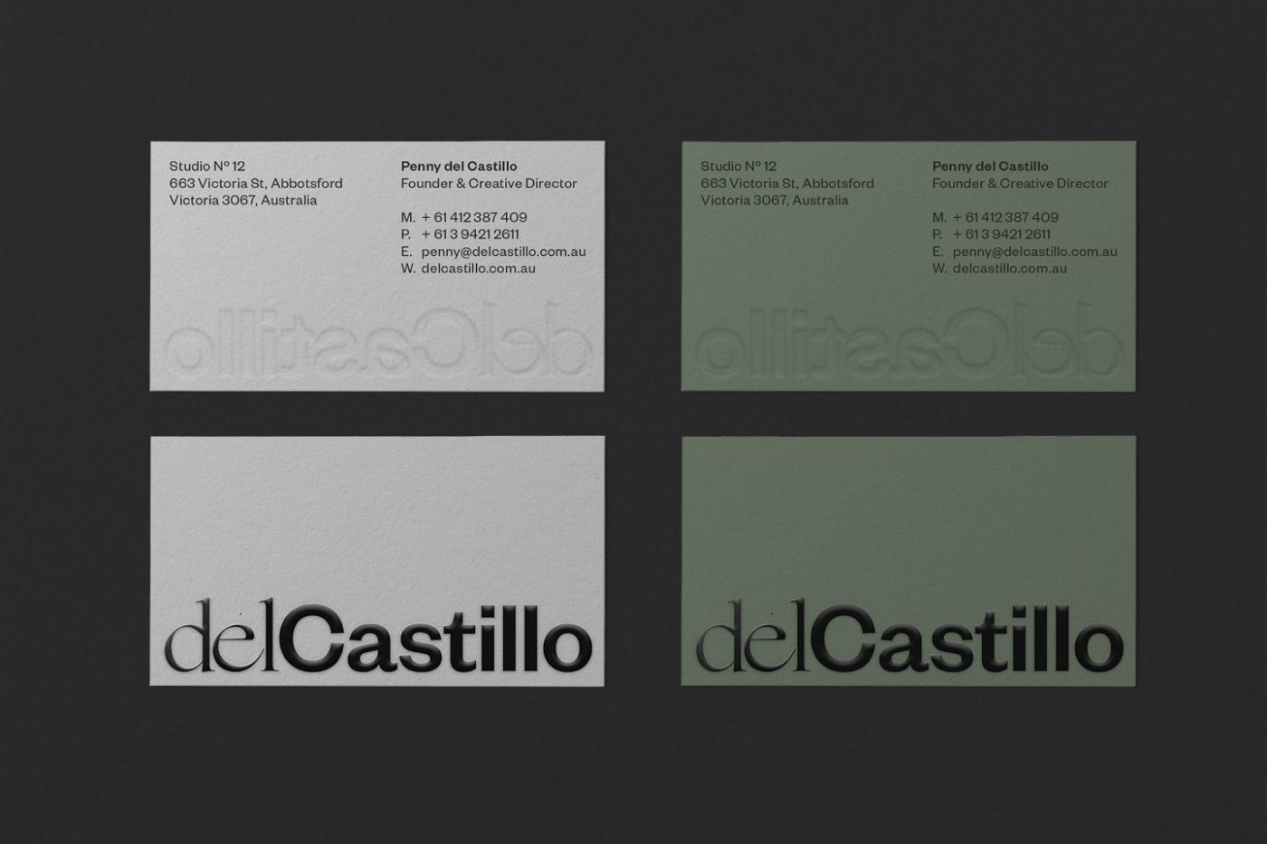
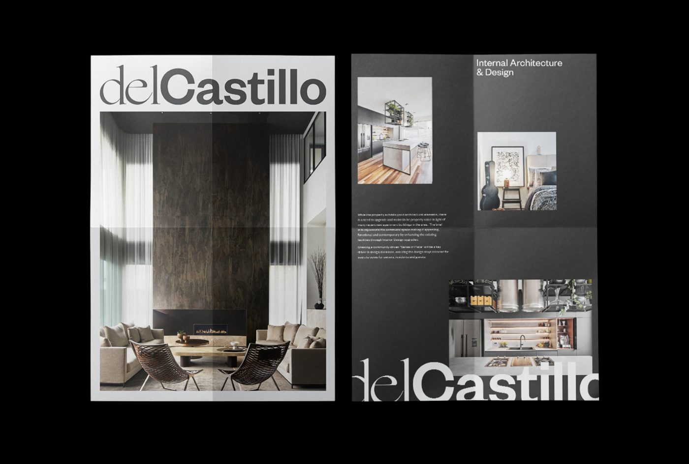
For the extended brand language and collateral, we played with scale to create a sense of drama. We highlighted the contrast of micro and macro in Del Castillo’s work — their attention to detail while maintaining a firm grasp of the big picture when designing and styling any space.
We also workshopped a digital strategy to strengthen the Del Castillo brand further. Our in-depth understanding of site maps and user journeys helped us to highlight key projects and imagery for the Del Castillo website. We also assisted with SEO, refining and optimising their copy while remaining mindful of Del Castillo’s communications, target audience and tone of voice.
As a brand agency, the Principal Design team understood the importance of developing and maintaining a strong brand for Del Castillo. Through our processes and workshops, we were able to fully communicate who Del Castillo was as a brand and ensured consistency throughout their business, story, and selling point. We had to look far down the track to ensure relevancy and leverage the brand equity through the reputation of Penny Del Castilo’s name. We needed to ensure there was flexibility for where the business evolved to in the future and consider a future need for brand architecture. It was a much more in-depth process than merely slapping a new name on the business which also made it far more rewarding to work on!
The Del Castillo team are incredible at what they do in the interior design realm, and we thoroughly enjoyed working with them.