We’d love to hear from you.

/
Alexander Spencer Accountants Branding & Marks / Digital Design
Alexander Spencer is a leading accounting and business advisory firm in Melbourne. They enjoy a proud history built on enduring client relationships across almost seventy years. They were evolving into a more sophisticated business and needed a brand that matched this evolution.
They approached us to create a visual language that would furnish them with the confidence to grow as a business. At the same time, it was vital that, as an established institution, they provided reassurance amongst their existing clients that they would continue to be nurtured during this evolution — that they would grow together.
At its inception, in 1952, the firm was known as Alexander Spencer. However, soon after they changed the name to AS Partners due to partnerships within the company
The name ‘AS Partners’ had significant brand equity and a loyal client base; so changing their name was a concern. Through our in-depth strategy, we visualised where the business was heading and determined their brand would resonate better with their target market if they went with Alexander Spencer. It felt more humanistic and also paid homage to their impressive history.
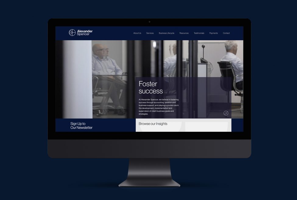
In business almost seventy years, Alexander Spencer had time to work out what mattered to them as a company. This was distilled into four core values — honesty, dynamism, selflessness and relentlessness. We built a strong brand story based on these values, employing a thoughtfully designed logo icon as the conduit. The icon comprises a quadrant within a circle, with each quadrant representing one of their four values. The large circle represents how Alexander Spencer protects their clients’ personal equity and provides continuity in their business. The small-to-large circle represents growth and their expertise dealing with both small and large businesses.
Our secondary language further fortified Alexander Spencer’s brand story. The use of continuous lines in their iconography set helped cast Alexander Spencer as a business that values an ongoing relationship with its clients. The rich colour palette provided a sense of trustworthiness and security, which are essential qualities for a business that deals with people’s finances.
Through our thoughtful design strategy and branding, we managed to maintain the maturity of an established financial business while also shifting its position to a more