We’d love to hear from you.

/
Archdiocese of Melbourne Wayfinding Branding & Marks / Wayfinding & Signage
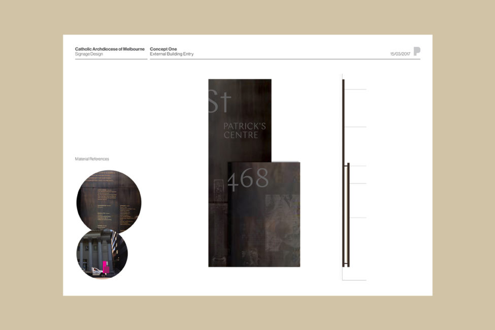
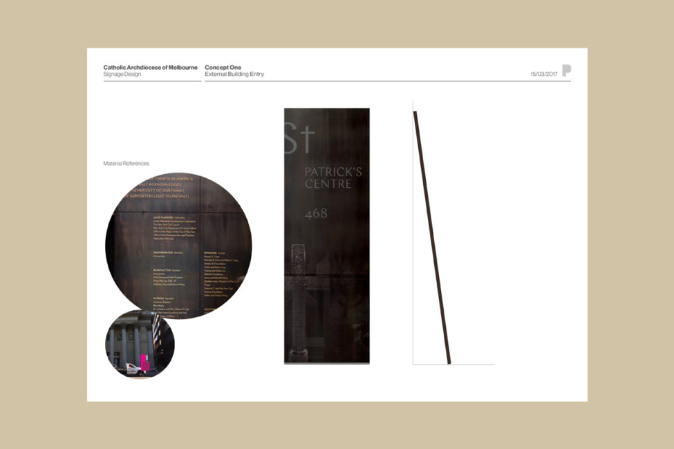
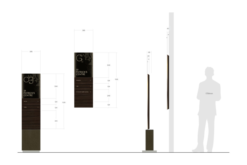
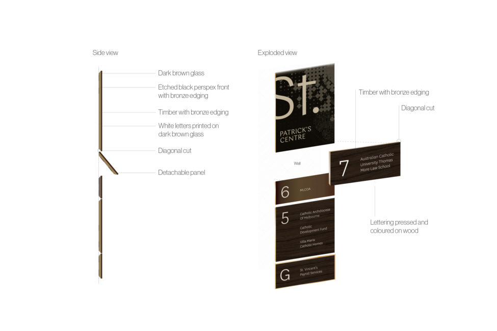
The Catholic Archdiocese of Melbourne project involved the rebrand of 486 Albert Street, previously named St. Patrick’s Centre. The project analysed existing branding including a high-level assessment directing the needs for the premises and previous site’s conditions. From meetings held, Principle Design identified the fact that the premises required a strong hierarchy of information within the building. It was critical that all brands that were housed within the building were visually and holistically represented. The signage of the Catholic Archdiocese of Melbourne also had to reflect this.
Principle Design implemented a central brand and style that was congruous throughout the space. The effect of this enabled visitors of the building to find their way easily and ensure that they’re on the right floor, as well as cover security measures for the premise by ensuring visitors were not in the wrong area of the building by mistake. Principle Design strategically worked alongside Spowers Architects in order to define the visual language, signage and wayfinding in order for visitors to move from one place to the next.
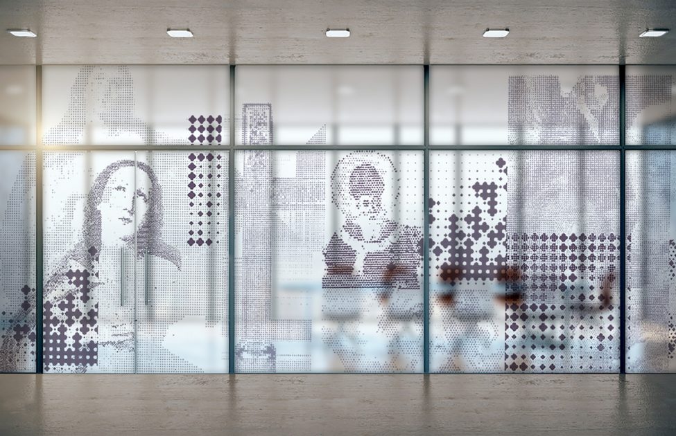
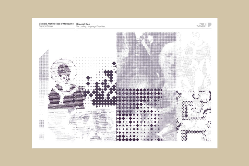
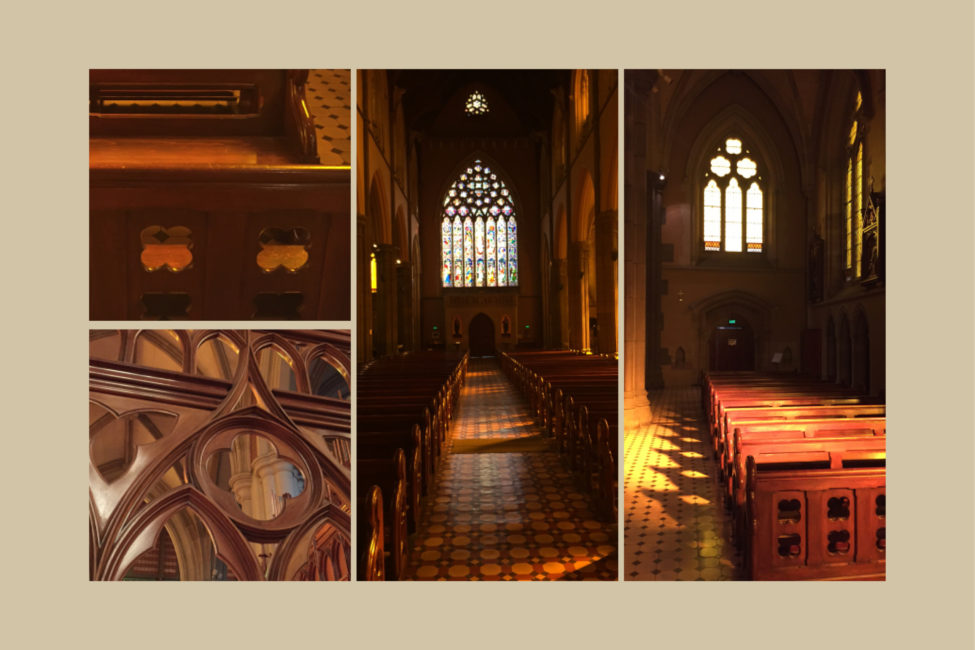
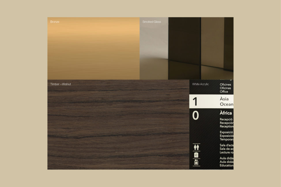
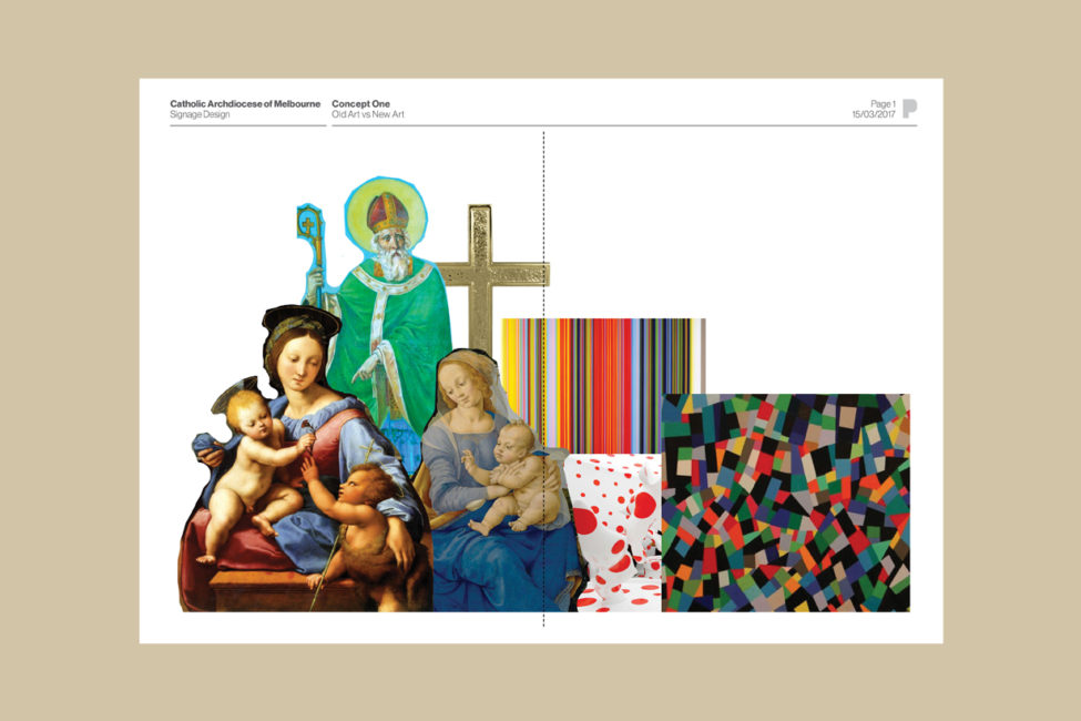
Principle Design had to understand the user journey experience of visitors. The visual inspiration used for the Catholic Archdiocese of Melbourne drew upon St Patricks Centre’s graphical language that was used for many centuries. Iconic of its history, the visual inspiration was integrated throughout the materials used via tinted glass, works of art and rich tones. Typography was also important in communicating both the historic and contemporary nature of the Catholic Archdiocese of Melbourne. One of the beliefs was to bring a contemporary touch to the historic feel.
Website: https://www.cam.org.au/