We’d love to hear from you.

/
Our Work

The Mark Property Development
The Mark is a refined residential development with stunning interiors designed by Rothelowman Architects
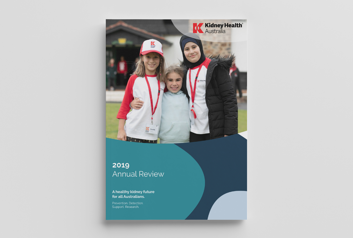
Kidney Health Australia Organisation
Kidney Health Australia is a close-knit workforce that values professionalism, collaboration and ambition

Ski Club of Victoria
With a century of history behind it, the Club was ready to look forward. We partnered with the team to create a refreshed brand that honours its legacy while embracing the future.

Known Stranger Prebiotic Sparkling Juice
We developed the brand from the ground up, starting with a strategy focused on shifting perceptions: the idea that what starts off unfamiliar (a stranger) can quickly become known and loved.
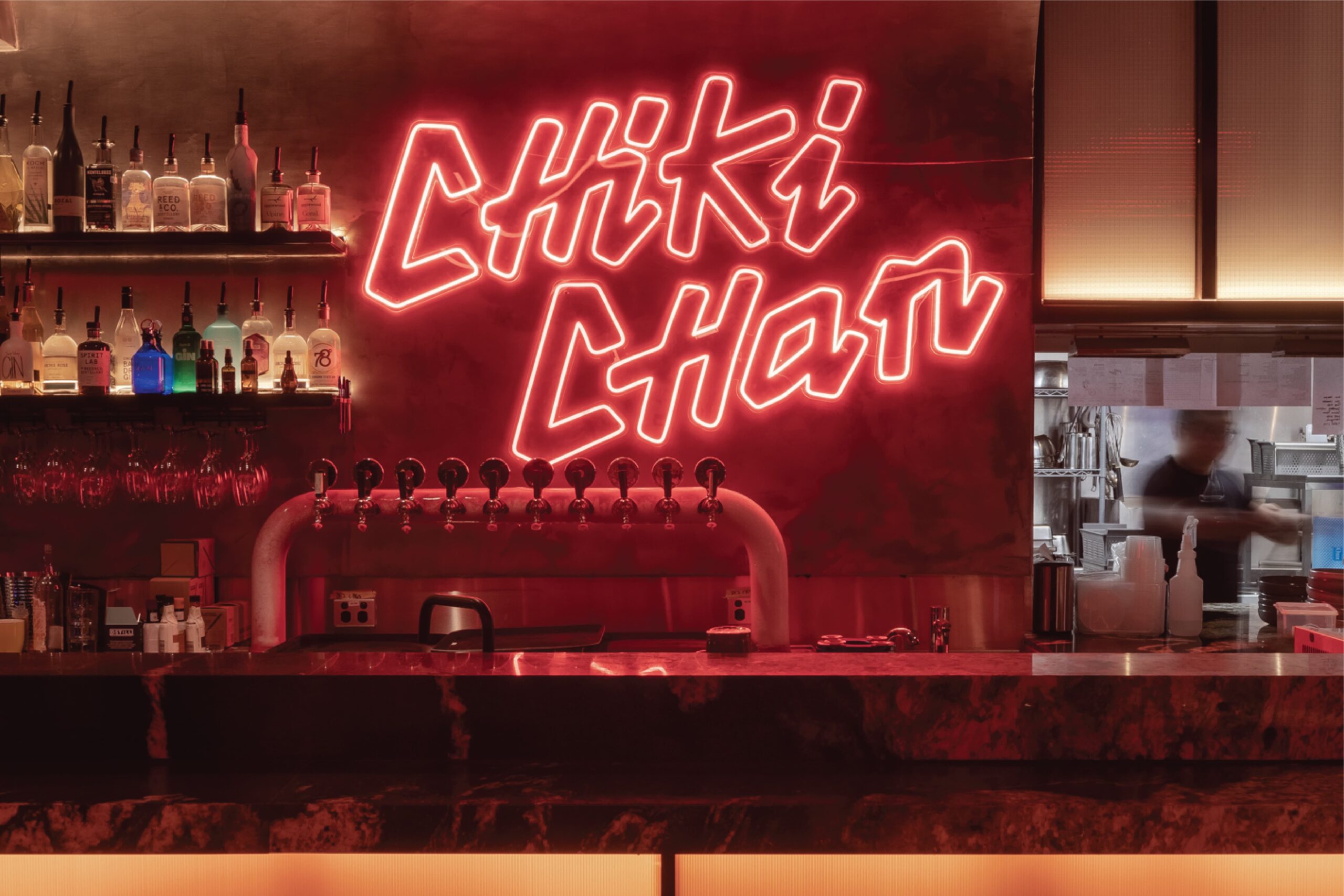
Chiki Chan Restaurant
Inspired by the energy of Asian street food culture, Chiki Chan is a bold and playful fusion restaurant that brings together flavours, traditions and mischief in equal measure.
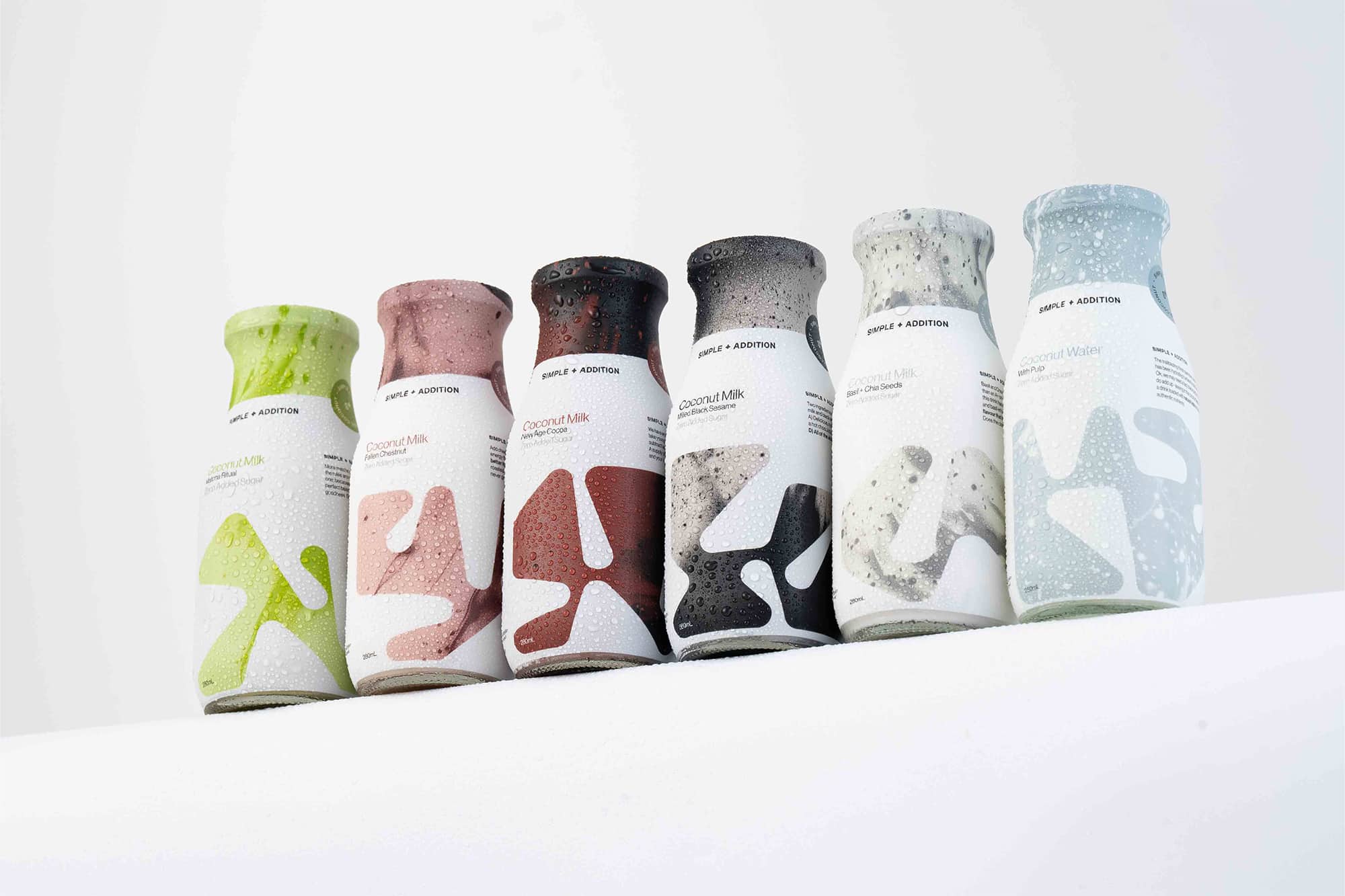
Simple + Addition Coconut Milk
Simple + Addition is a brand rooted in the belief that better living starts with simple choices.
Western Autistic School
WAS engaged Principle Design to refresh their brand and digital presence, reinforcing their role in Victorian education for students with special needs.
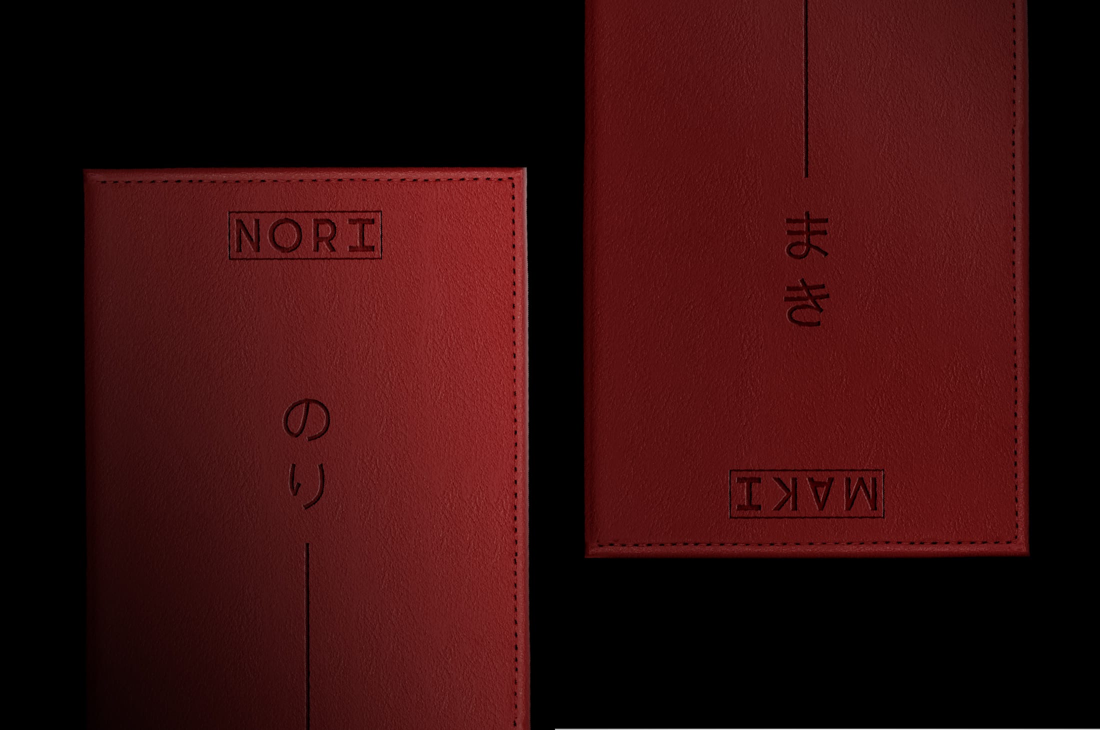
Nori Maki Omakase Restaurant
Nori Maki is an experience built on precision and pace, where the storytelling is part of the serving. Our role was to give it a brand that invites you in at first glance.

Victorian Adolescent & Young Adult Cancer Service
We had the privilege of reimagining the brand identity for Victorian Adolescent & Young Adult Cancer Service, formerly “ONTrac at Peter Mac.”
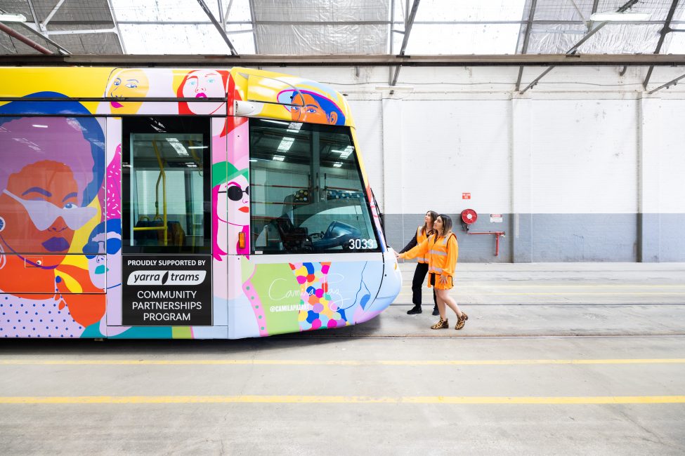
SisterWorks Hire Her Campaign Tram Wrap Design
Principle Design created #HireHer, a tram promoting workforce diversity for SisterWorks and Yarra Trams.
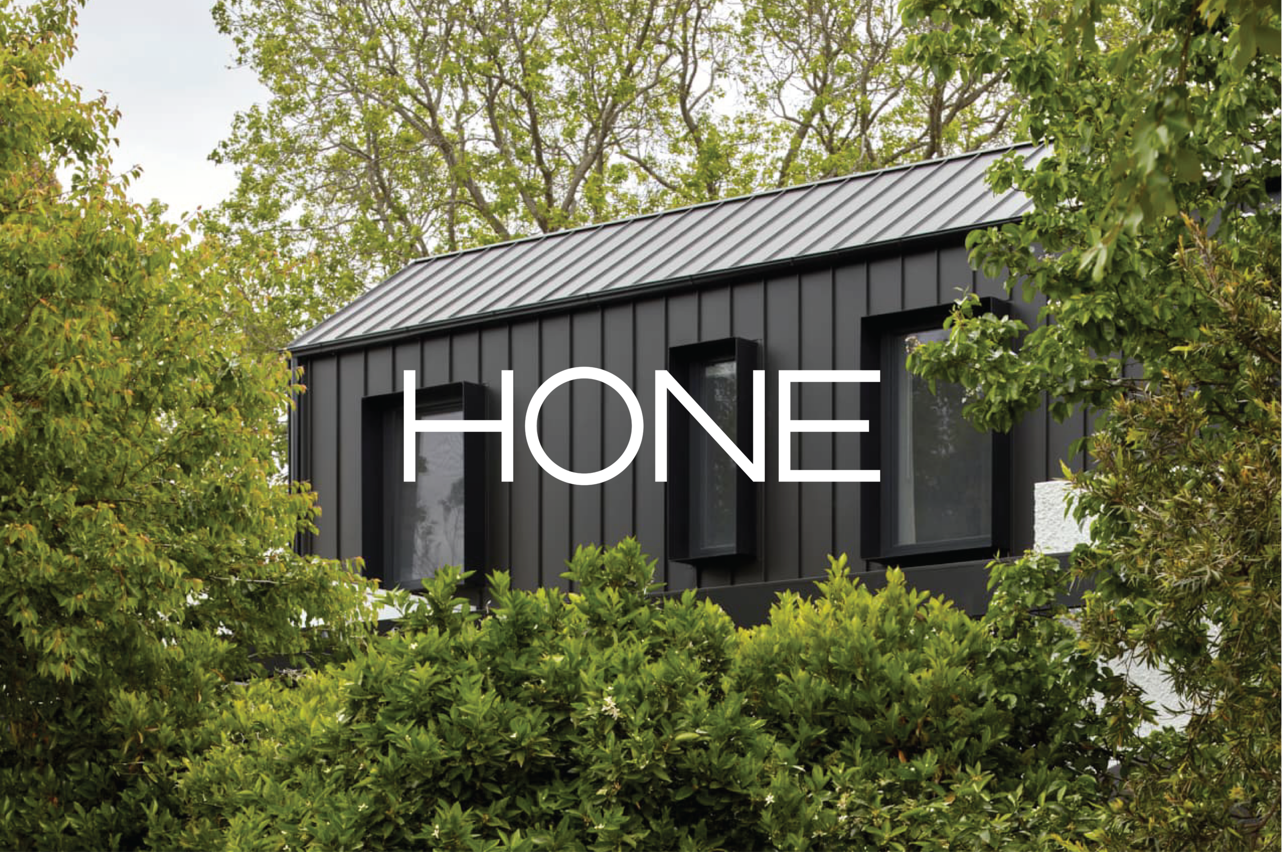
HONE Built
The Hone Built brand identity was designed to highlight the benefits of passivhaus building and educate the Australian market on its value.
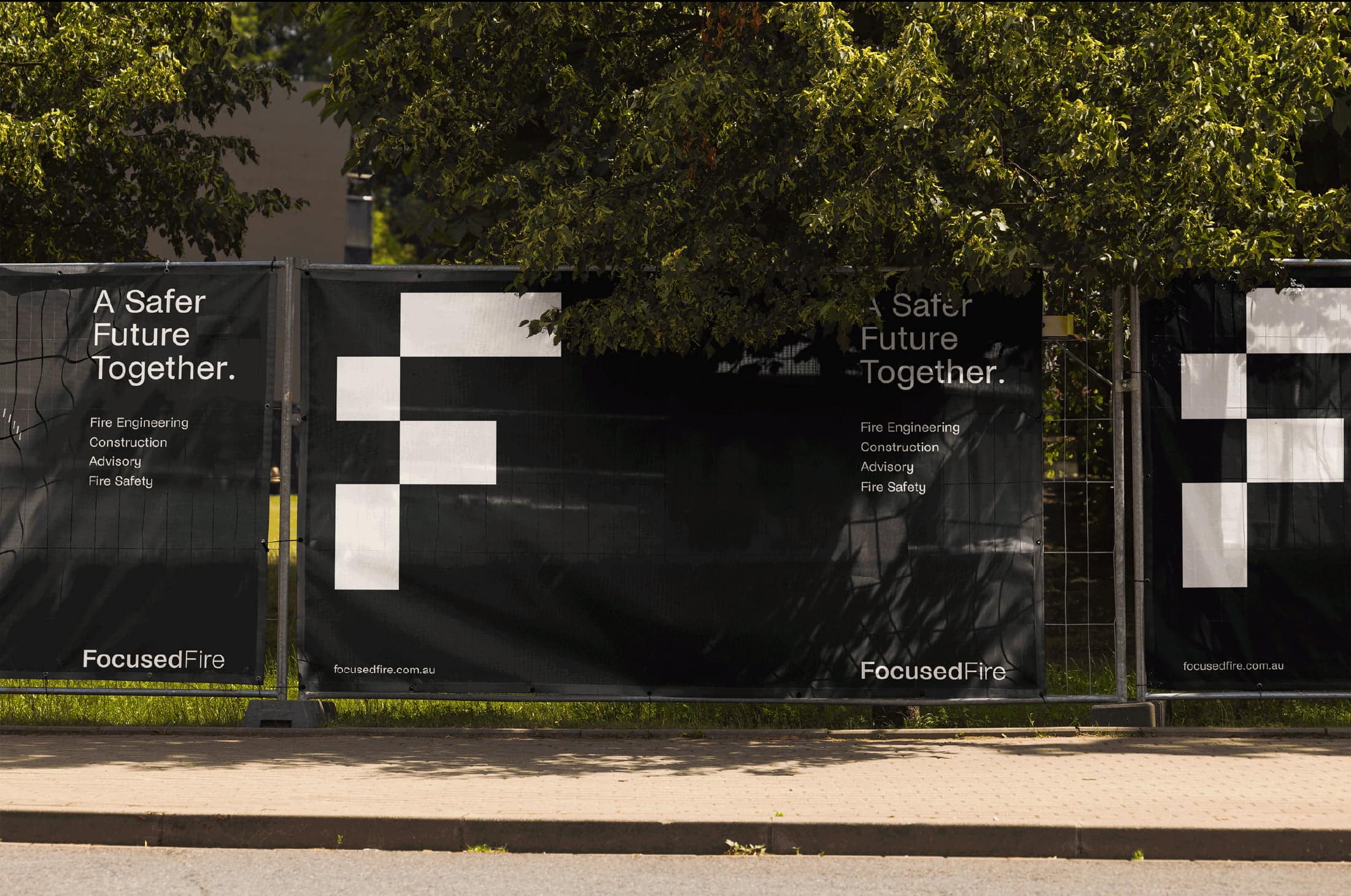
Focused Fire
With a century of history behind it, the Club was ready to look forward. We partnered with the team to create a refreshed brand that honours its legacy while embracing the future.
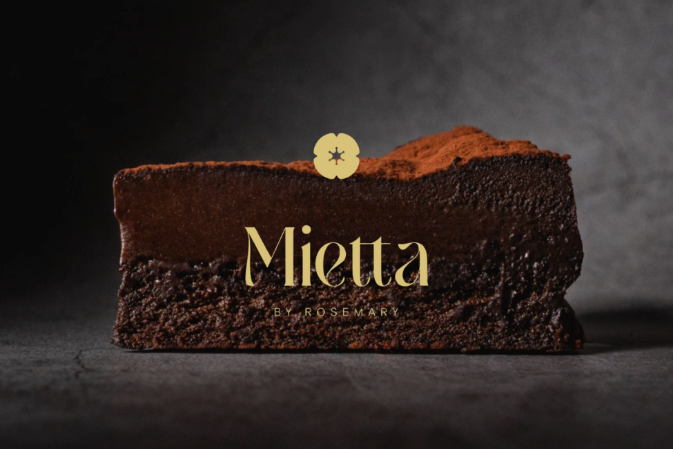
Mietta By Rosemary Andrews
Mietta by Rosemary combines global patisserie expertise and is now at Malvern’s doorstep.
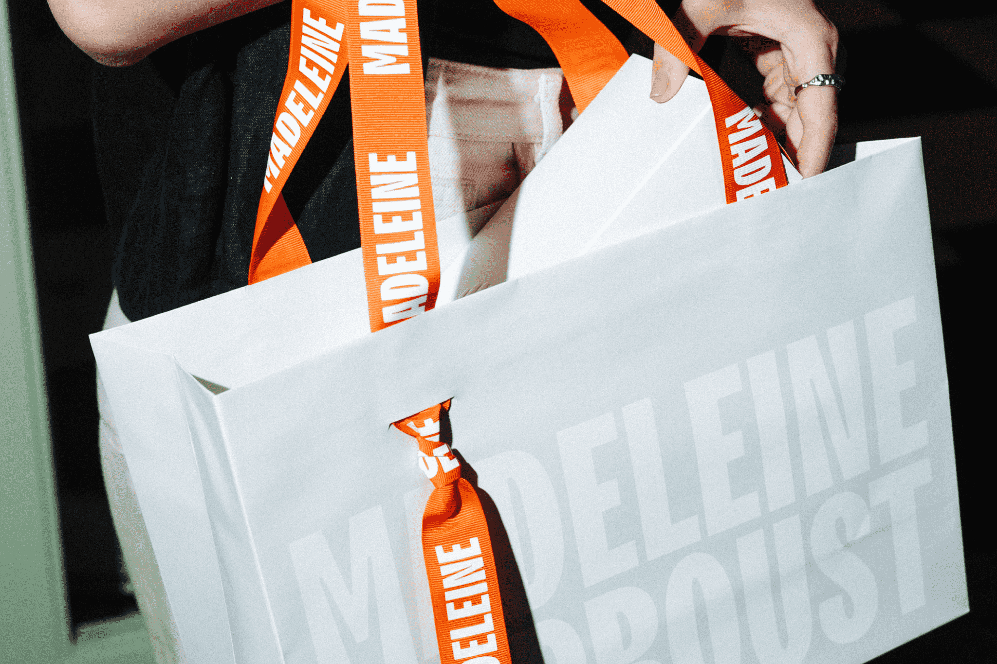
Madeleine de Proust Patisserie
Lygon Street’s latest kid on the block, Madeleine De Proust, is creating nostalgia with crumbs and glazes.
We'd love to get a coffee with you
and learn more about your project.