We’d love to hear from you.

/
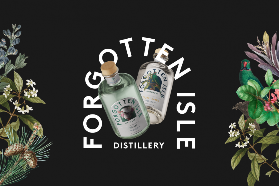
Forgotten Isle Distillery Gin Branding & Marks / Packaging
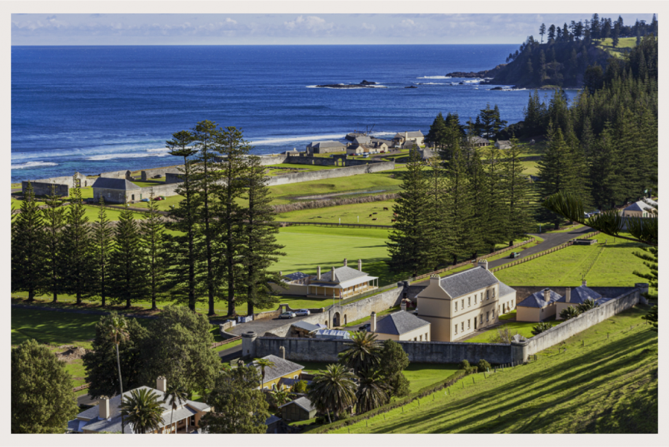
Located on the stunning and remote Norfolk Island, Forgotten Isle Distillery harvests unique botanicals native to the Island, transforming them into rare and limited craft spirits.
There is an untamed feel to the island, which is defined by its rugged terrain. Tall pine trees balance on top of jagged cliffs, met below by crashing waves. Its colonial history is just as highly charged, filled with mutinies and uprisings.
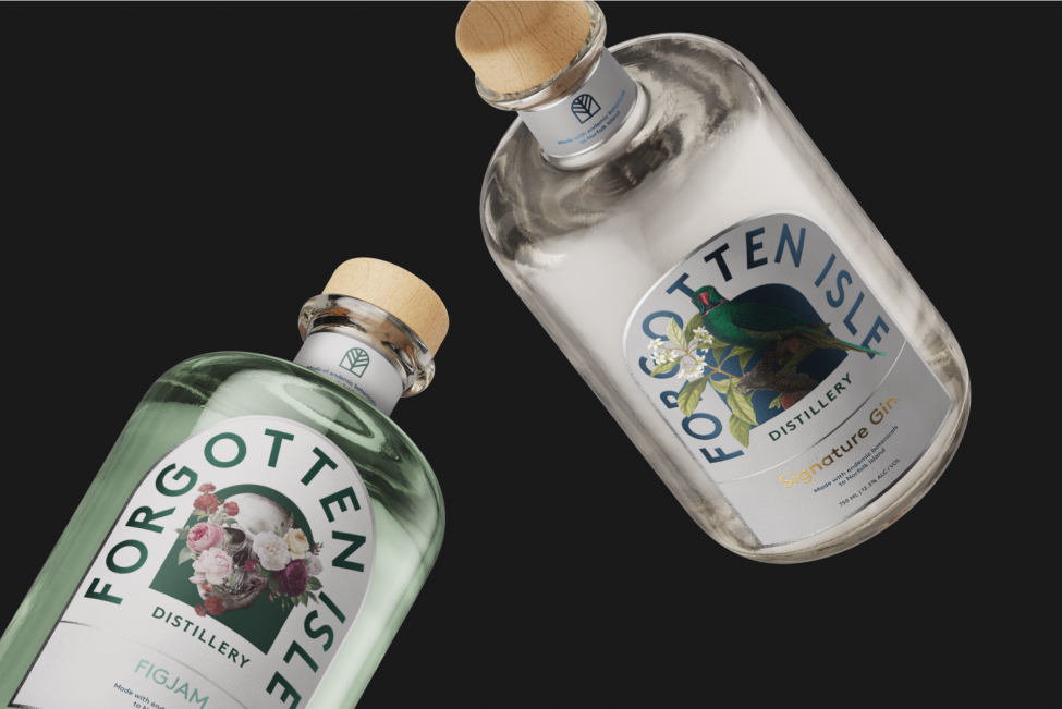
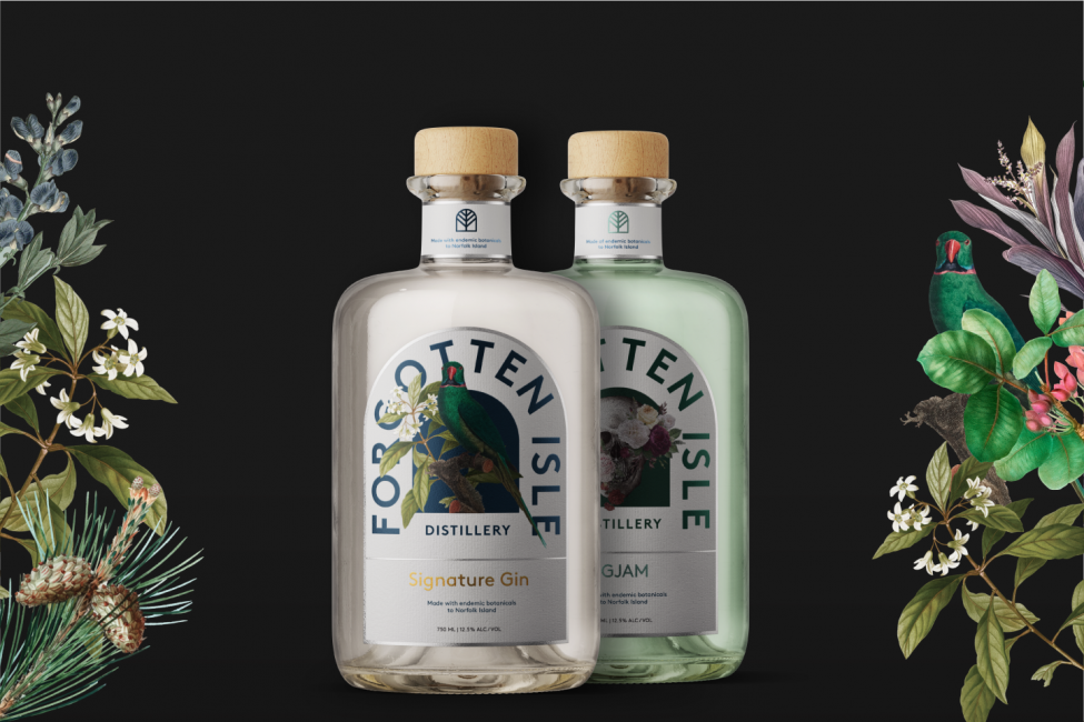
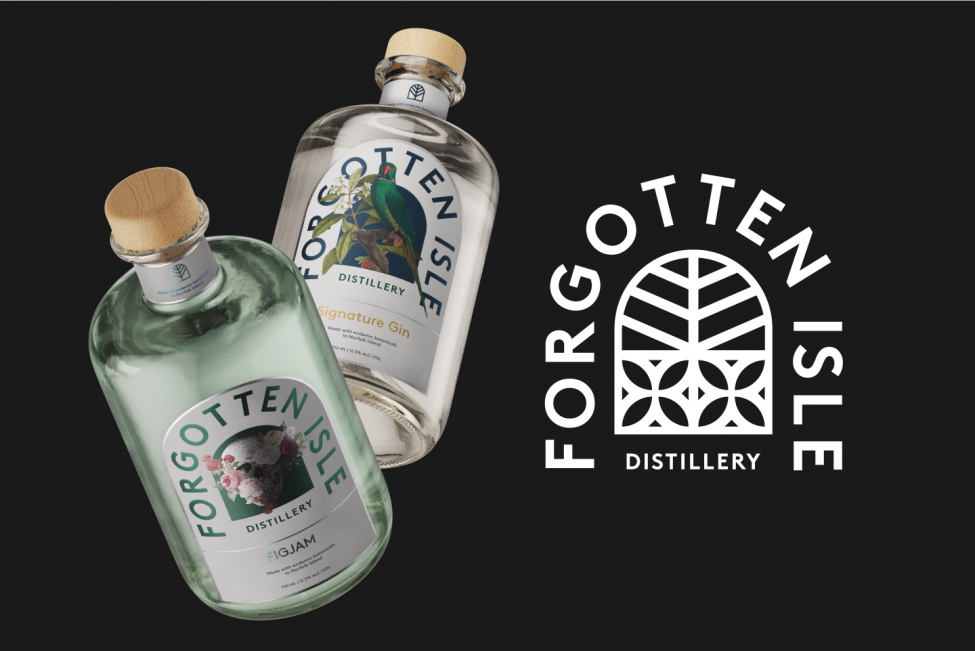
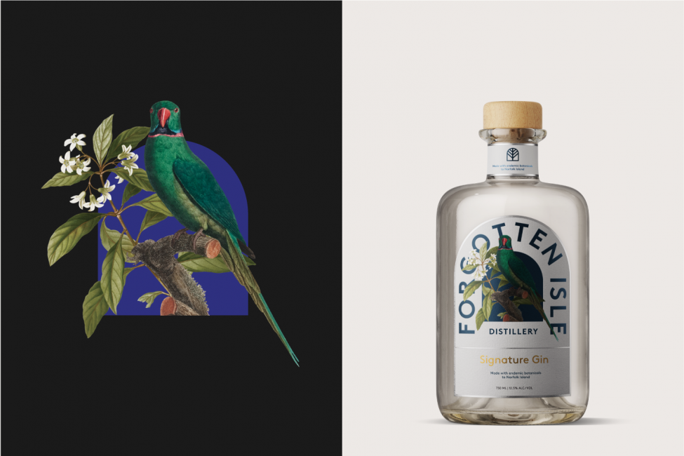
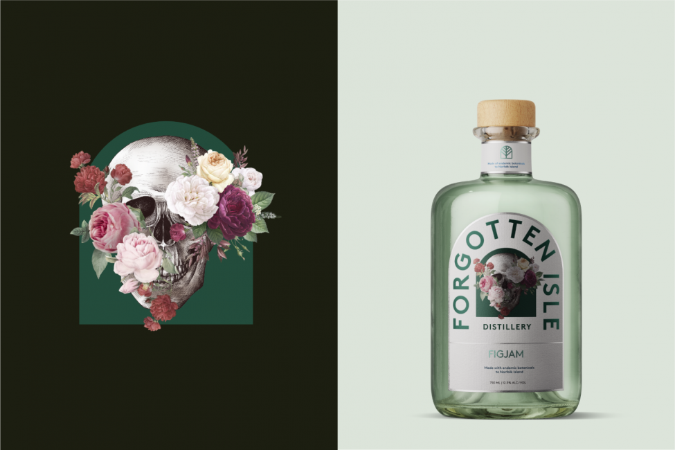
Forgotten Isle Distillery wanted to tell its distinct brand story from the vantage point of a parent brand. They needed a robust but flexible identity to allow for an expansion of products down the track, so we advised them on a brand architecture strategy. The brand will start with two product offerings, a more niche ‘Rare Species’ product targeted at collectors of art and experience, and FIGJAM, which will appeal to a broader range of consumers.
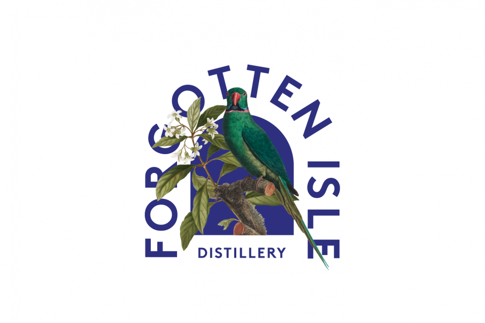
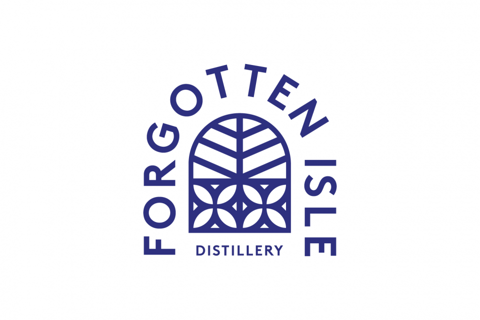
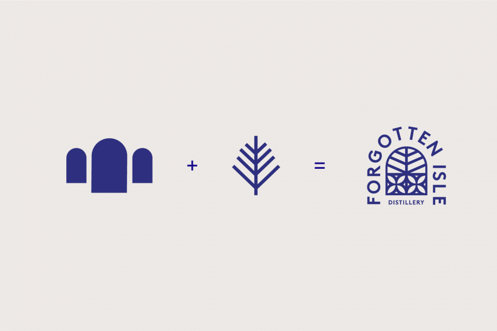
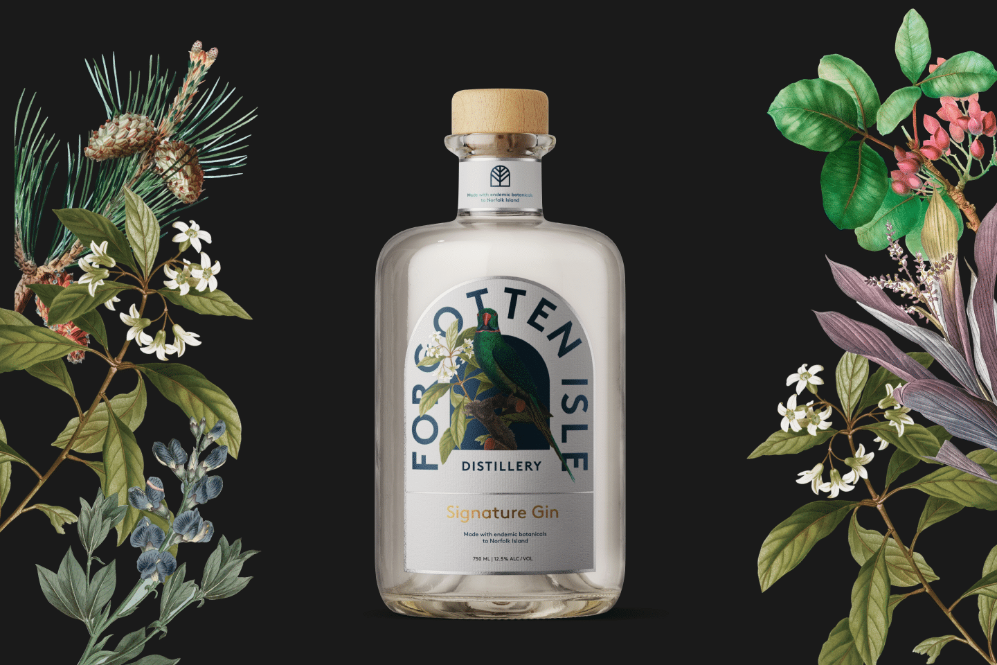
We devised a distinct brand language that clearly communicated the story of Norfolk Island, its architecture and its geography. This was achieved by translating iconic imagery from the island into simple yet universal symbols.
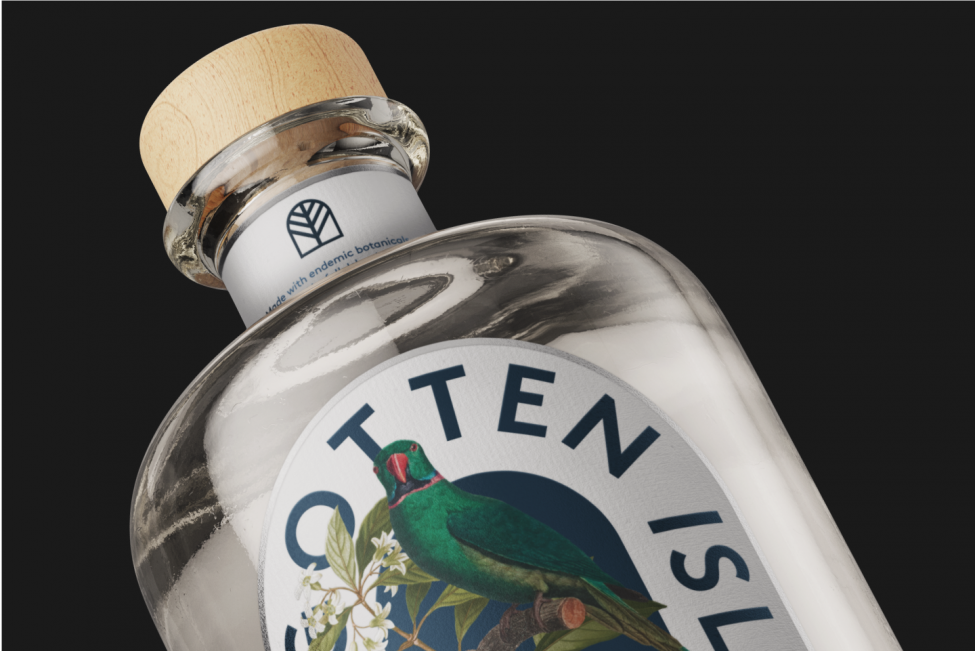
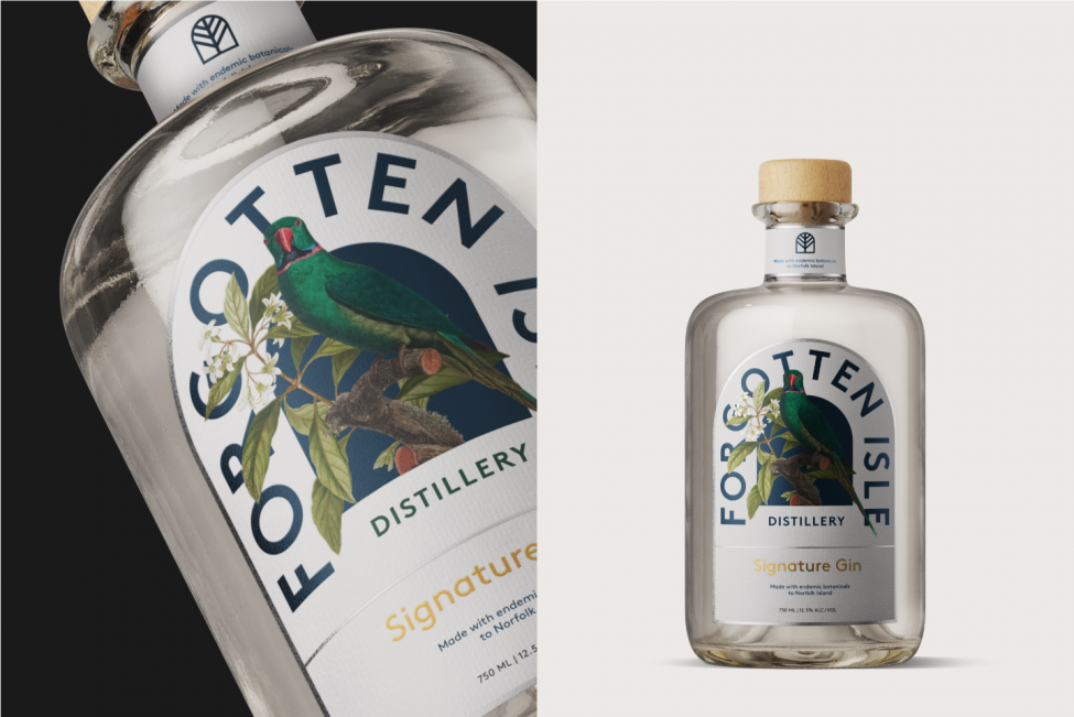
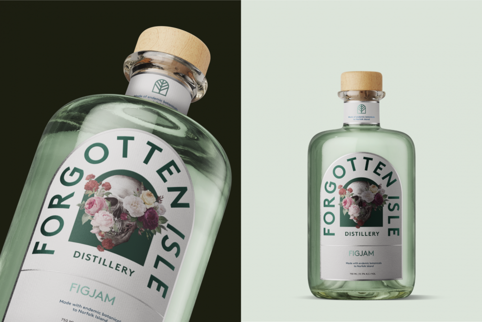
The heritage-listed stone arches standing proudly throughout the island, built in the late eighteenth century, were a source of inspiration. We created a bold typographic arch that acts as a holding shape where other symbols can sit within, to frame the stories of the island. Filling the archway with different styles of imagery dramatically changes the tone of voice of the package and allows for flexibility within Forgotten Isle’s brand’s architecture.
Looking at the natural landscape, we harnessed the imagery of the Evergreen pine trees, prevalent throughout the island, and which also feature on the Norfolk Island flag. Not only did this symbolise the island it also helped us relay the sustainable processes used by Forgotten Isle Distillery in order to protect the island’s special ecosystem.
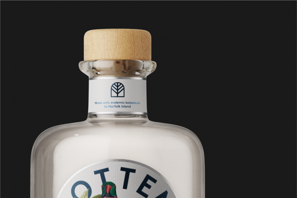
When designing for a physical product, it’s important to also consider how the label will look when printed and displayed — in this case, on a bottle. We determined that embellishments such as foiling and layering of inks would contribute to shelf appeal, showing the product in its best light.
Through brand architecture, strategy and design we aided Forgotten Isle Distillery in telling the story of Norfolk Island, its lure and heritage — a key influence on the brand itself.