We’d love to hear from you.

/
Francis Lim Barristers and Solicitors Branding & Marks / Digital Design / Packaging, Print & Editorial
Francis Lim is a family-run, Christian law firm based in Melbourne who provides their clients with compassionate, honest, and cost-effective solutions to their legal matters.
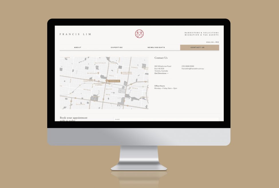
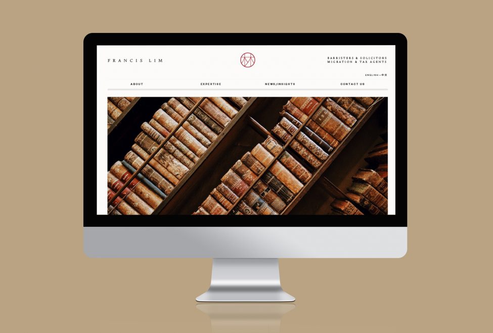
The law firm was in need of a brand and digital refresh. They wanted to better communicate their expertise within the legal arena, coupled with their strong Christian ethos.
Through our careful brand strategy, we found a gap in the market where we could position Francis Lim and help them to stand out amongst their competitors.
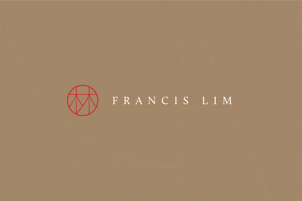
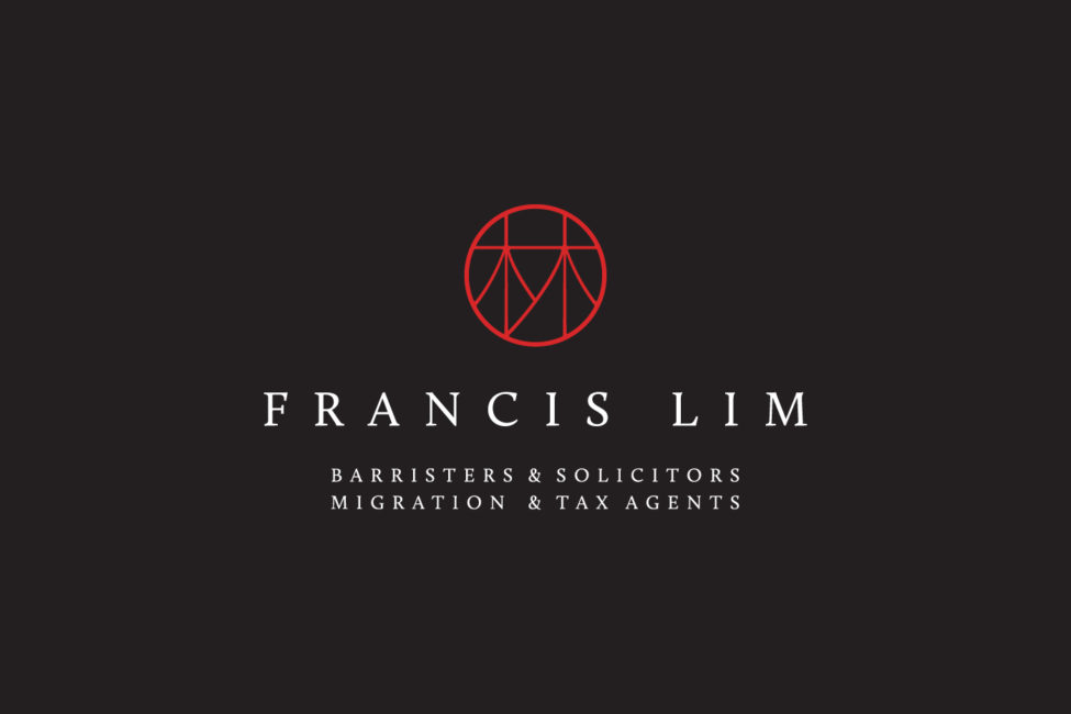
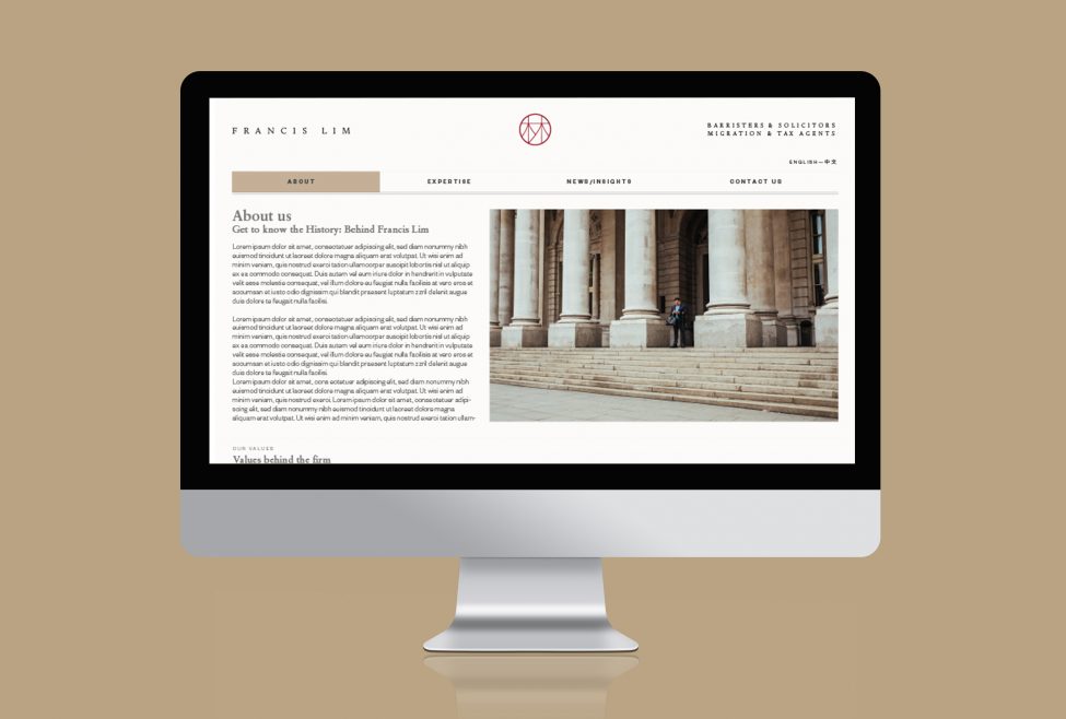
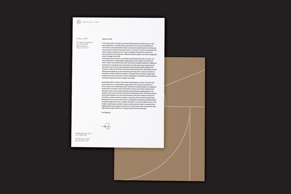
We sought inspiration from the shape of the word “Lim” when written out as a Chinese character, and the role it plays in the history of Francis Lim as a family-based law firm. We build on this character, enclosing it in a circle. A circle is a limitless shape that we used to demonstrate how Francis Lim have no limits when it comes to bringing first-class solutions to the table. The crosses, embedded within the Lim character, represent a service that is first and foremost based on compassion and trust and places Christianity as a vital foundation of their service.
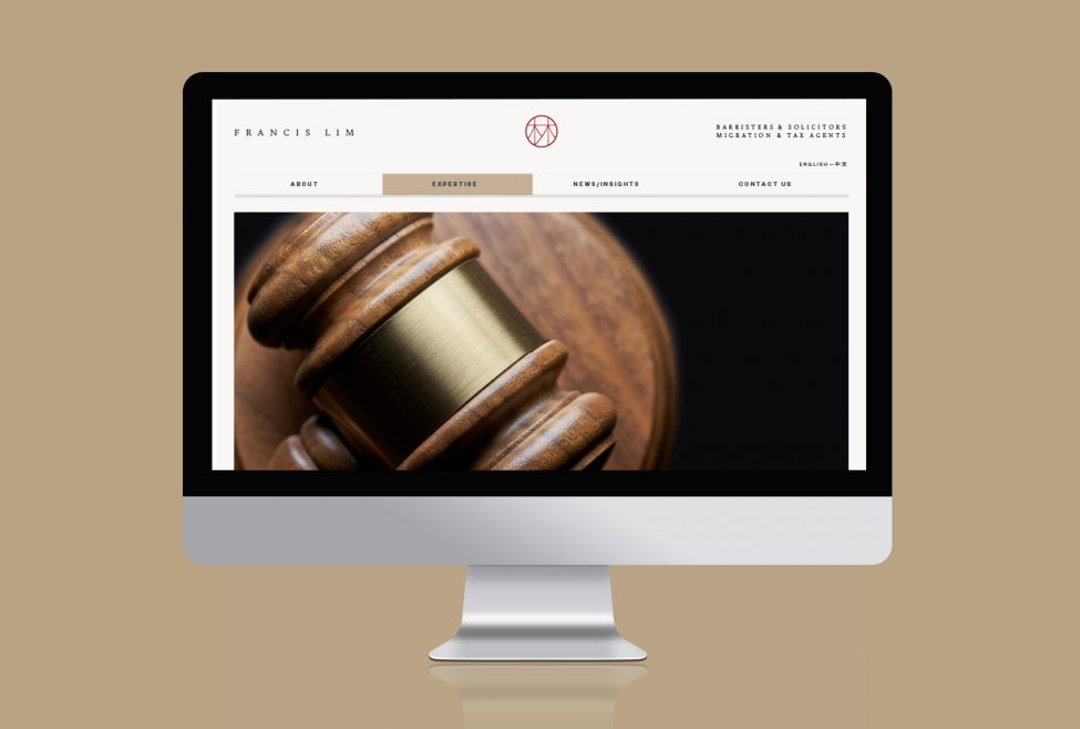
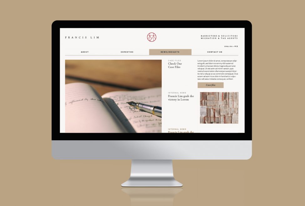
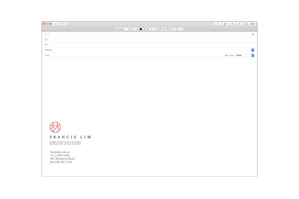
The logo stands out in vibrant red which is seen as an auspicious colour in many Asian cultures, particularly Chinese the country from where the logo’s symbol derives. It also helped with the transition from their previous brand, which included several shades of red. The red logo is contrasted against a white background with black font, which is practical and professional in nature.
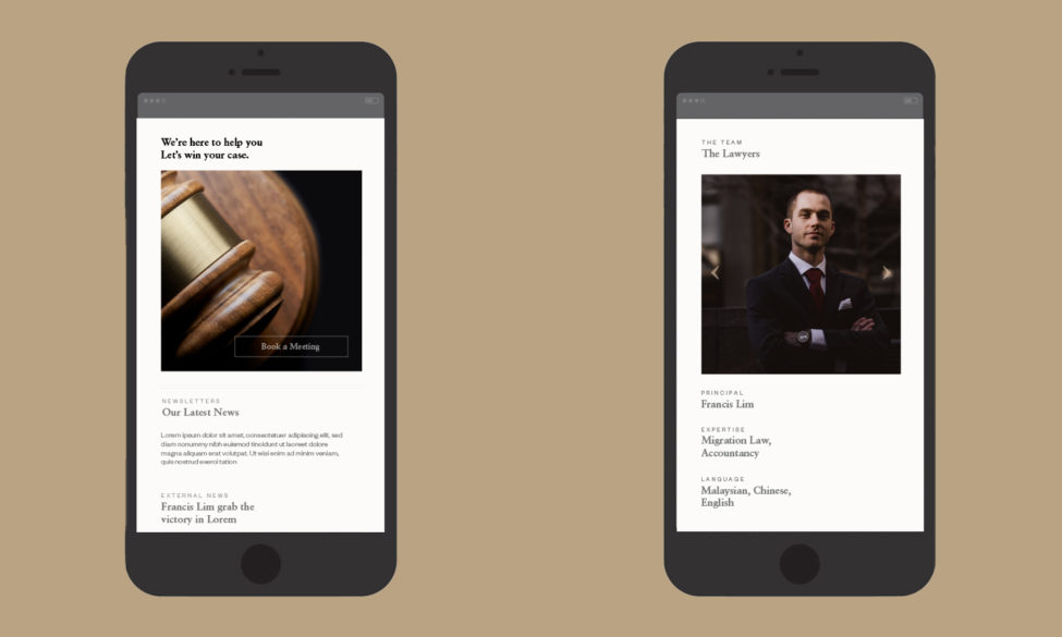
From our research and experimentations, we managed to visually display Francis Lim—both through branding and digitally via their website—as a trustworthy and compassionate firm that provides clients with approachable communication and adaptive solutions.