We’d love to hear from you.

/
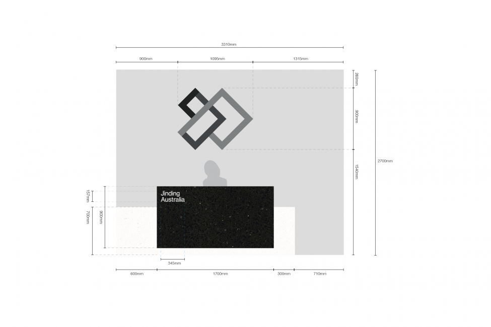
Jinding Integrated Property Services Branding & Marks / Wayfinding & Signage
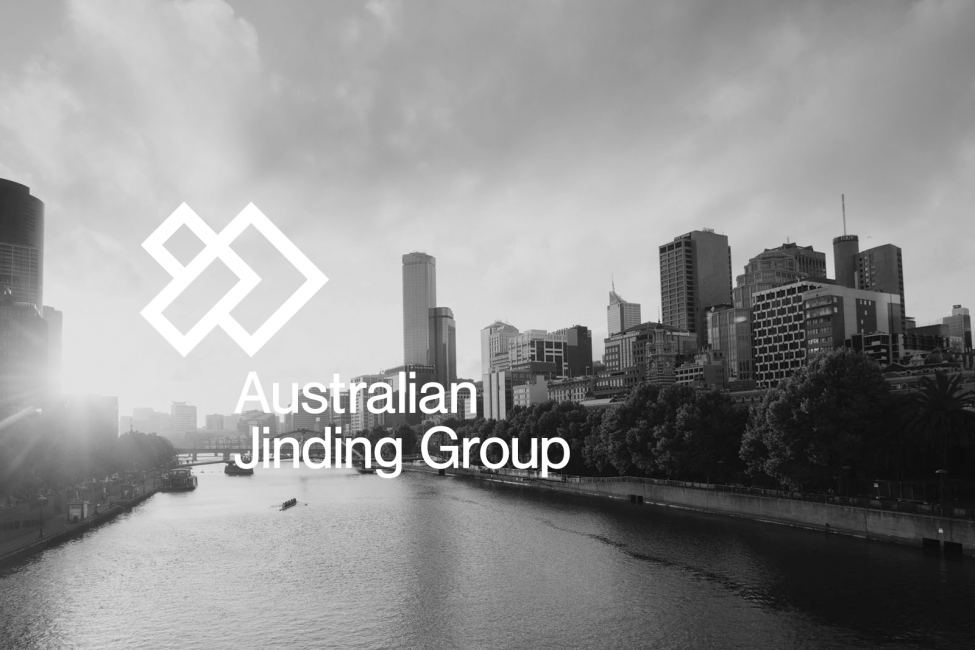
Jinding Australia is an integrated property services company offering three primary services: property development, education and migration. Founded ten years ago, Jinding Group has grown to own 65 branches in China, employing 1600 staff members and servicing more than 23,000 customers worldwide, including a new chapter in Australia.
Due to the company’s growth, including opening a branch in Australia, we assisted the team in growth brand strategies and developed a brand and language for them.
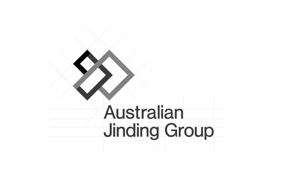
In Chinese, ‘Jinding’ translates to “a lifetime of commitment”, and historically it was a set of nine saucepans used by royalty as a symbol of imperial power. We wanted to harness the rich and powerful heritage of the word, Jinding, and translate it into a meaningful and modern brand.
We began with the brandmark. It denotes interlocking building blocks that make a strong foundation of a building, relevant to both the strength of the business and the industry in which they operate. It celebrates power and commitment as the integral value of the Jinding Group.
The logo comprises three sections representing the company’s three primary services: property development, education and migration.
Within the design, we referenced the number nine—the highest number in ancient Chinese and a nod to the number of vessels used by royalty—and constructed the brandmark using nine distinct lines. Within these lines sits an arrow. This arrow communicates ‘moving forward’ and demonstrates the company’s enthusiasm and drive to grow, including its new venture in Australia.
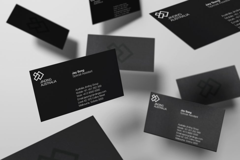
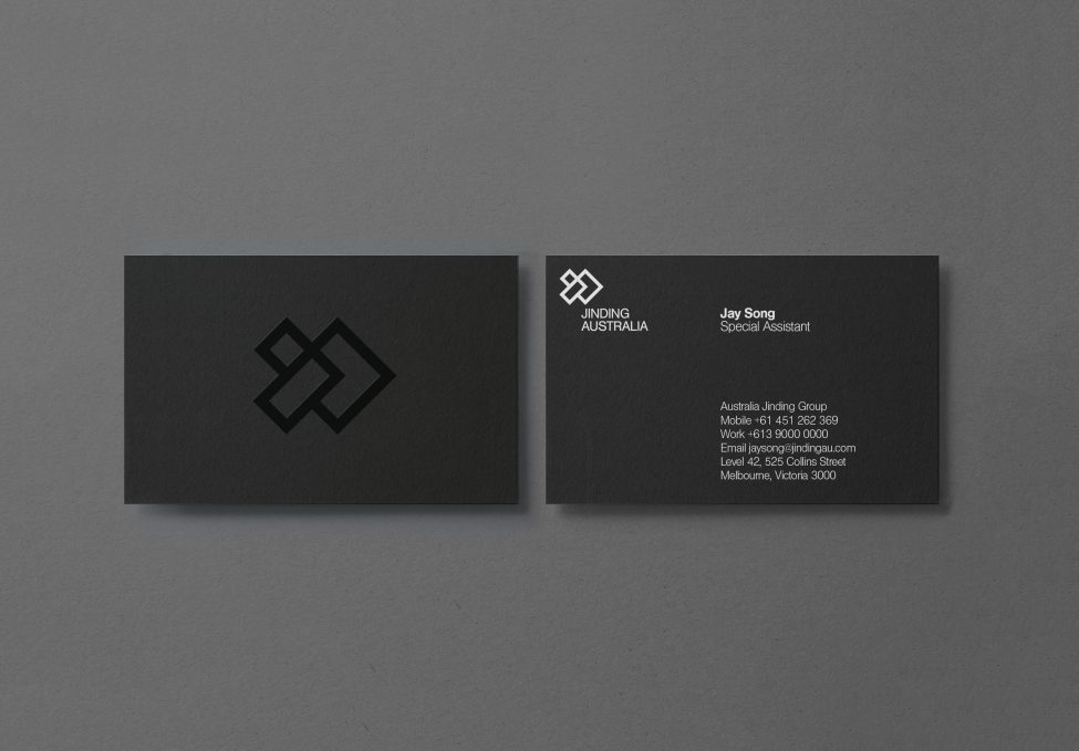
We kept their colour scheme simple using blacks, whites and greys, to denote a more classic and refined tone.
Through thorough research and strategy into the history and values of Jinding Group, the team at Principle Design were able to create a global brand, including signage