We’d love to hear from you.

/
Uptick Branding & Design Development Branding & Marks / Digital Design / Featured / Packaging, Print & Editorial

Uptick’s mission is to simplify and digitise the archaic building compliance network in Australia. Principle Design led the Uptick team through a thorough and collaborative online brand strategy workshop. With this starting point, Principle Design had a clear understanding of the direction the brand was being taken. Uptick were eager to be seen as an industry leader in the fire services sector allowing businesses to bring massive efficiencies into their workflows with their SAAS (software as a service) product. We reinvigorated the brand voice, ensuring we were speaking directly and clearly to the defined target market.
Uptick is Australia’s first cloud-based building compliance network, bringing auditors, fire service providers, property managers and business owners together on one platform. Established in 2014, Uptick has grown to become Australia’s leading compliance network company. They now cover 20 percent of the Australian commercial property market – servicing more than 110,000 buildings in Australia. They are an incredible organisation focusing on easy-to-use asset maintenance software.
We focused our efforts on creating a brand language that was simple and upbeat, representing Uptick as industry leaders to highlight the cutting edge technology that Uptick was bringing to the Australian market.
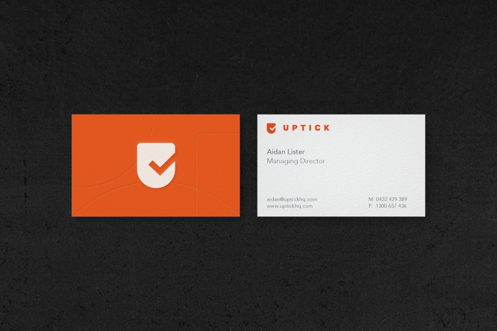
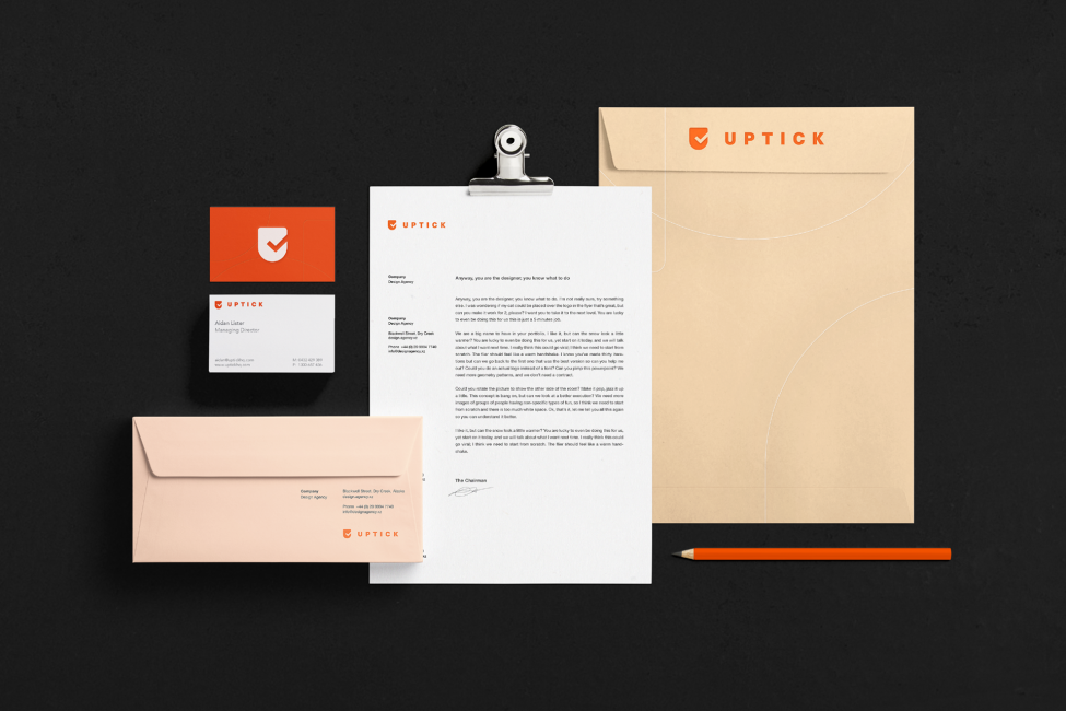
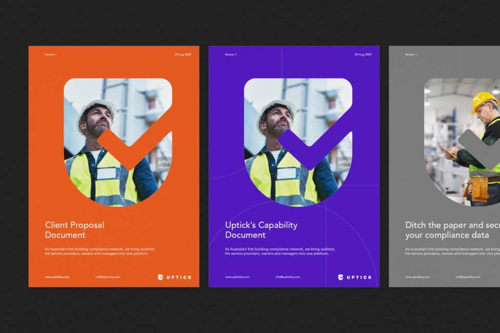
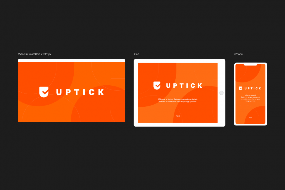
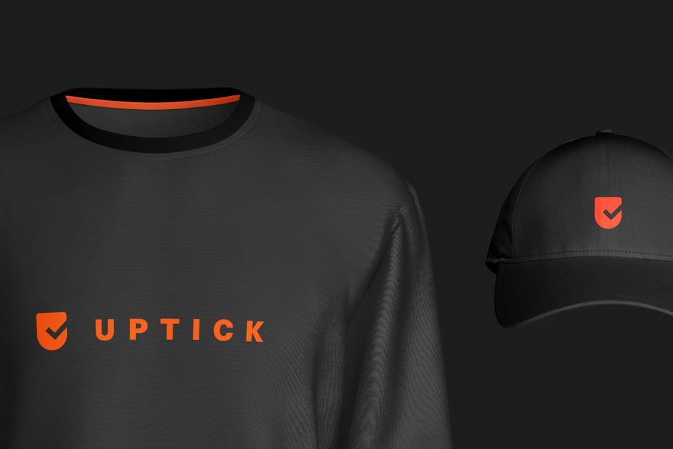
We refreshed Uptick’s brand colours to a warmer palette to convey its position as an industry leader, implying trust and credibility. We simplified their logo to create a minimal and clear message completed by the orange, purple and grey tick. The graphical language symbolised by the tick and shield further support Uptick’s brand identity. This element also provided the jumping-off point for the range of custom illustrations that were developed.
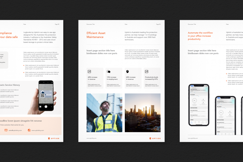
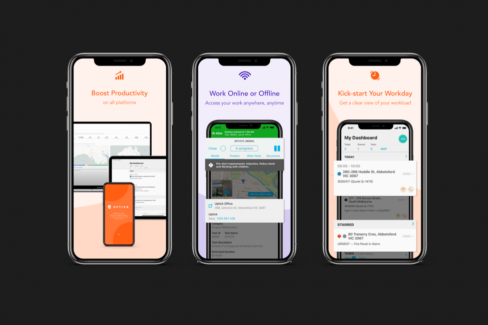
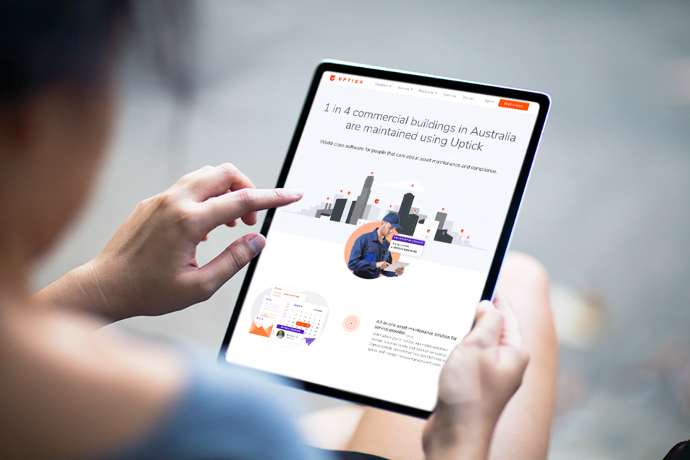
Our branding exercise with the Uptick team also determined the importance of the user experience across their website, which meant simplifying their brand language and offerings for their market to complement their highly reputable brand. Similar to the Uptick logo, we streamlined the website to influence a simple and easy user experience to ensure a sense of hierarchy and evoking a sense of credibility. We incorporated illustrations and animations to describe the sometimes complex workflows.