We’d love to hear from you.

/
Yakikami Brand Name / Branding & Marks / Packaging, Print & Editorial

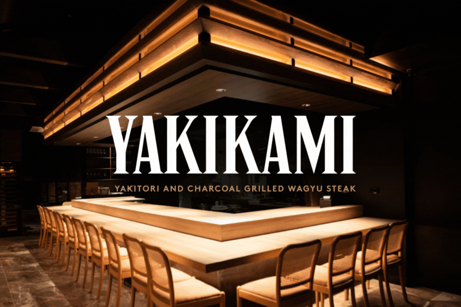
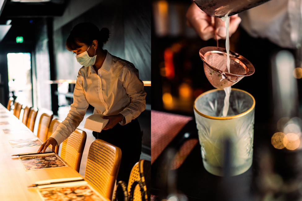
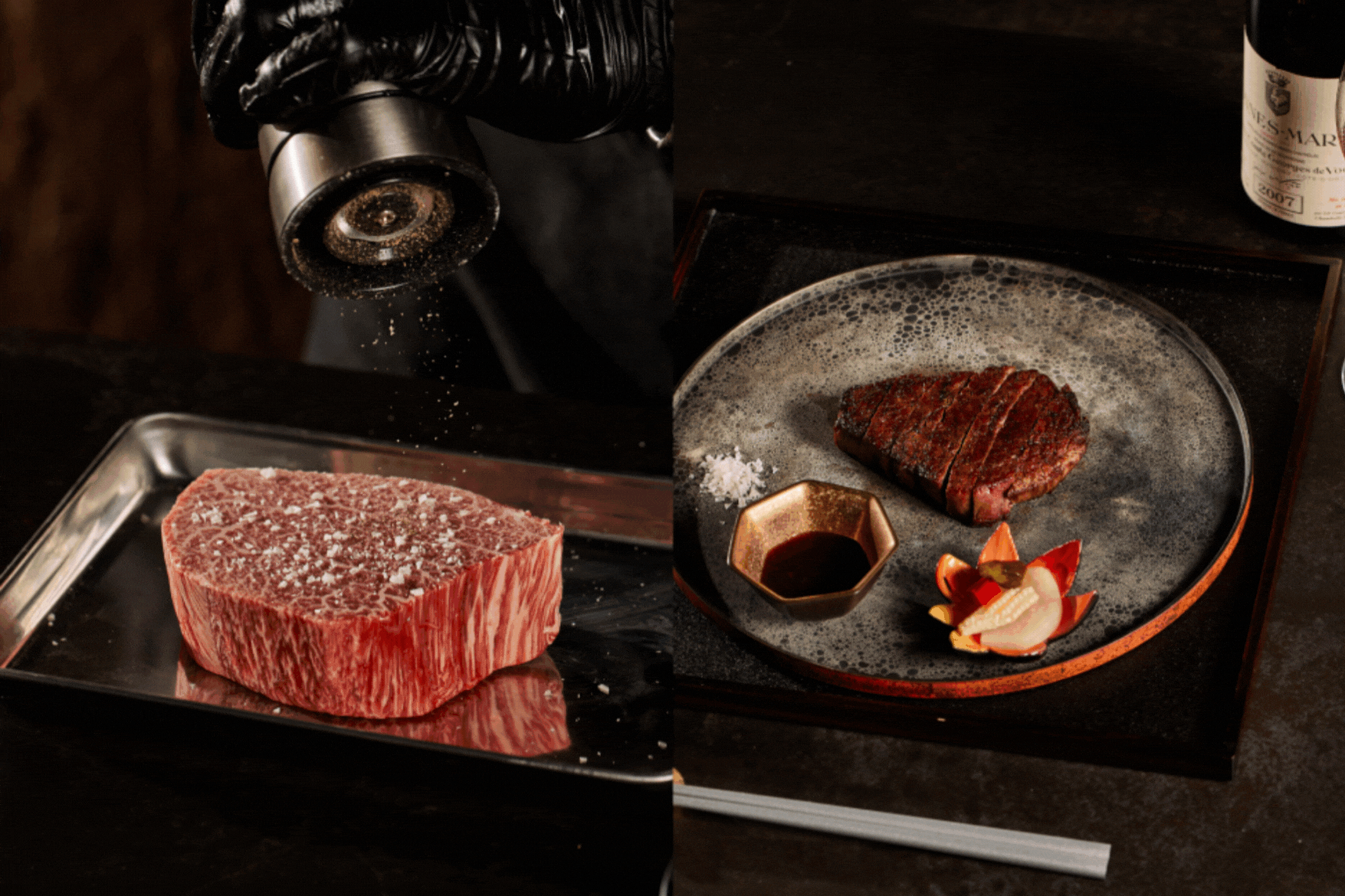
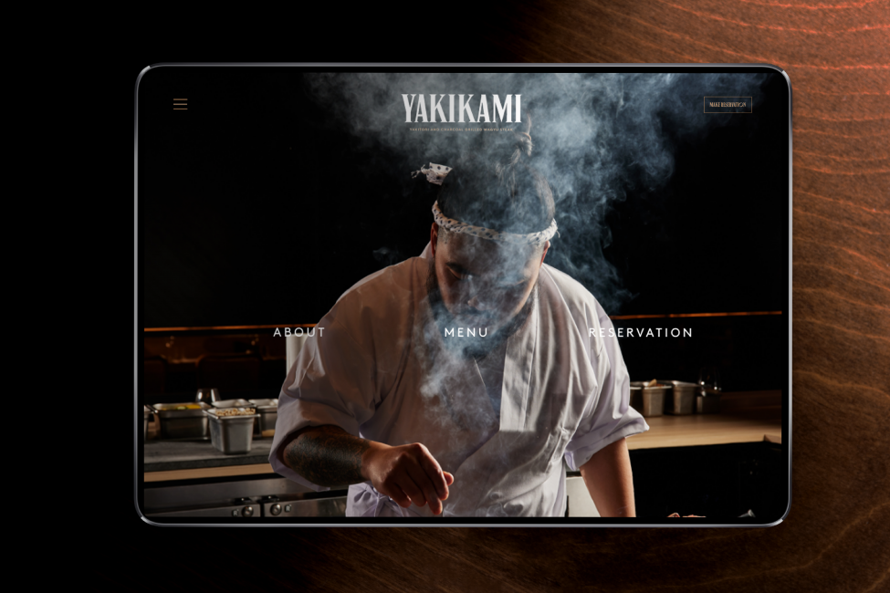
Yakikami is an opulent new wagyu and yakitori grill-house located in the heart of South Yarra. We were approached by fine dining specialist Roy Yu, to visualise and execute a timeless look and feel that denotes elegance and sophistication whilst paying homage to the traditional yakitori cuisine.
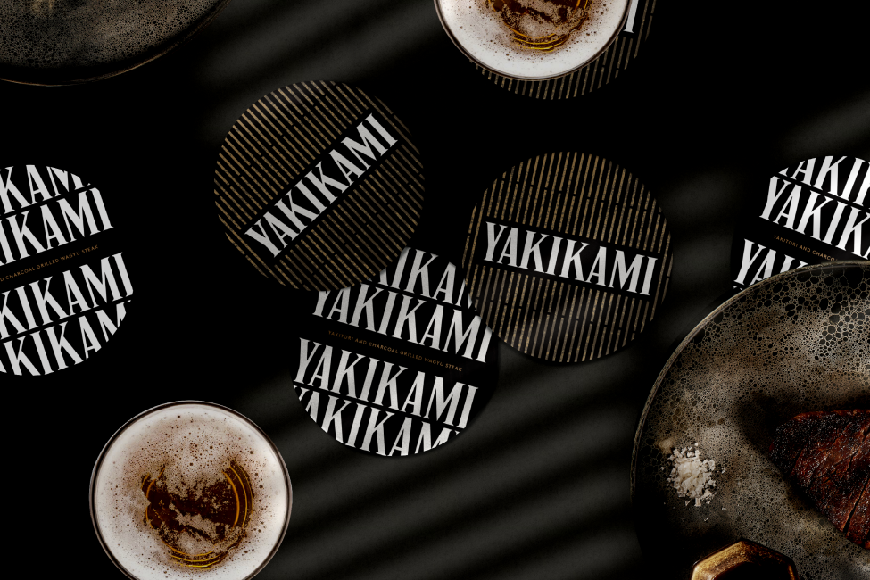
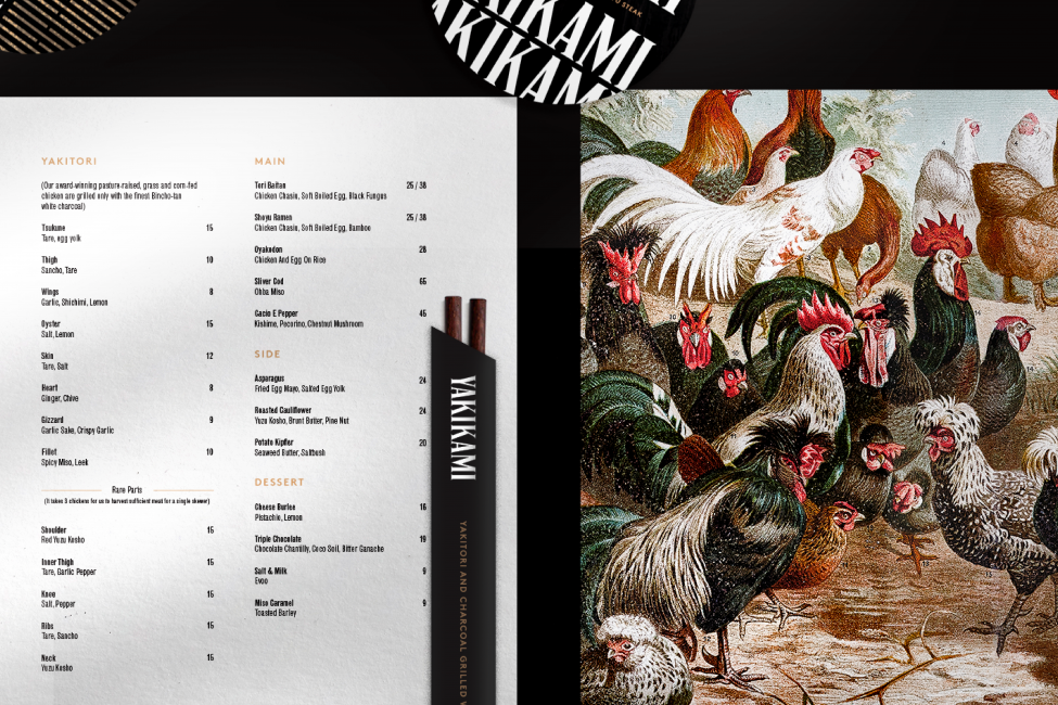
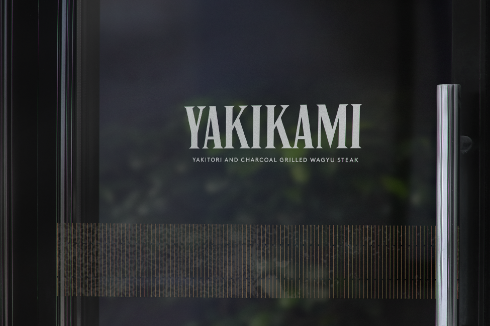
A lavish and moody space, the restaurant was a core reference point throughout our design process, resembled on varying scales across all graphical outcomes. Wearing the brand name is a bold sans-serif typeface that forms an identifiable logo marque to carry Yakikami through years of excellent service. Plastered across menus, coasters, and many other tangible items, it was critical for this logo to jump off the page in its boldness and confidence.
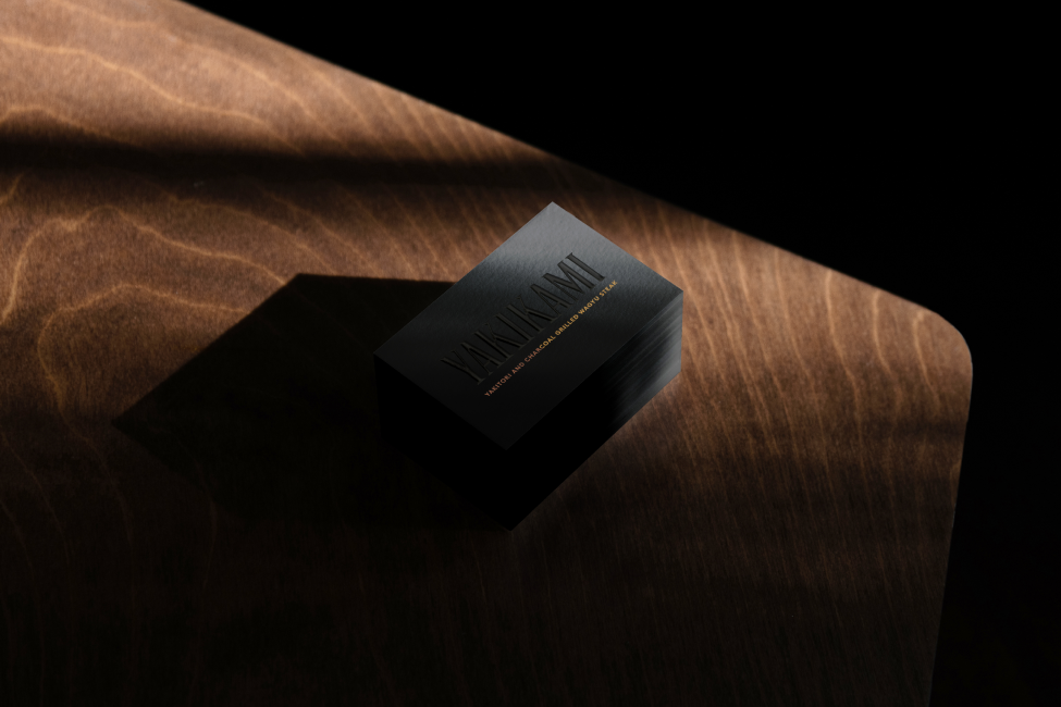
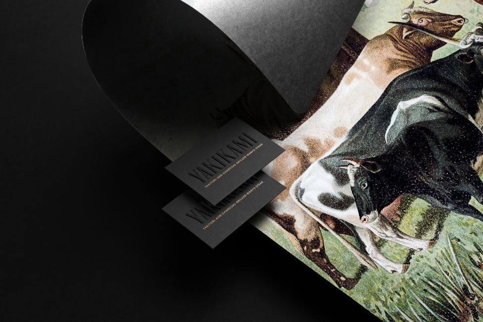
Conspicuous of the Yaki-tori cooking method, the secondary brand language draws inspiration from the smokey texture and fiery grill that forms the basis of this specific Japanese cuisine. The distinct grill-like pattern brings balance to the brand’s simplicity and creates a sense of unity between all collateral items, including menus, placemats, chopsticks, coasters, and business cards.