We’d love to hear from you.
/
Yeosin Restaurant Branding & Marks / Packaging / Wayfinding & Signage
Yeosin Asian BBQ restaurant embraces the rich food cultures of South Korea and Japan, drawing its influence from Seoul Kitchen BBQ restaurant.
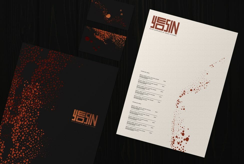
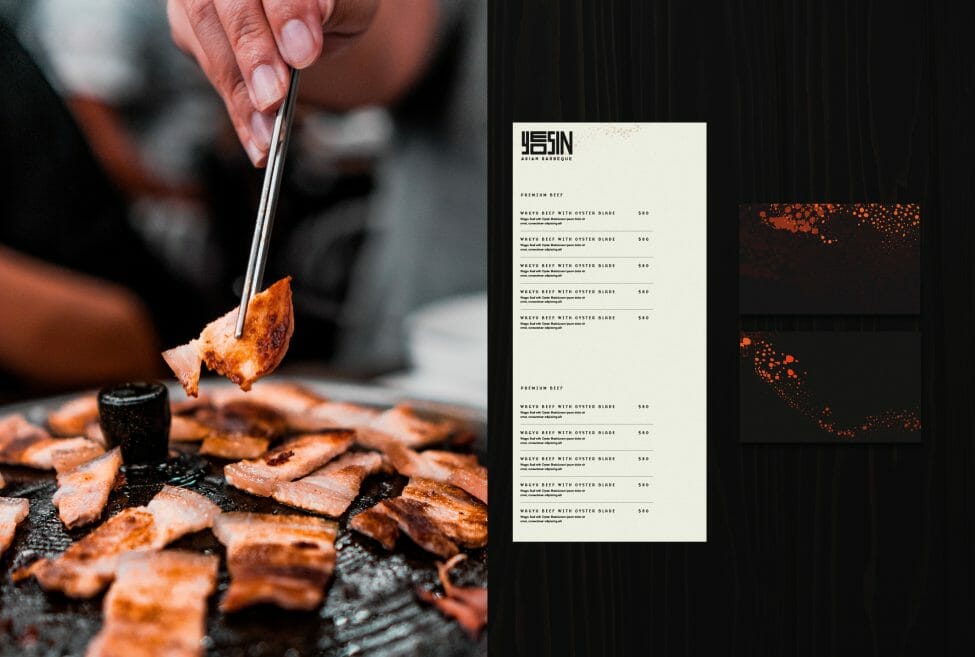
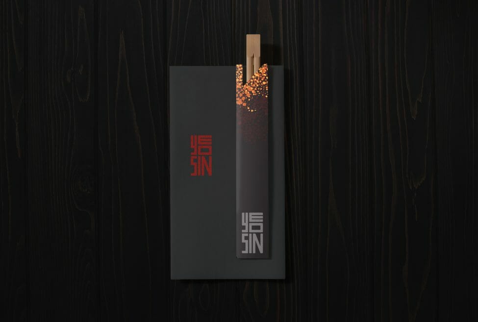
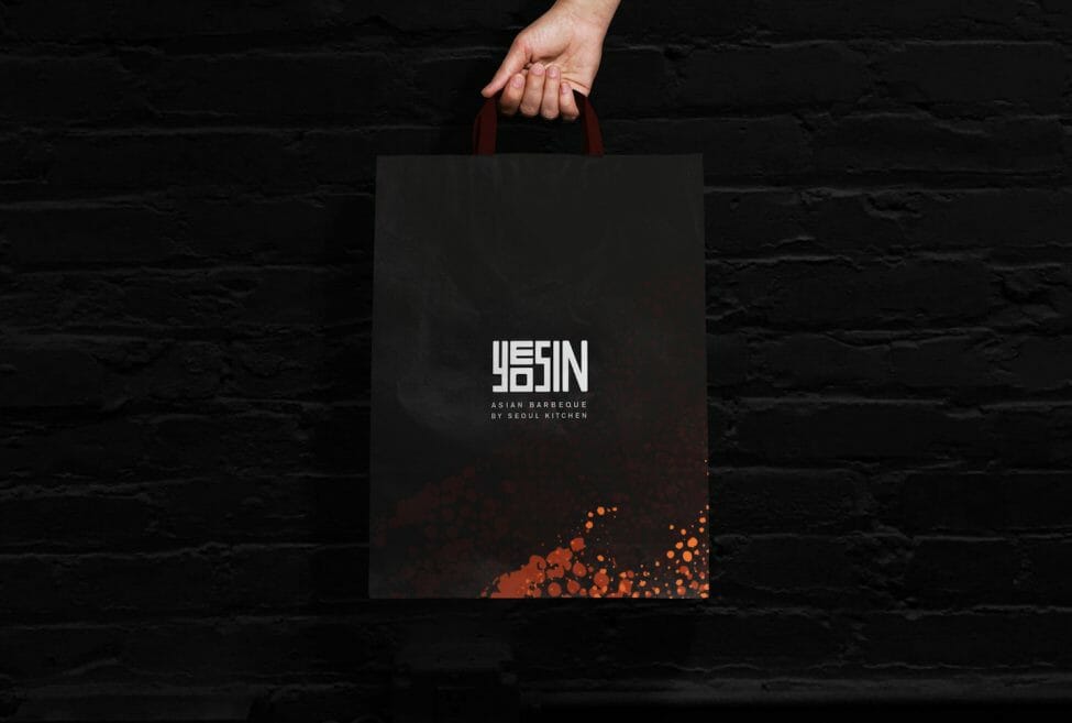
When creating a brand identity for Yeosin, we wanted to represent a contemporary Korean BBQ experience. The dynamism and elegant colour palette of hot burning embers became the focus of our inspiration — to highlight the sense of excitement that comes from cooking with fire.
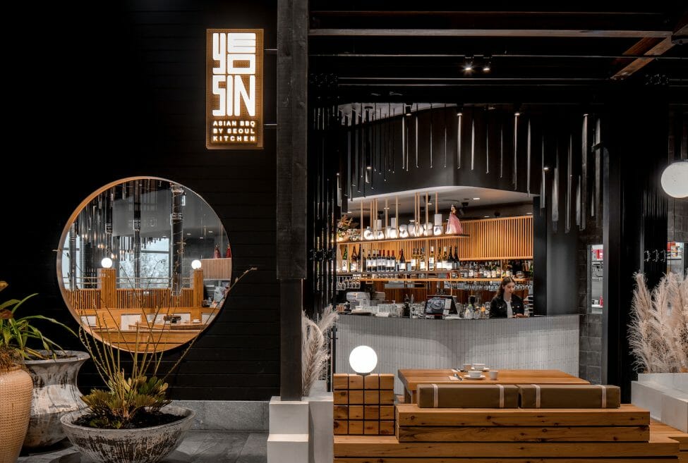
The client wanted a unique fine dining experience, but the space was within the confines of a shopping mall. This unique location would require a deeper level of immersion for diners than a stand-alone restaurant space to block out the clutter from outside shoppers.
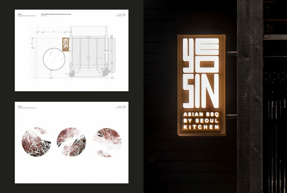
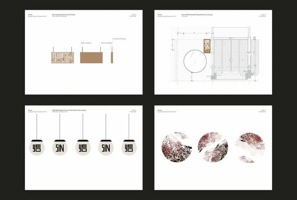
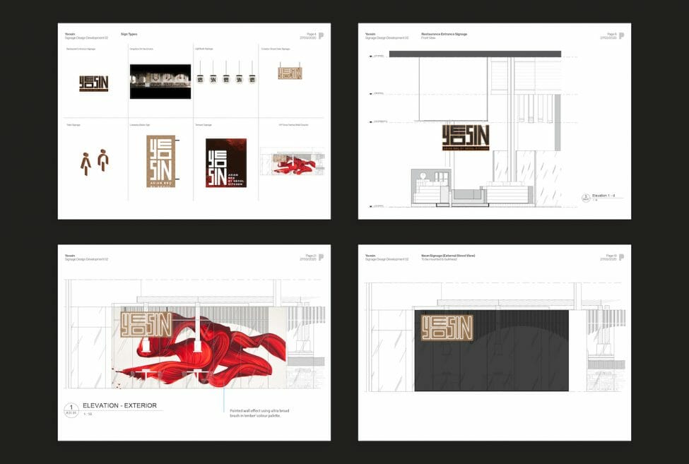
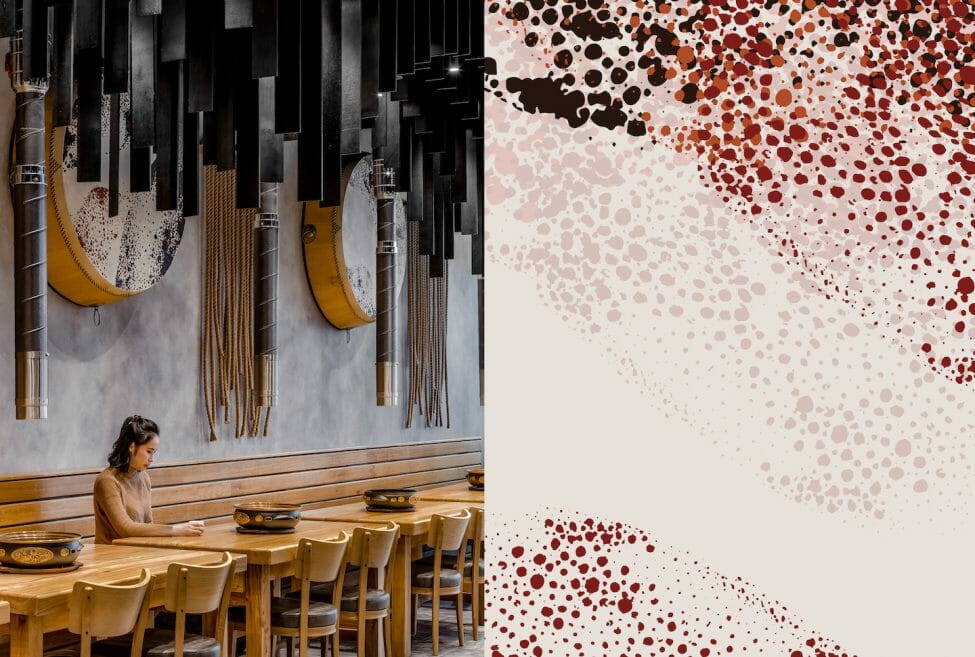
It was essential to maintain the Korean BBQ theme. We carried this across to the restaurant name, Yeosin, which means ’embers’ in Korean. In collaboration with Architects EAT, hanging charred timber planks were incorporated throughout the restaurant to add a visceral element to our ember theme on the branding and collateral. We also included charred details on the signage.
To tie in with the cuisine’s Korean origins, we integrated traditional Korean “buk” (drum) elements onto the walls, the skins proudly displaying the ember brand design. We also collaborated with an artist to paint larger-than-life gestural brushstrokes as part of a feature wall, evoking a freeing sense of movement and alluding to Korean calligraphy.
The project was a success, thanks in part to thoughtful strategy. We talked in detail with the business owner, chef and Architects EAT about their vision for the restaurant and made sure there was an alignment with our own ideas. We also took into consideration that the restaurant was in a shopping centre, as this attracts a different type of customer while staying true to the fine dining elements of the brief. We ensured this strategy remained at the forefront throughout the whole design process.
