We’d love to hear from you.
/
Anton RockStud Collection Branding & Marks / Packaging, Print & Editorial
As an established brand and key player in the premium quality jewellery industry, Anton is a Melbourne founded jewellery house with a long history. Inspired by the natural beauty of extraordinary diamonds and gemstones, the luxury brand specialises in diamonds that bring their customers affordable luxury through captivating pieces. They are renowned for their premium European design and high quality pieces.
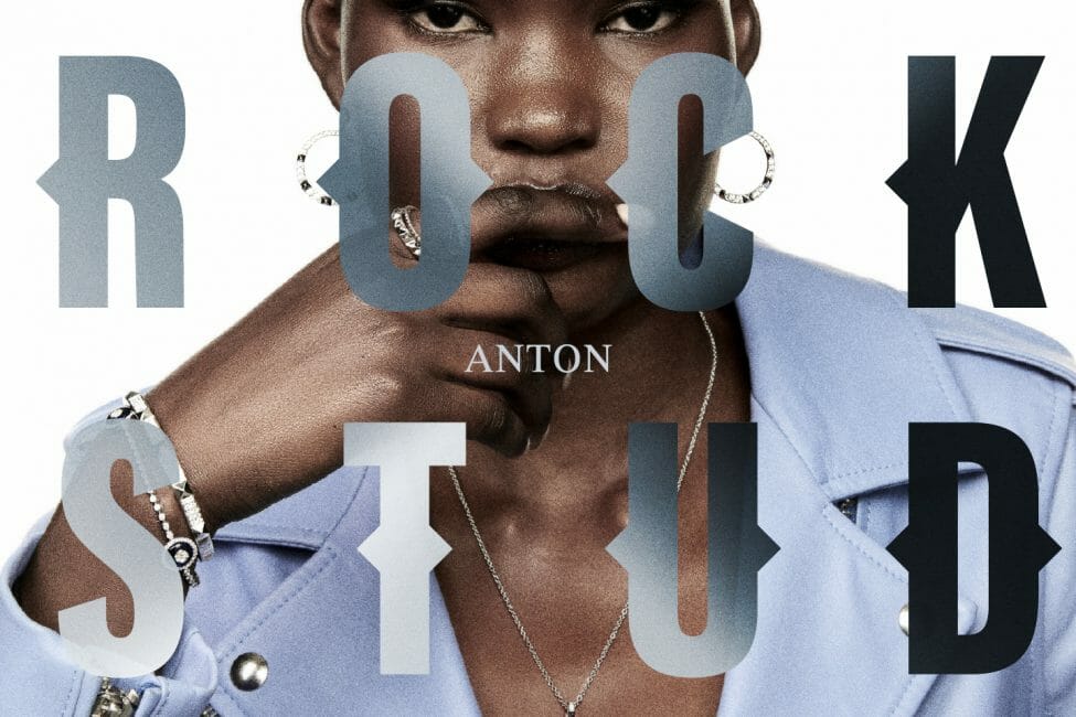
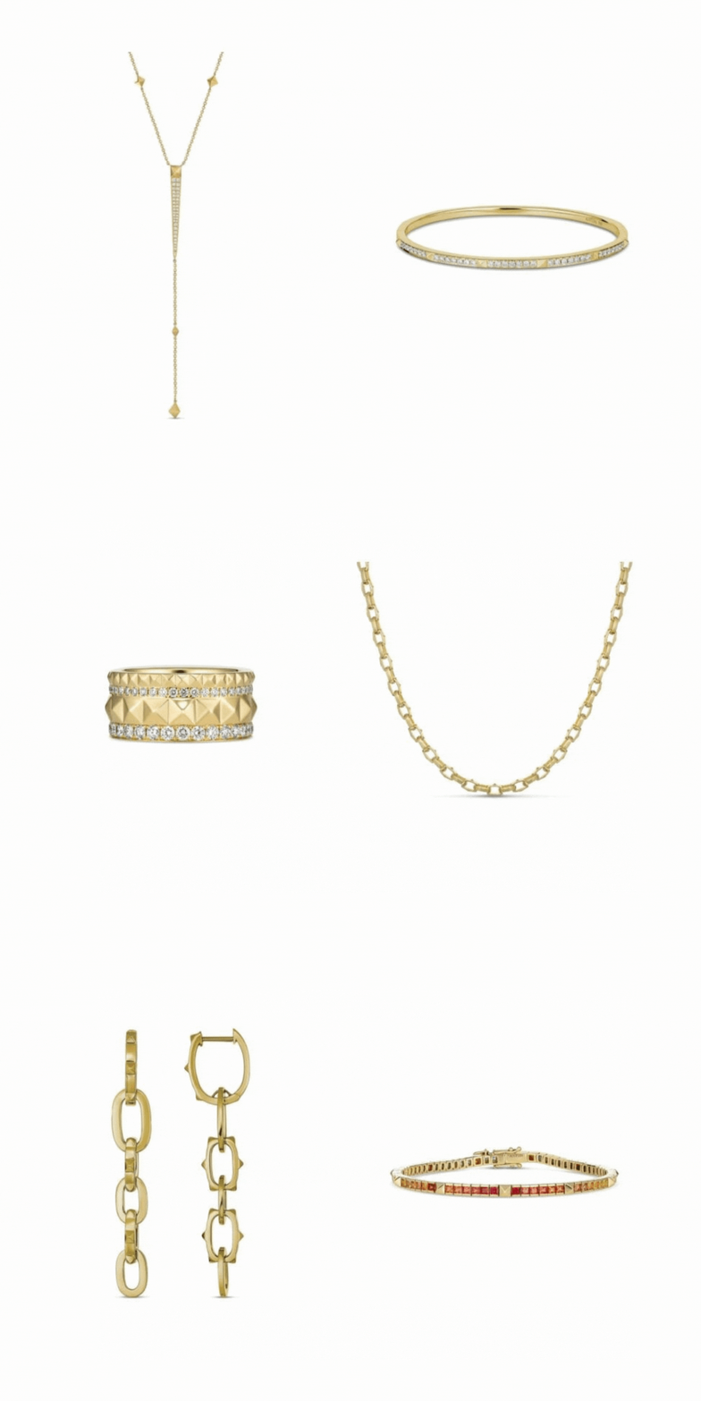
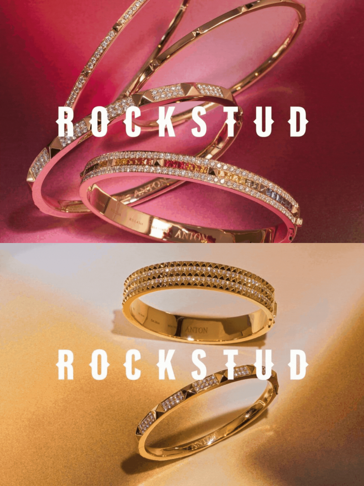
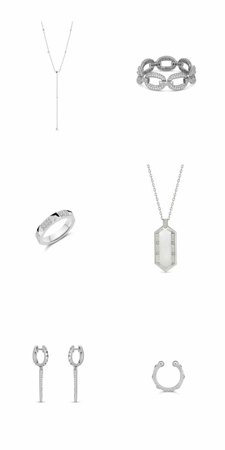
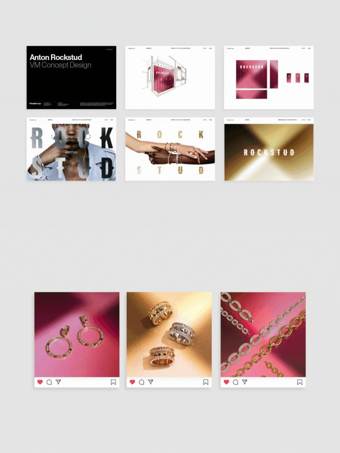
Anton approached us in the early stages of developing their new range, the RockStud Collection. With approximately 30 new styles, the collection’s motif was to bring edge to everyday life through the geometric shapes, sleek lines, and precious metals.
Drawing on established typography of high fashion and jewellery brands, and inspired by the angular forms of the jewellery studs, our designs were focused towards a sharp serif typeface and combined graphic mark. The extended language utilised angular gradients inspired by the refraction of light off the studs. Being a noticeable and iconic collection, there was emphasis on the story behind the collection – one that was not tied to a specific style, it can be anything – something that introduced a bold and striking homage to high fashion.
