We’d love to hear from you.
/
Labour Solutions Australia Branding & Marks
Labour Solutions Australia (LSA) is a national workforce management group, providing labour hire and outsourced employment solutions. Their industry-leading workforce management services focus on innovation and customer-centric solutions.
The company approached us to refresh their brand and refine their brand architecture. They wanted to build on the recognition of their current identity while also resonating more evenly across their multi-sector demographic.
We applied our extensive knowledge in brand architecture to create a cohesive brand family for Labour Solutions.
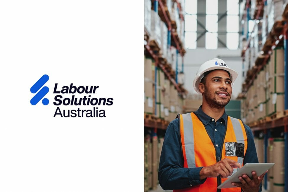
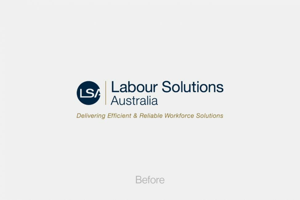
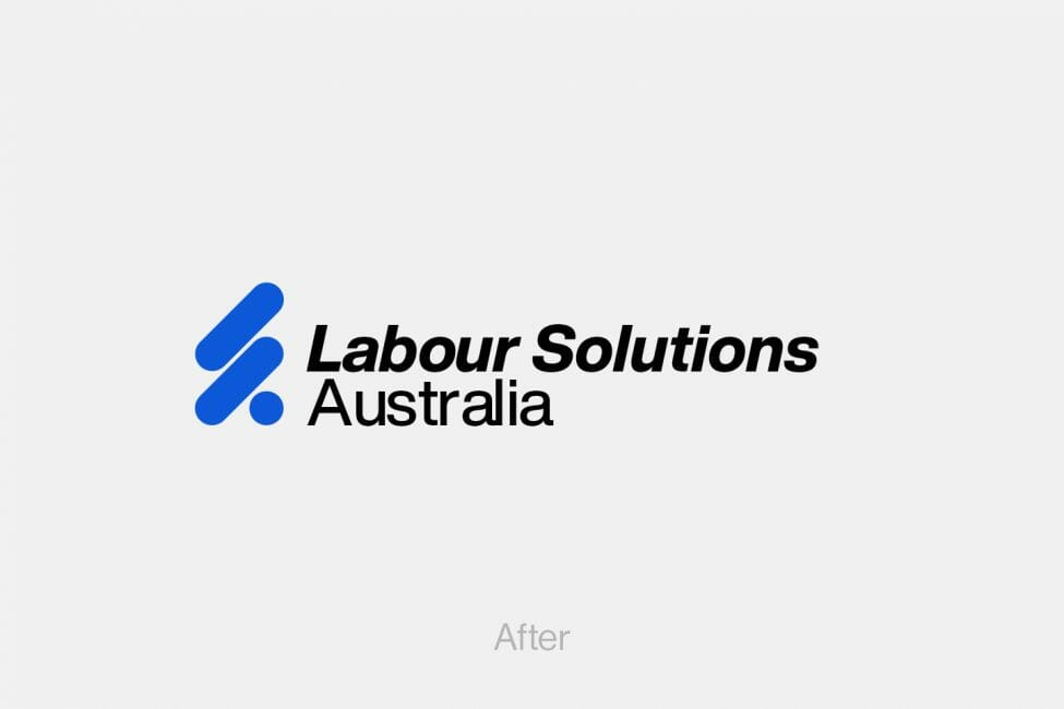
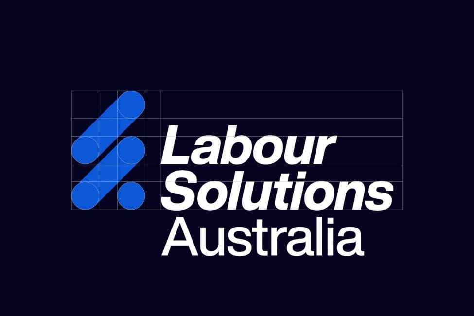
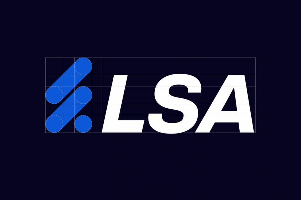
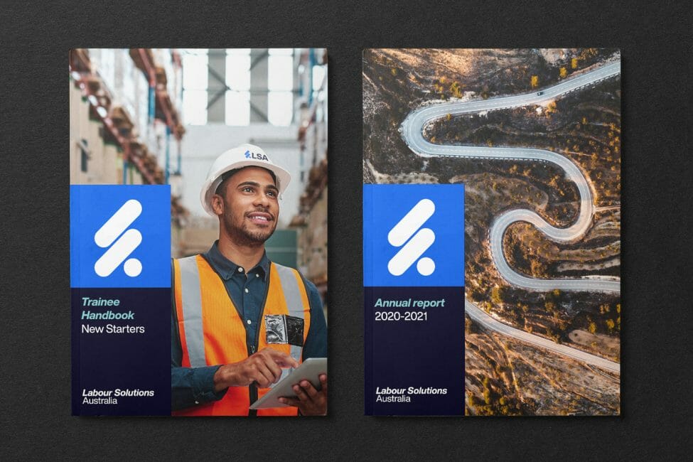
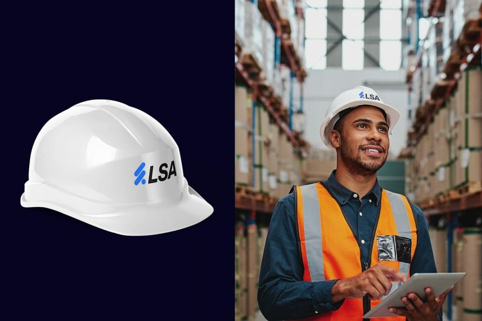
With a clear strategy on how to relieve Labour Solution’s pressure points, we were able to create a fresh and memorable logo that was also versatile so as to appeal to all their different sectors. Ensuring the typeface remained recognisable to the existing brand, we focused on revamping the old circular logo. We extended the circle out, resulting in two forward momentum lines stacked on top of each other. These bold lines signify LSA’s innovation and forward-thinking.
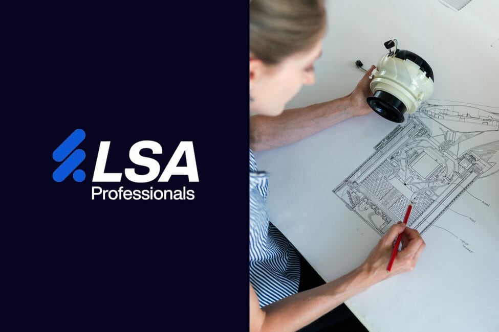
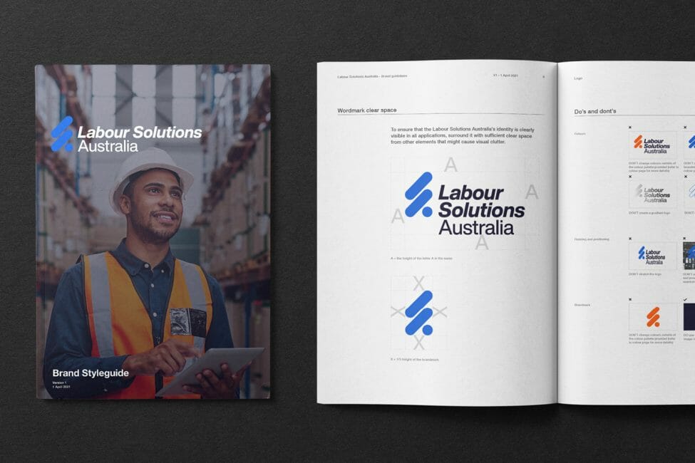
We applied the updated branding consistently across both parent (Labour Solutions Australia) and children brands (LSA Health and LSA Professional Services) to create a united front, using the branded house methodology.
Labour Solution’s pre-existing navy blue colour palette was authoritative and trustworthy, which was a good place for us to start. We wanted to build on this current hue to help LSA stand out amongst their competitors. We did this by adding a more vibrant blue to the mix, helping to modernise the brand and establish it as future-focused.
Through strategic design, we helped establish Labour Solutions as a go-to solution for Australian businesses seeking innovative, efficient, and cohesive labour solution services.
