We’d love to hear from you.

/
Chiki Chan Restaurant Brand Strategy / Brand Naming / Brand & Logo Design / Digital Design / Print & Editorial / Signage
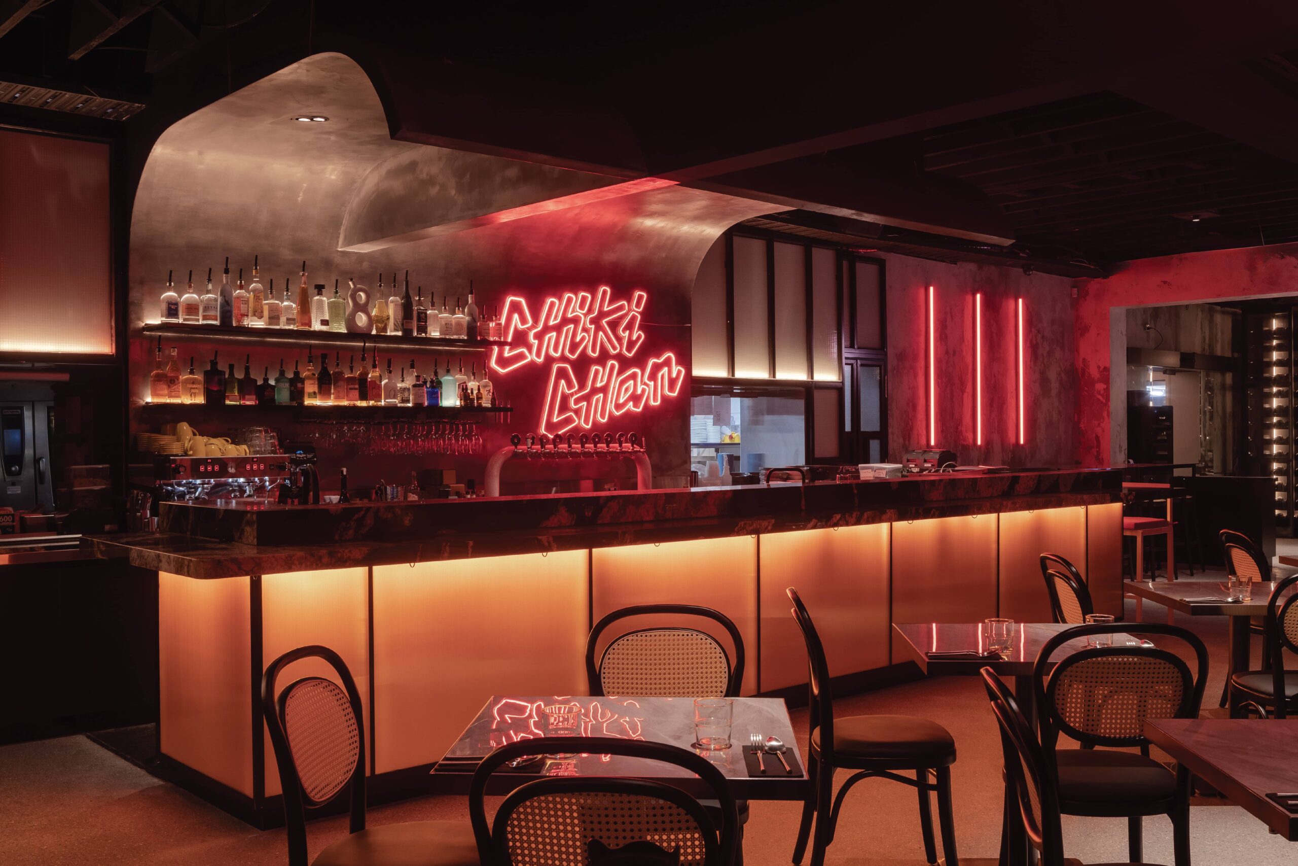
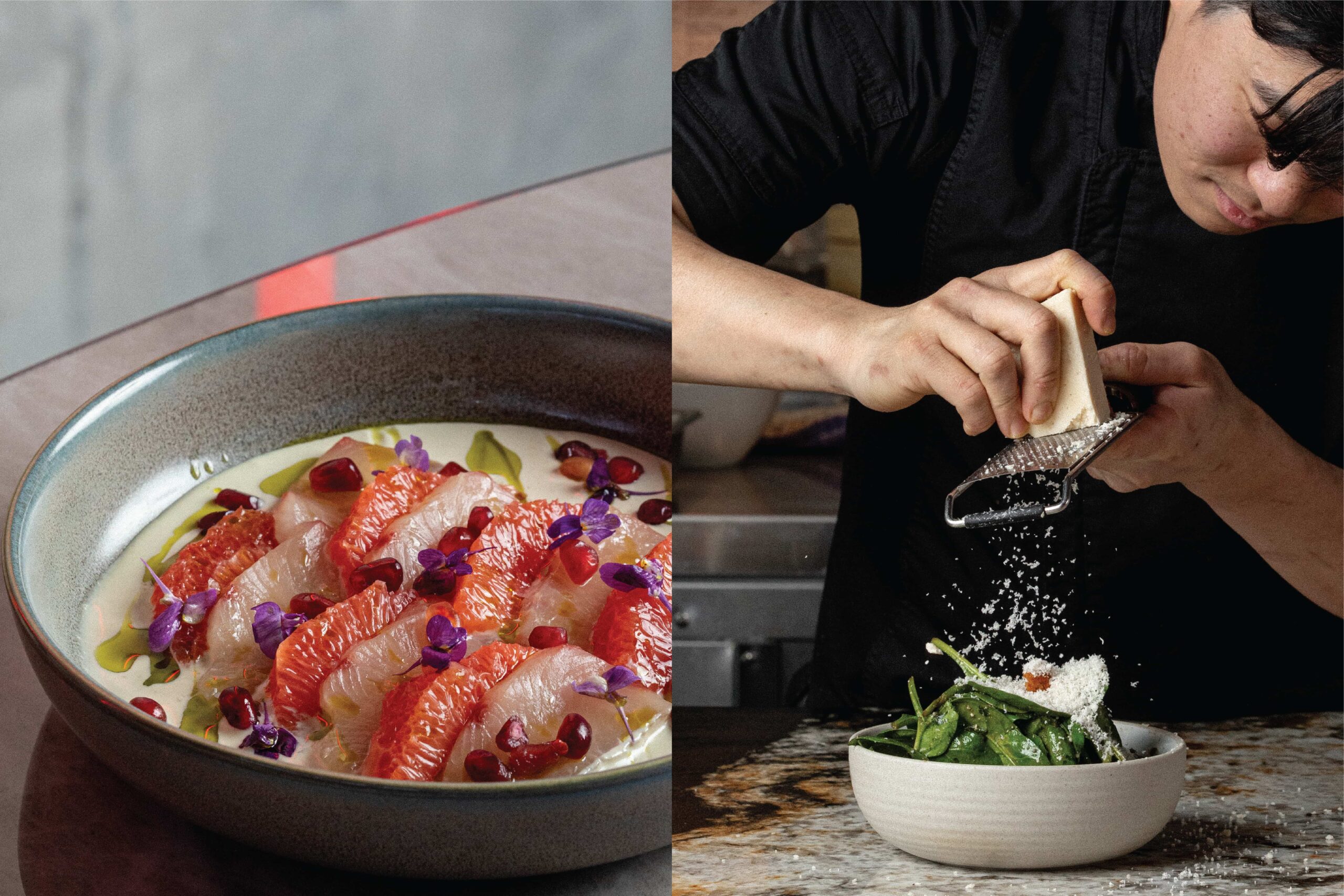
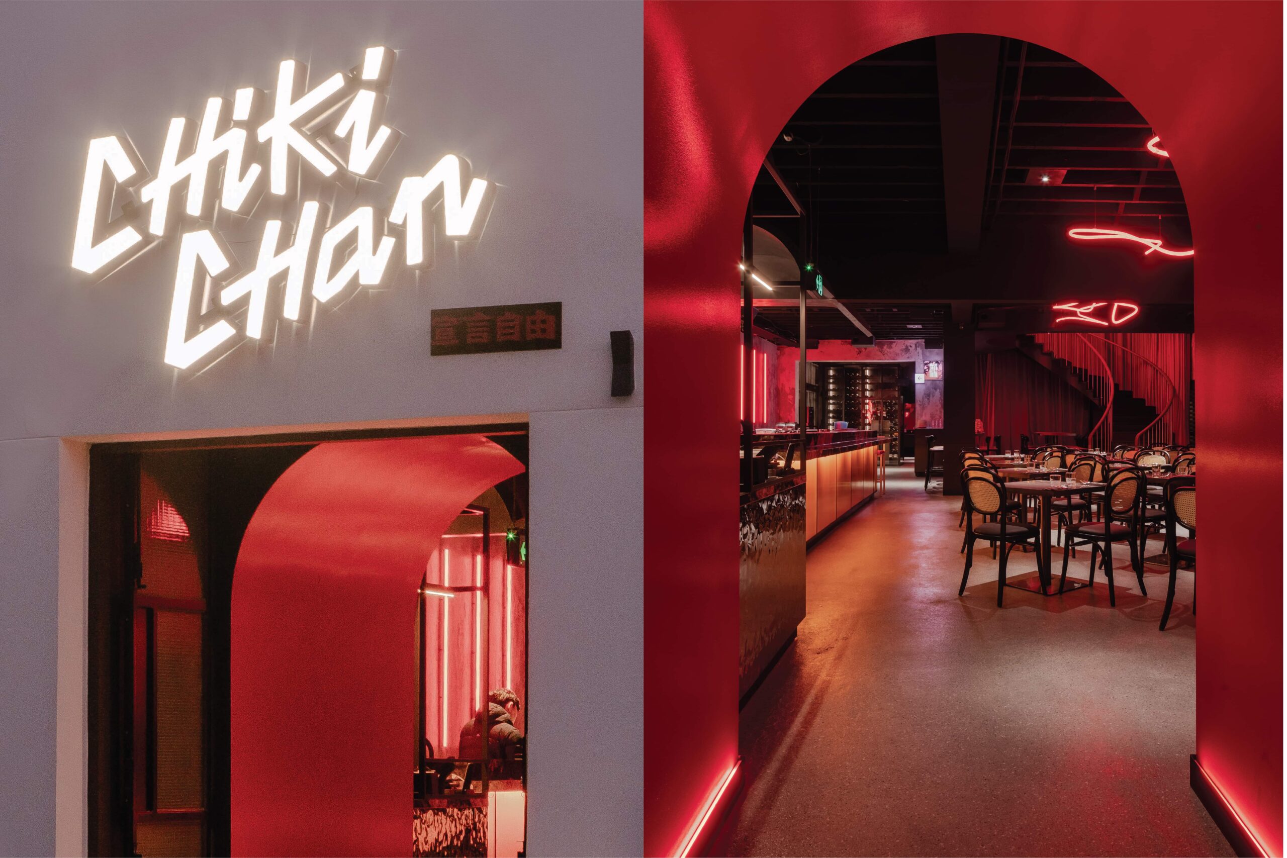
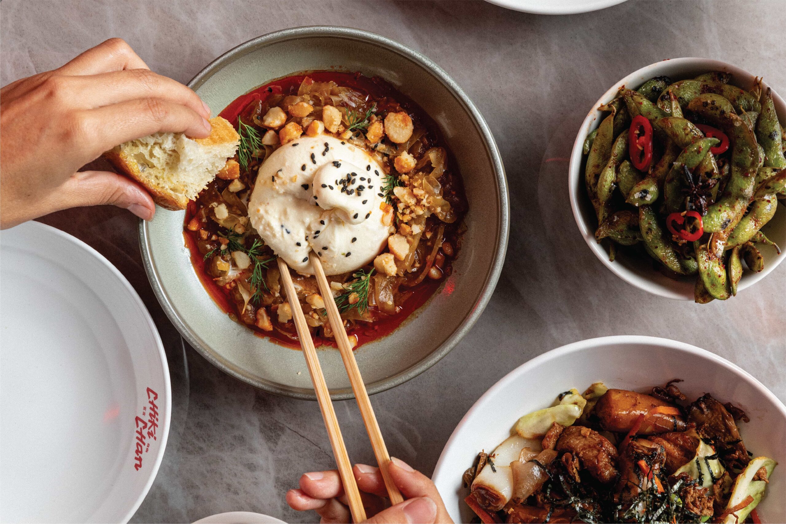
Inspired by the energy of Asian street food culture, Chiki Chan is a bold and playful fusion restaurant that brings together flavours, traditions and mischief in equal measure. Located in the heart of Melbourne’s inner north, it’s a place where fiery dishes meet neon lights and where nothing is taken too seriously, except the food.
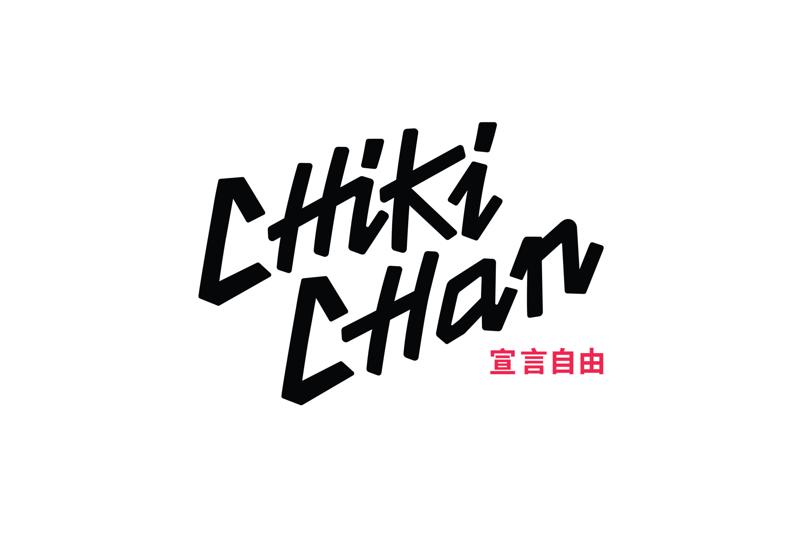
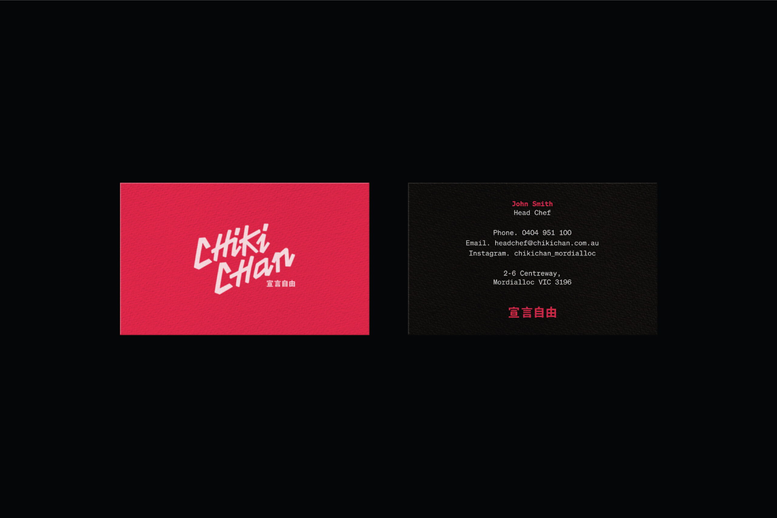
We partnered with the team from the beginning, developing a name that captured the brand’s cheeky personality and nod to its Asian roots. ‘Chiki Chan’ blends charm with a wink, a name that’s fun to say, easy to remember, and sets the tone for everything that follows.
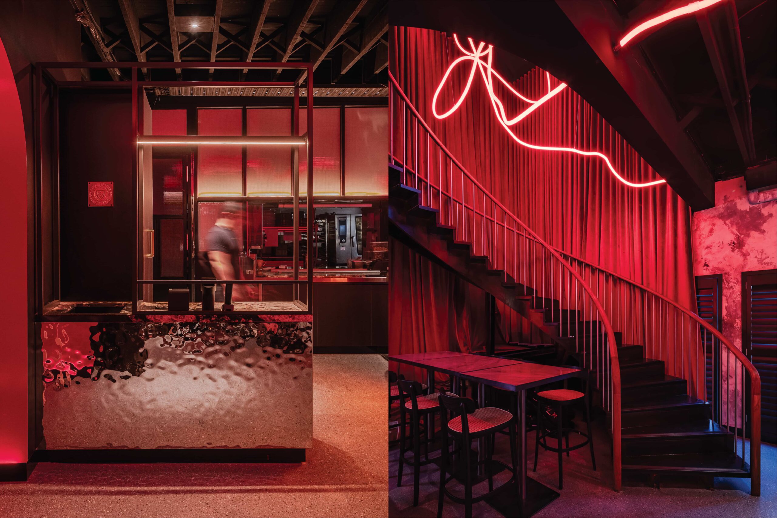
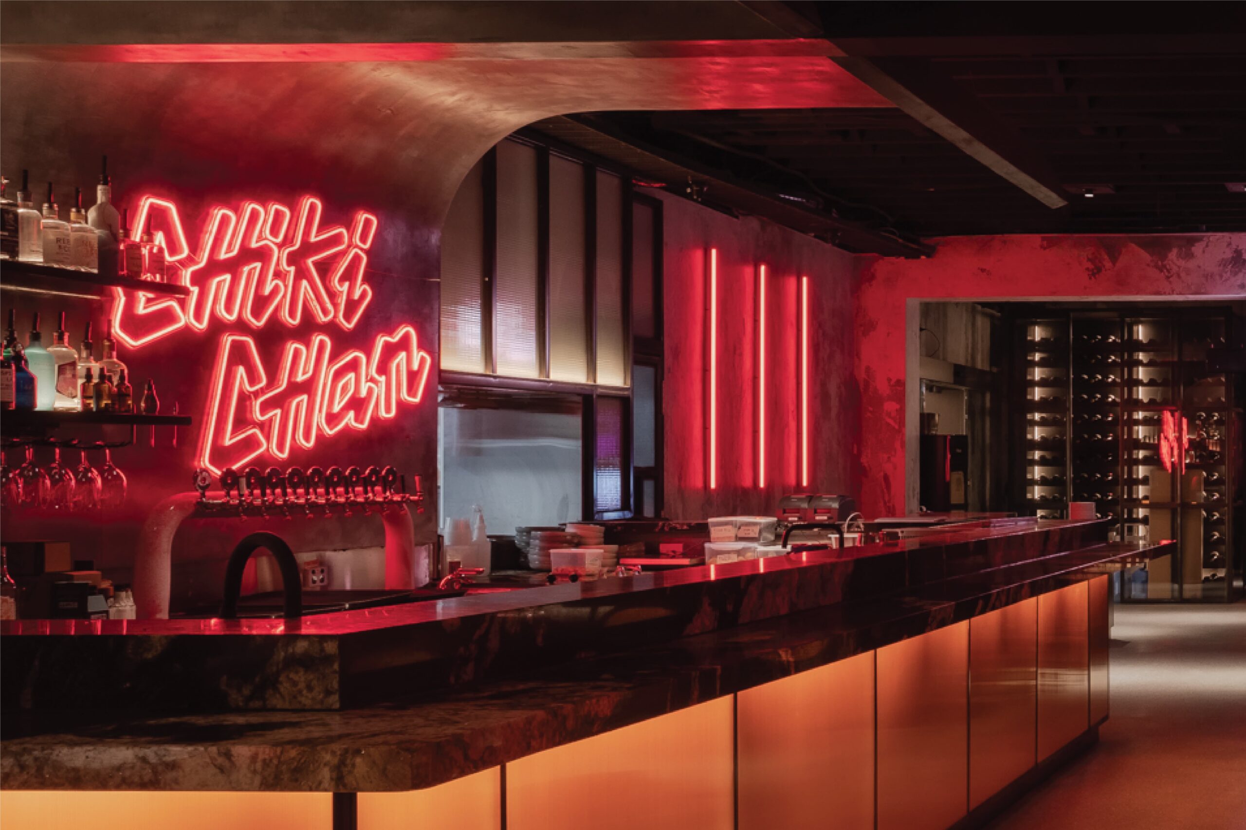
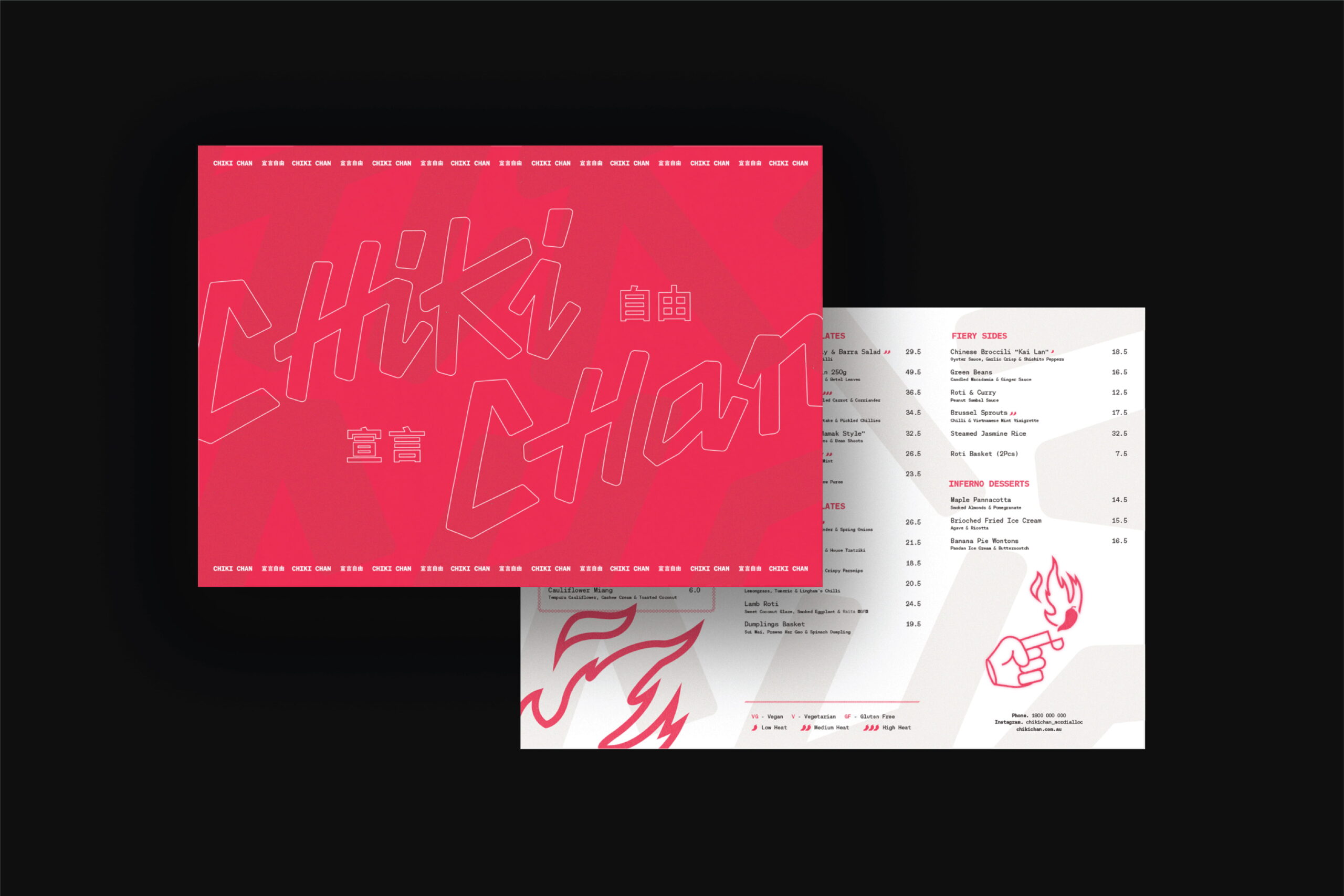
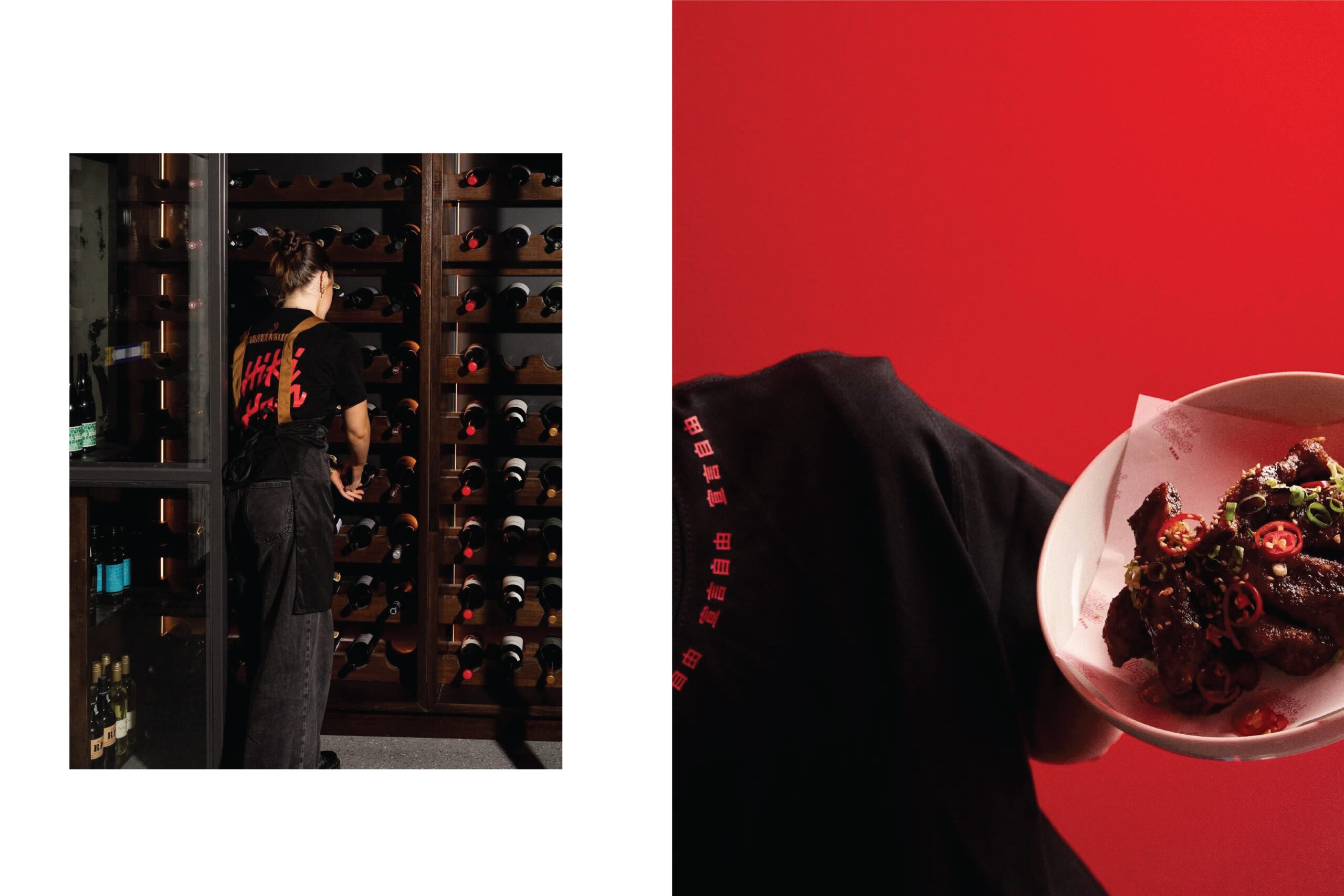
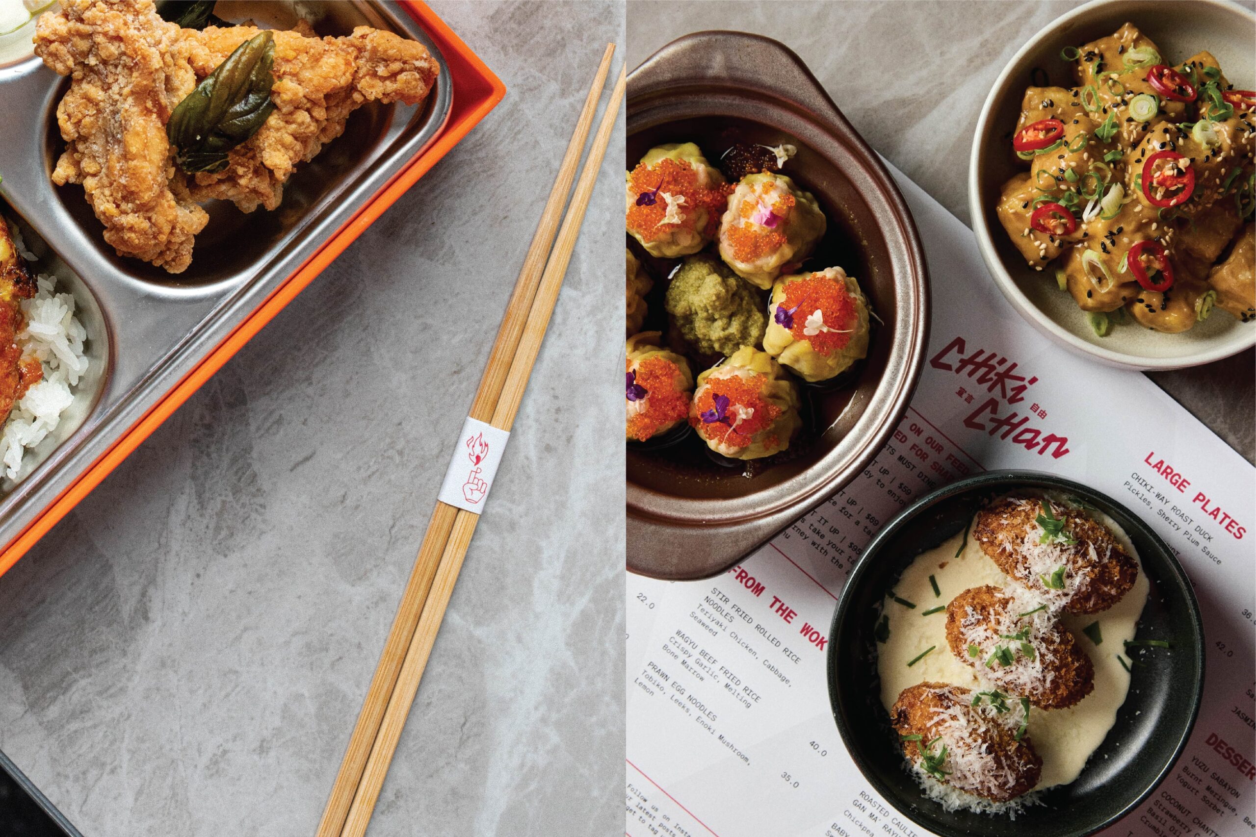
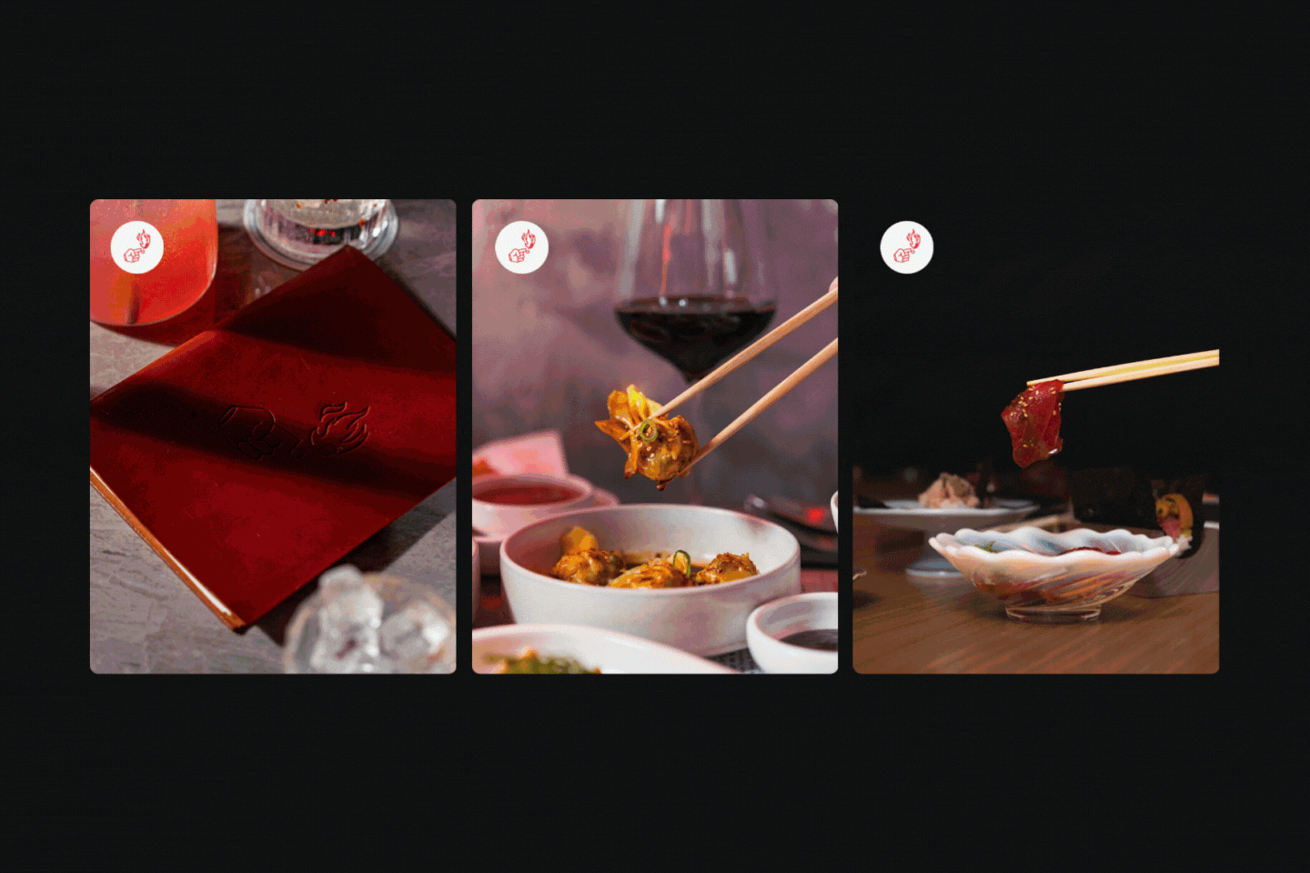
From there, we created a full brand strategy and identity system, supported by signage, uniforms, collateral, editorial and digital design. The visual language draws inspiration from the vibrancy of Asian street life, think red neon, back-alley heat and the organised chaos of a night market. The result is layered, spicy and full of attitude.
At the heart of the identity sits the Fire Finger, a graphic icon that brings flavour to life. Part flame, part gesture, it embodies the heat, the cheek and the signature dishes that define the Chiki Chan experience.
Every touchpoint, from menus to murals, was designed to feel immersive, expressive and unafraid. The result is a hospitality brand that balances street culture with substance, turning up the volume while never missing a beat.