We’d love to hear from you.

/
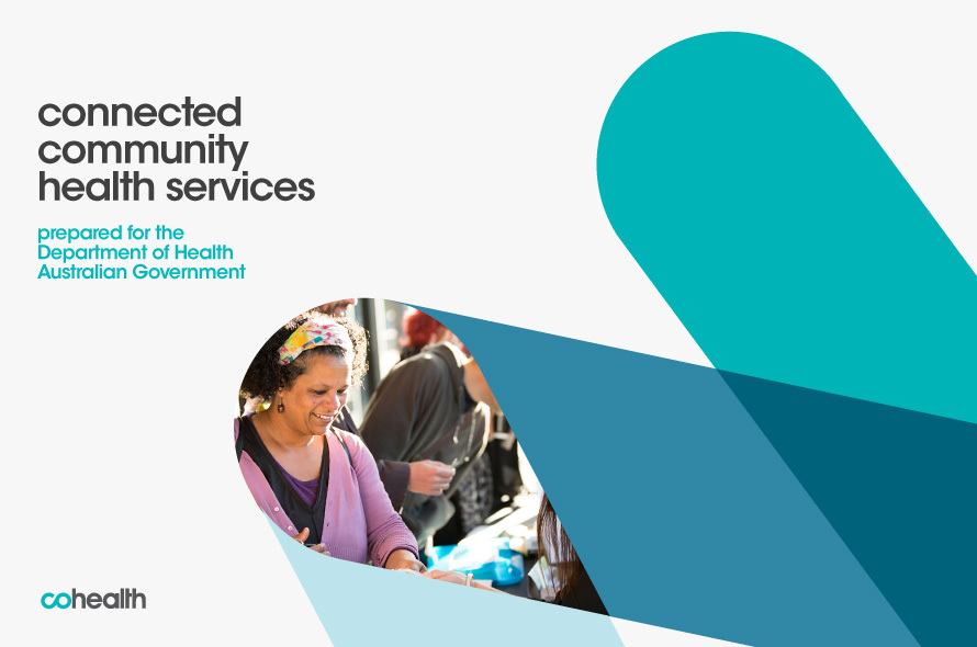
cohealth Brand Identity / Print Design
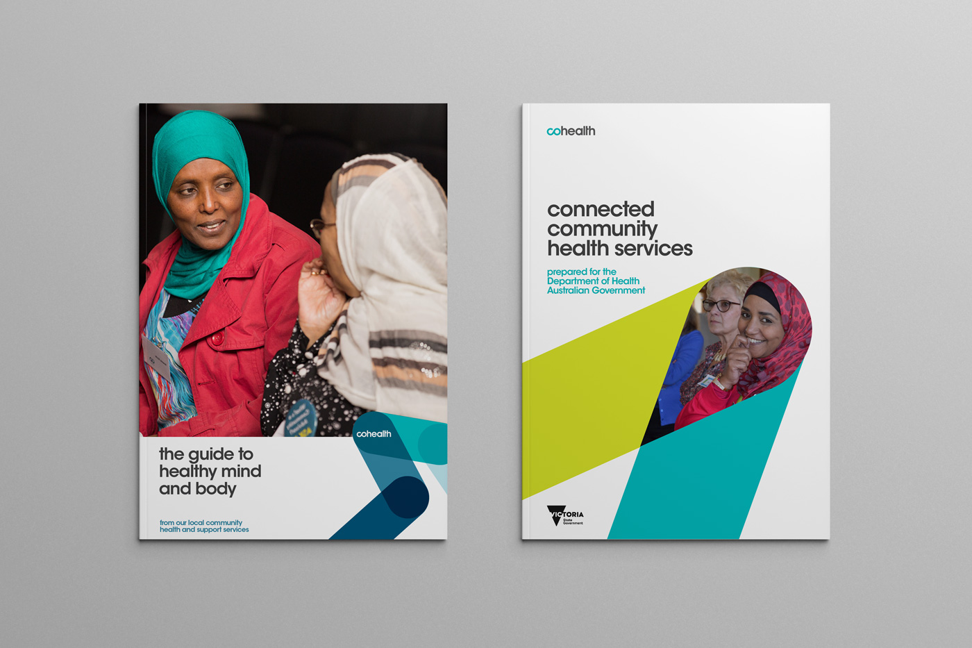
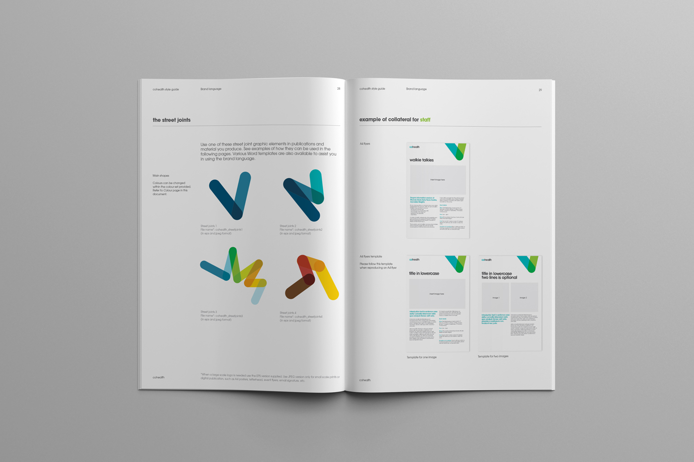
Australia’s largest community healthcare organisation, cohealth, engaged us to evolve their brand language to better represent the vital role it plays in creating healthy communities and healthy people. The brand story celebrates cohealth’s history, diversity of users and the exceptional service that they provide. With a significant focus on community our visual language introduced ‘the streets’ as a motif that represents connection within the community. We evolved this motif into a flexible brand system of visual devices, arriving at a dictionary of shapes and series of icons to represent the services provided.
As vaccinations became mandatory across Victoria, many disadvantaged communities were left uncertain about their eligibility and access. Cohealth stepped in with a mission: to reduce health inequity by providing clear, accessible information and delivering vaccination hubs to those who needed them most.
Working alongside Cohealth brought us closer to the issue. It reminded us that there’s no single solution, and creating real change takes a collective, community-driven effort. We’re proud to have played a small part in supporting that mission.