We’d love to hear from you.
/
Nori Maki Omakase Restaurant Brand Strategy / Brand Identity / Print Design / Digital Design / Signage
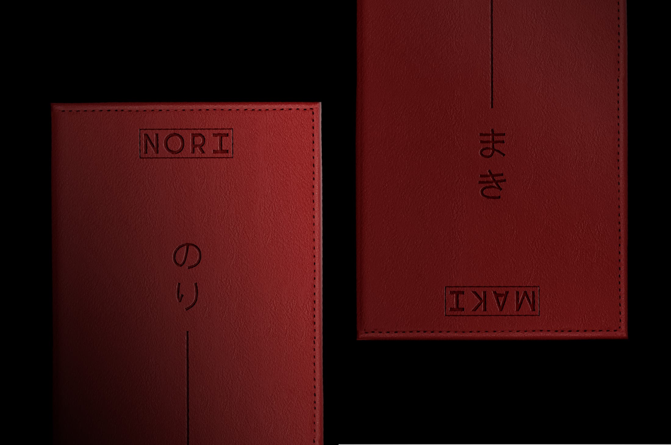
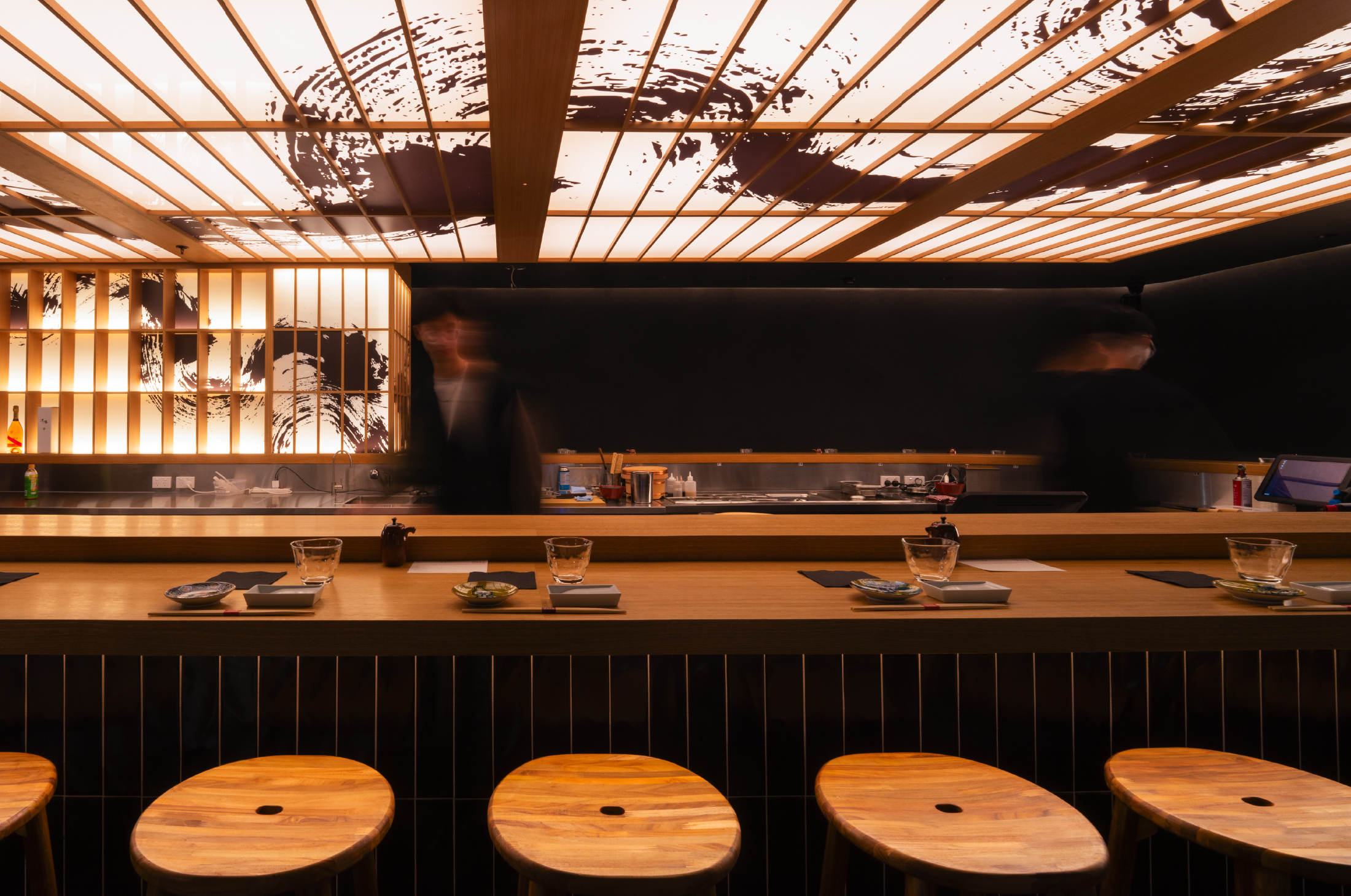
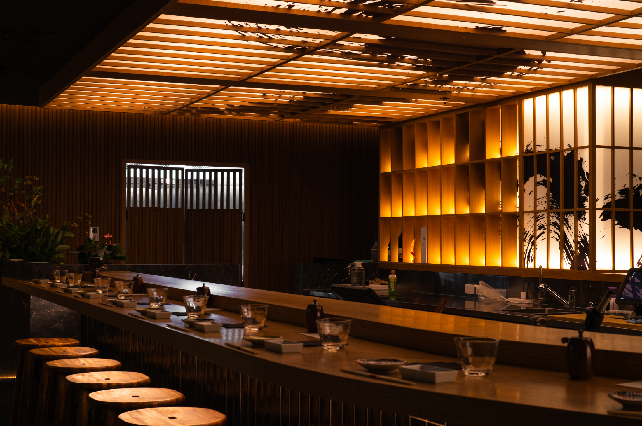
Bringing the theatre of Omakase to the heart of Melbourne, Nori Maki lifts the veil on a dining experience that’s traditionally reserved, inviting guests to sit front and centre as each dish is prepared before them. Rooted in Japanese technique but reimagined for a contemporary audience, Nori Maki delivers refinement without pretence, and quality without the price tag.
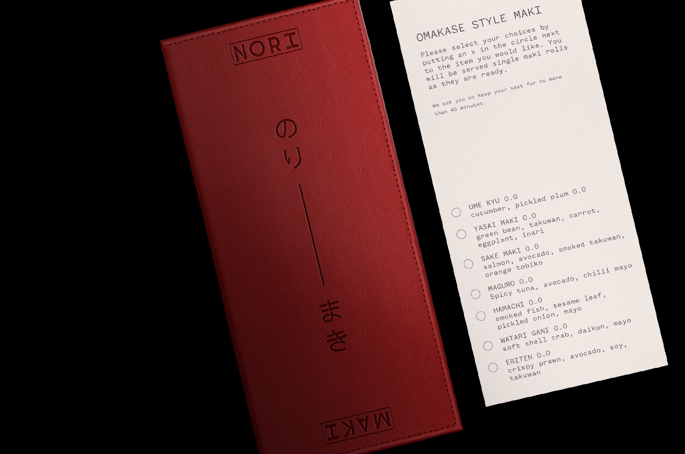
The brand came to us to shape a new identity, one that could honour its cultural origins while standing out in a competitive hospitality landscape. We worked closely on brand strategy, identity and collateral, building a system that feels both grounded and energetic, traditional yet bold.
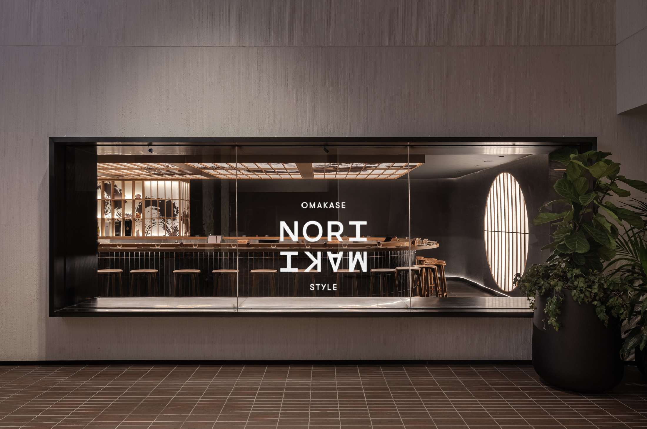
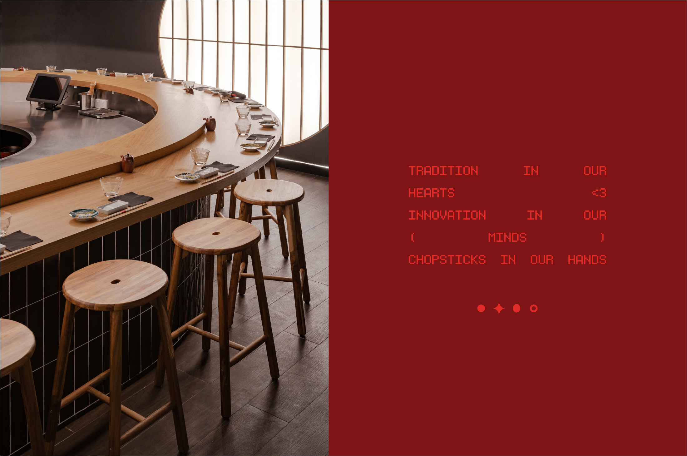
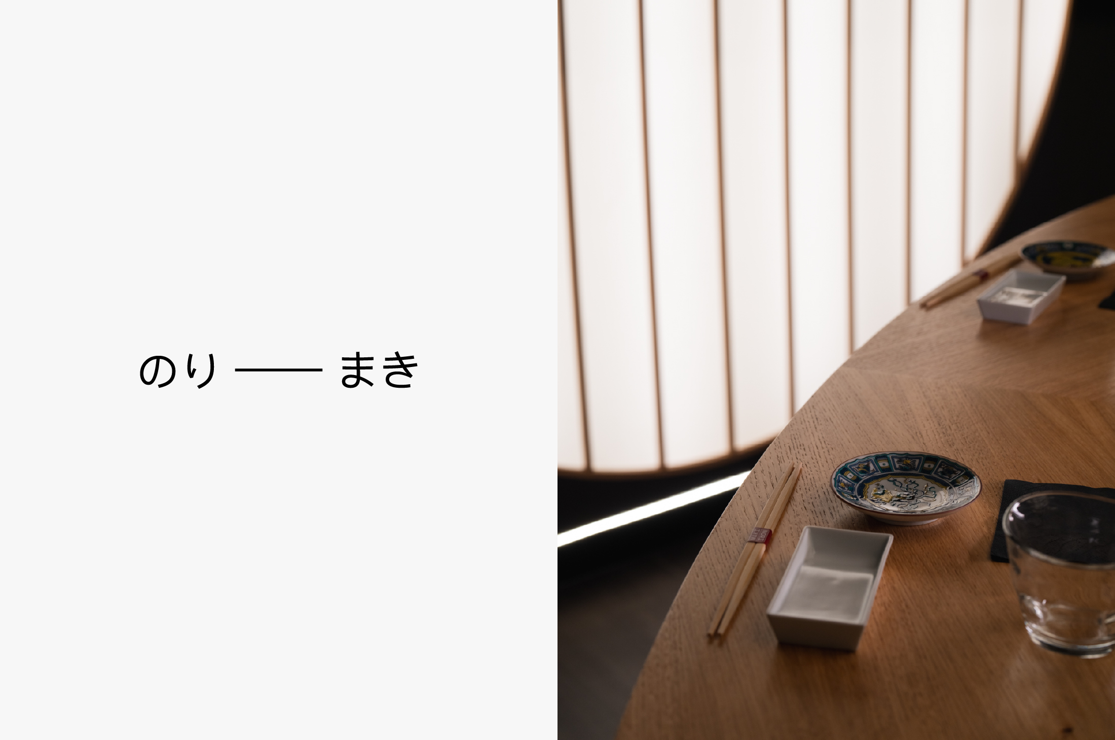
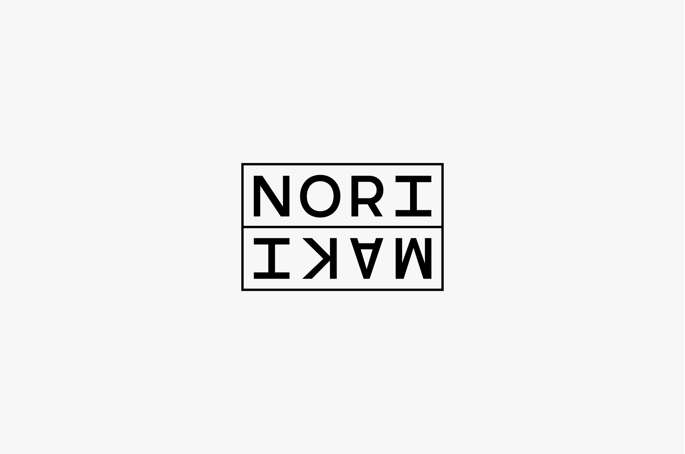
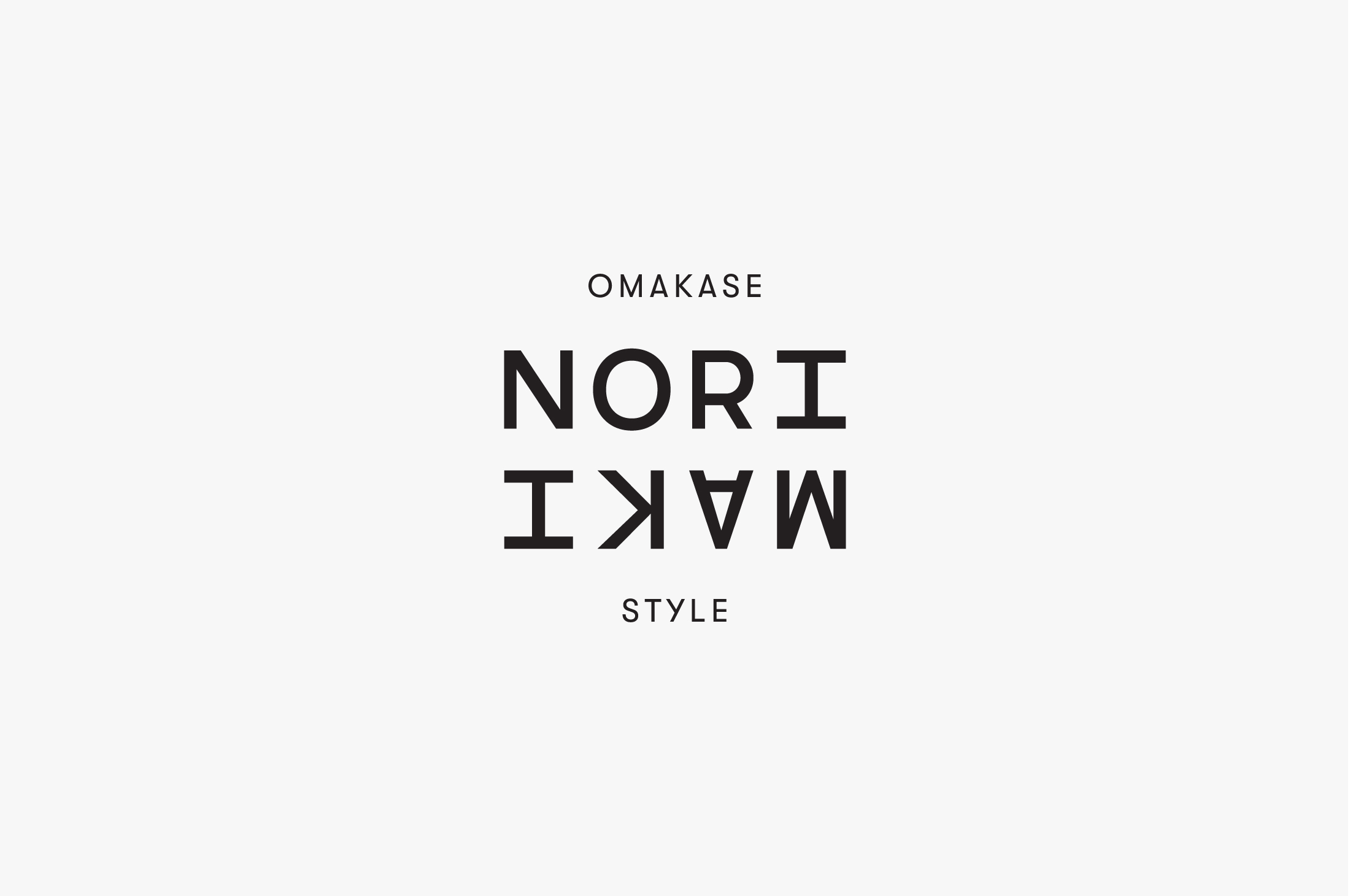
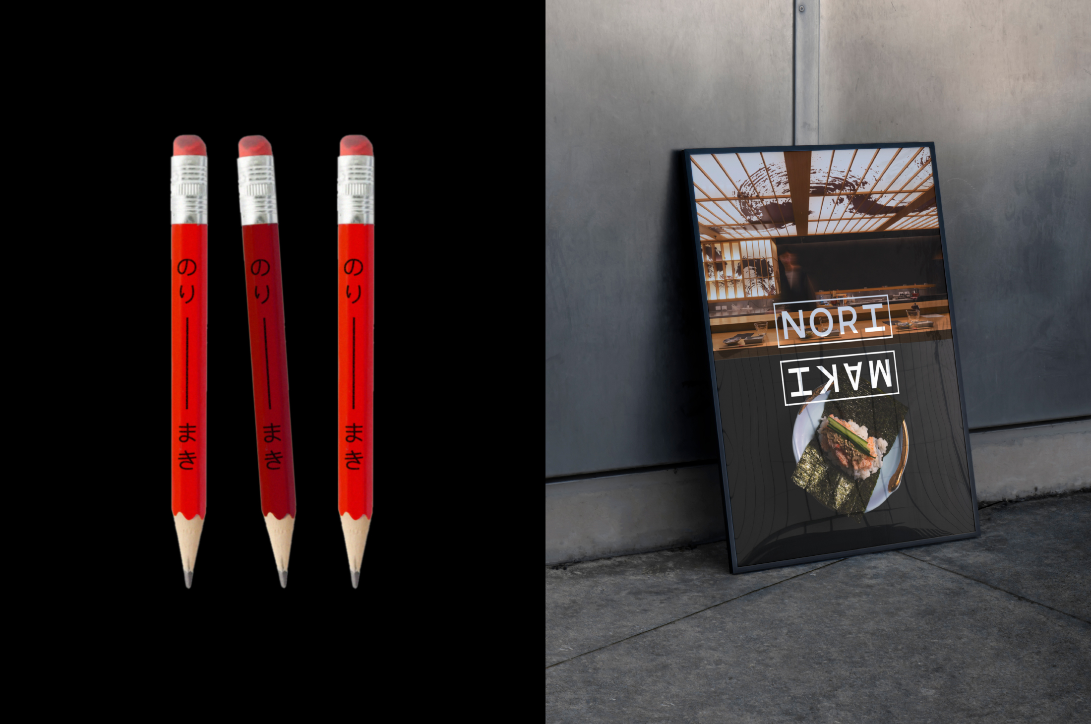
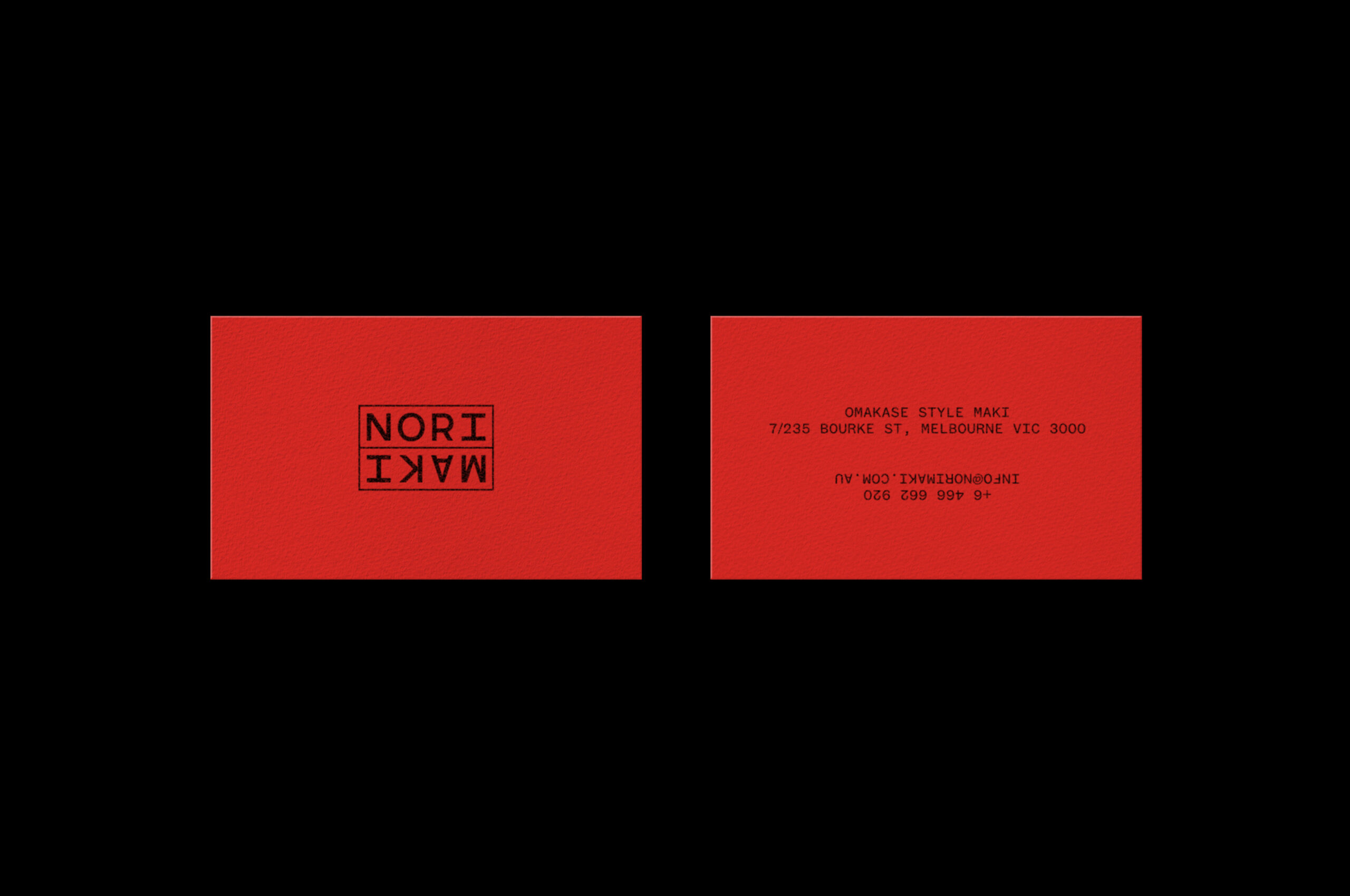
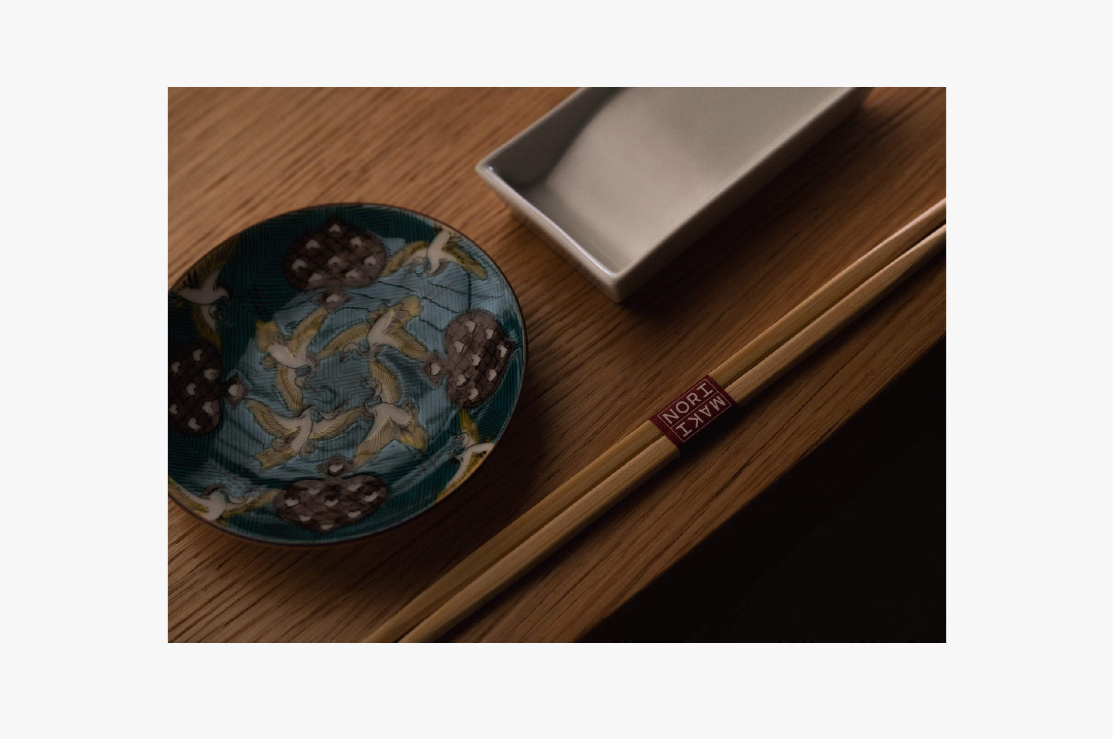
The mirrored logotype was designed to reflect the heart of the Omakase experience, the interaction between chef and diner, seated face-to-face, sharing in the rhythm of preparation and presentation. It’s a nod to symmetry, participation and the intimacy of being invited in.
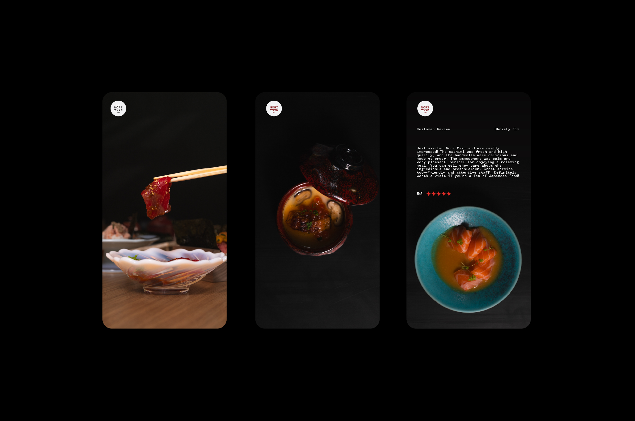
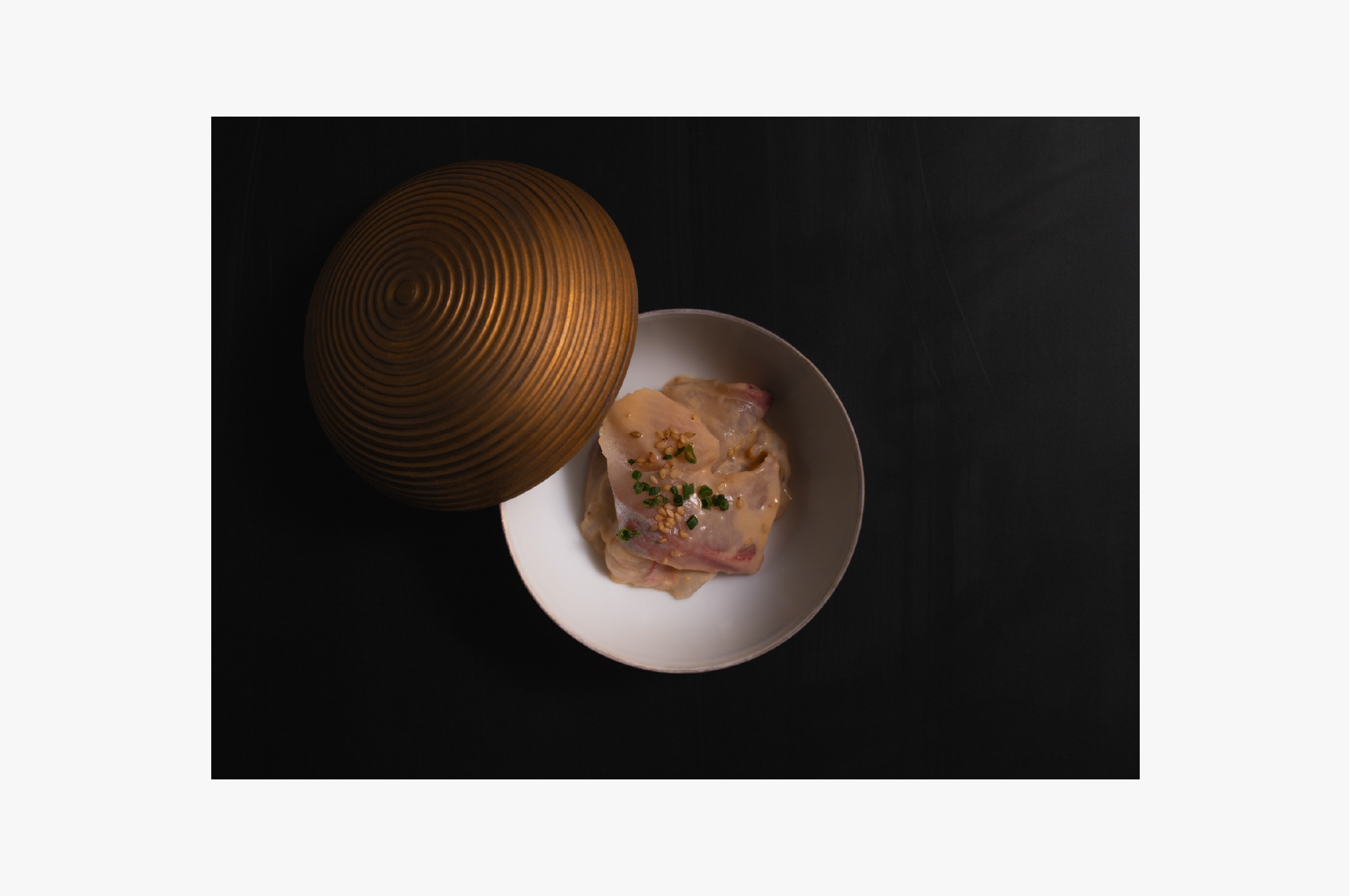
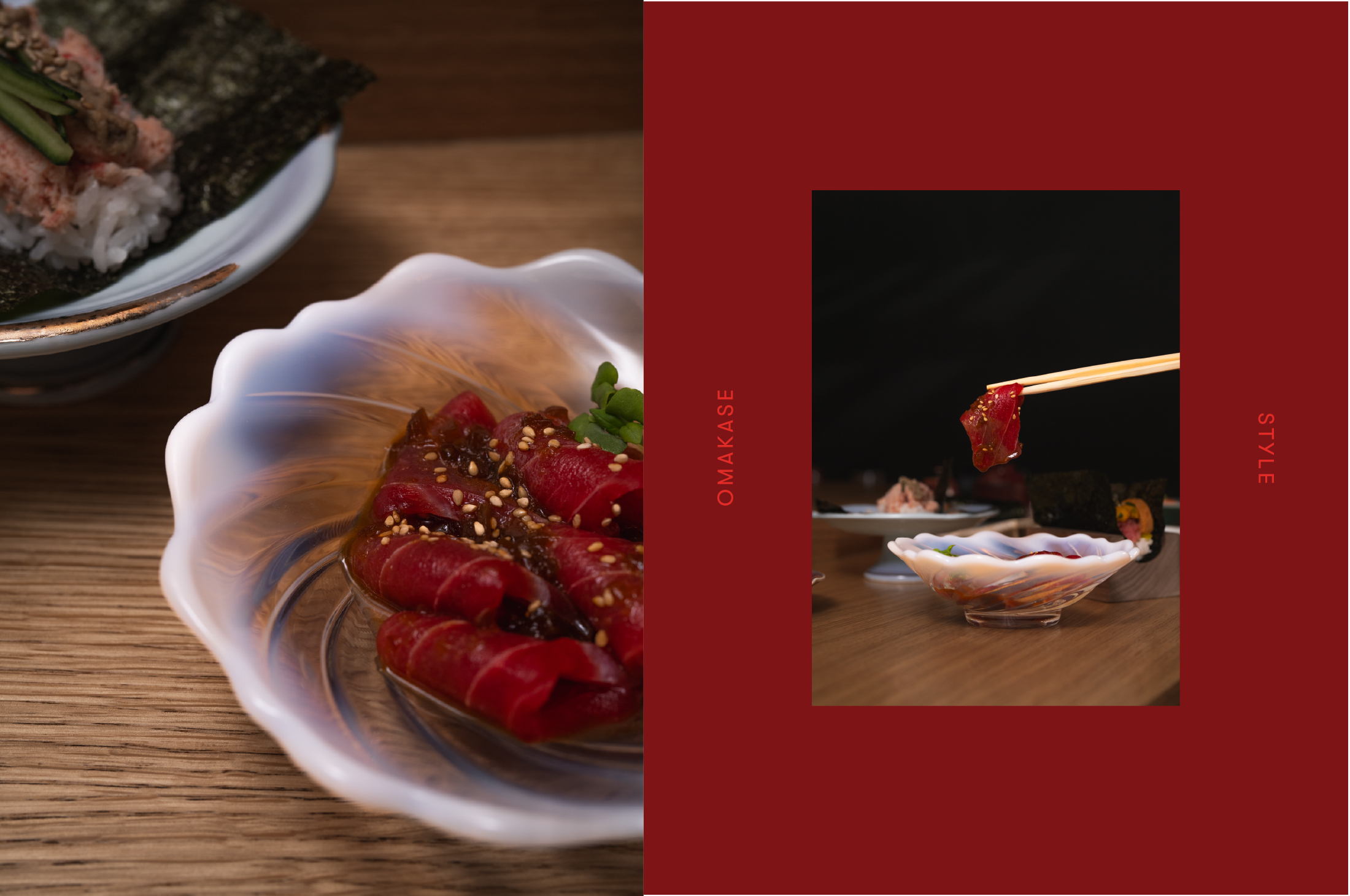
The visual identity centres around a confident, curated palette: Deep Cherry, Japanese Red and Salmon Pink, all colours drawn directly from the food, the environment, and the layered moments that define the brand. Combined with vibrant photography and a clear visual hierarchy, the system creates a balance between craft and clarity.
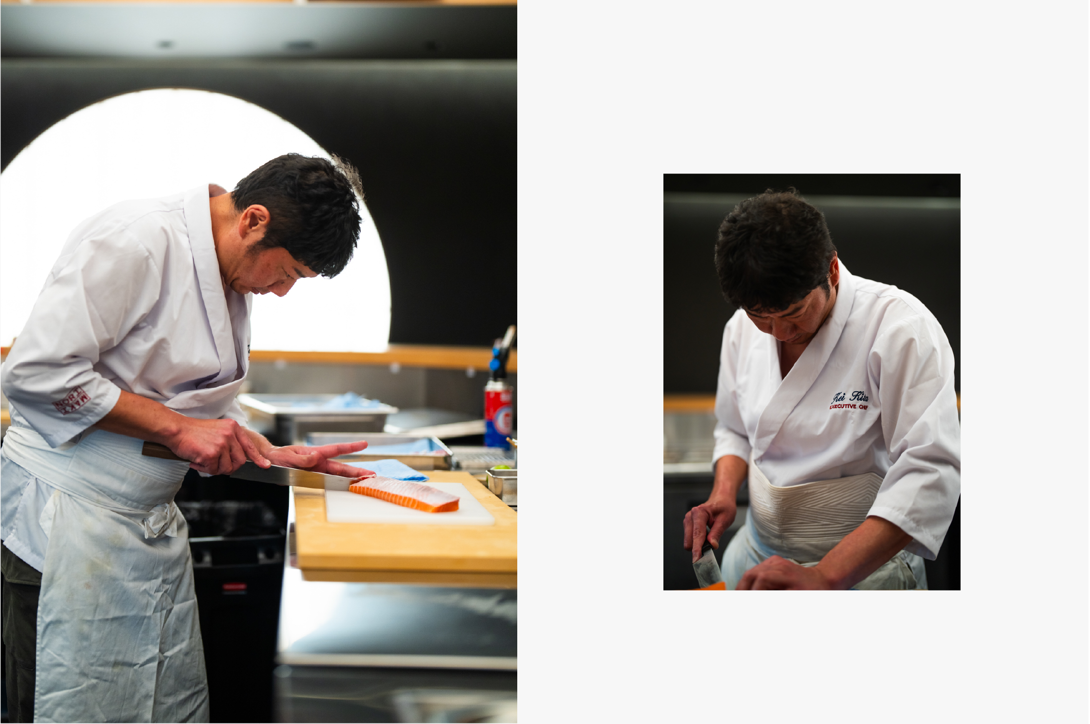
Nori Maki is an experience built on precision and pace, where the storytelling is part of the serving. Our role was to give it a brand that invites you in at first glance.
