We’d love to hear from you.



/
Pekada Branding & Marks / Digital Design / Packaging, Print & Editorial
Pekada is an established financial services company based in Melbourne that struggled to show that it is a leader in technology and focused on managing diverse clients and businesses. Given the nature of a professional advisory company, the brief aimed to revamp the tone and style of the brand with a contemporary feel, while depicting Pekada as a trustworthy and credible company that is experienced and agile.
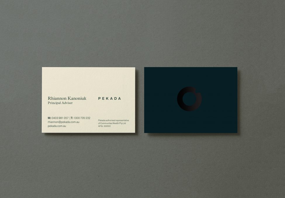
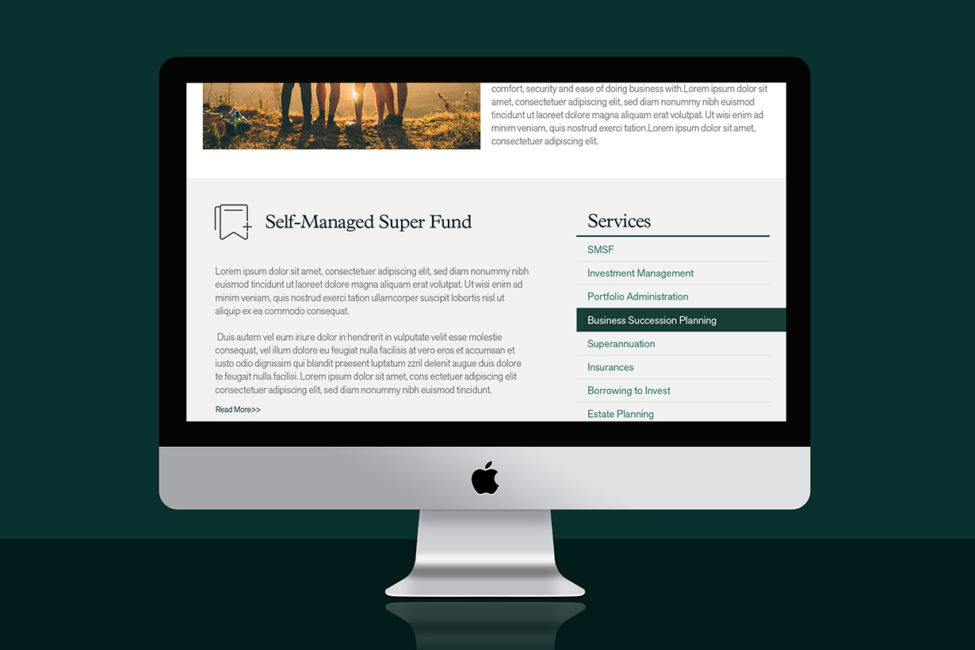
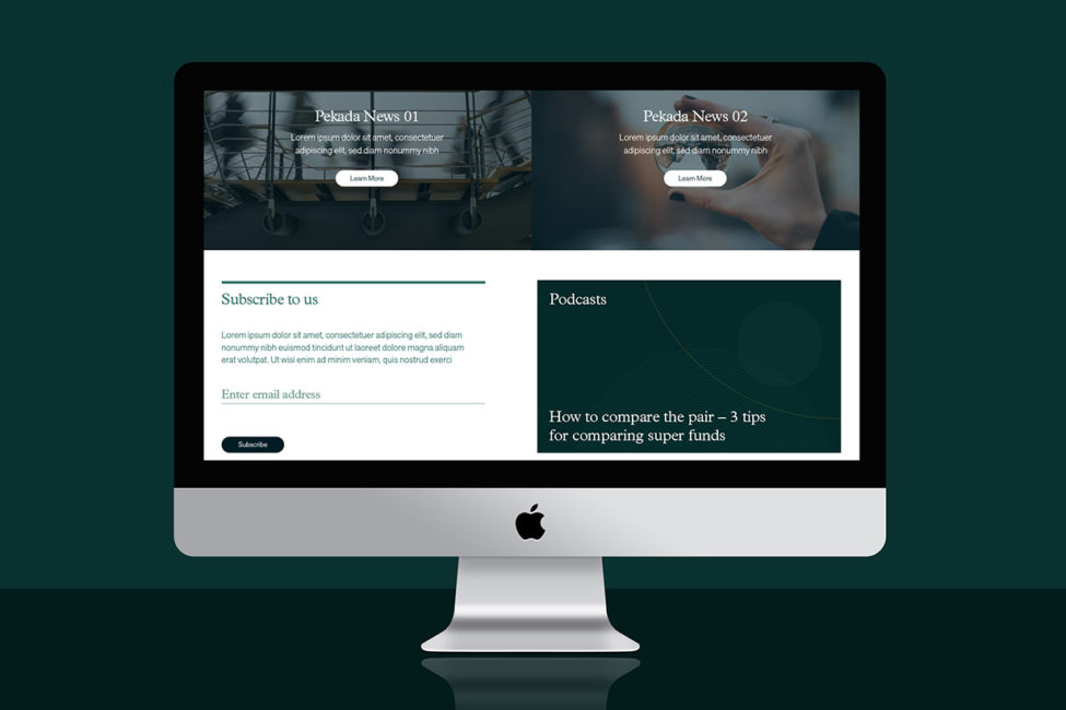
The work with Pekada demonstrates that a complete rebrand is not the only option. Refreshing the colour palette with earthy greens and calming broken white and redefining the website with inspiring images empowers the brand with a fresh style.
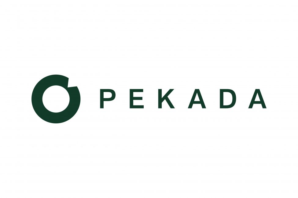
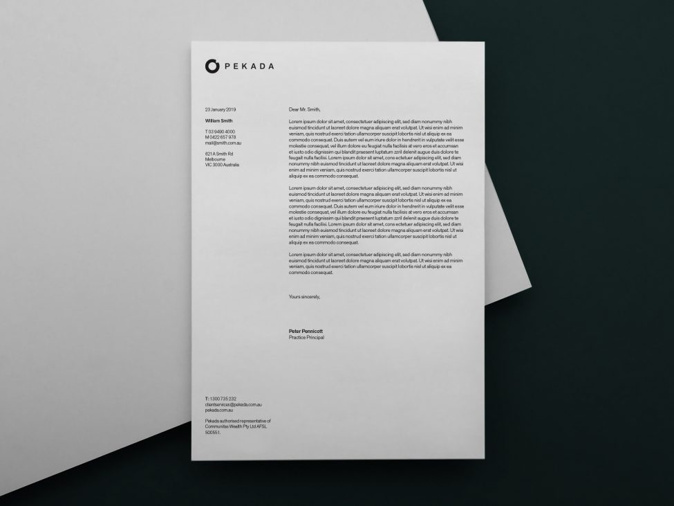
Using the existing logo as a guide, the team drew out the circle from the top corner and made it a feature alongside the rest of the letters. Space was added between each letter to make it feel lighter, and a sans serif font with strong, defined lines was used to portray a sense of purpose and safety.
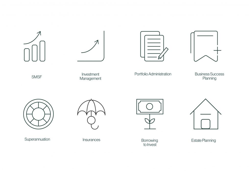
Circle linework was used throughout the assets to create a sense of continuity and future planning with clients as the centre; the play of transparency in the faint linework represents honesty with clients. Green denotes intuition, truthfulness and an approachable nature and was a focus point of the design to align with Pekada’s client-first values.