We’d love to hear from you.

/
Simple + Addition Coconut Milk Packaging Brand Strategy / Brand Identity / Print Design / Digital Design / Art Direction
Simple + Addition is a brand rooted in the belief that better living starts with simple choices. For their coconut-based product range, we were tasked with developing a name, identity and campaign that championed real ingredients and an effortlessly healthy lifestyle.
The name Simple + Addition was born from three key ideas: a nod to science and precision, a reminder that better habits can be easy to adopt, and a reflection of the brand’s commitment to simple, high-quality ingredients that do more with less.

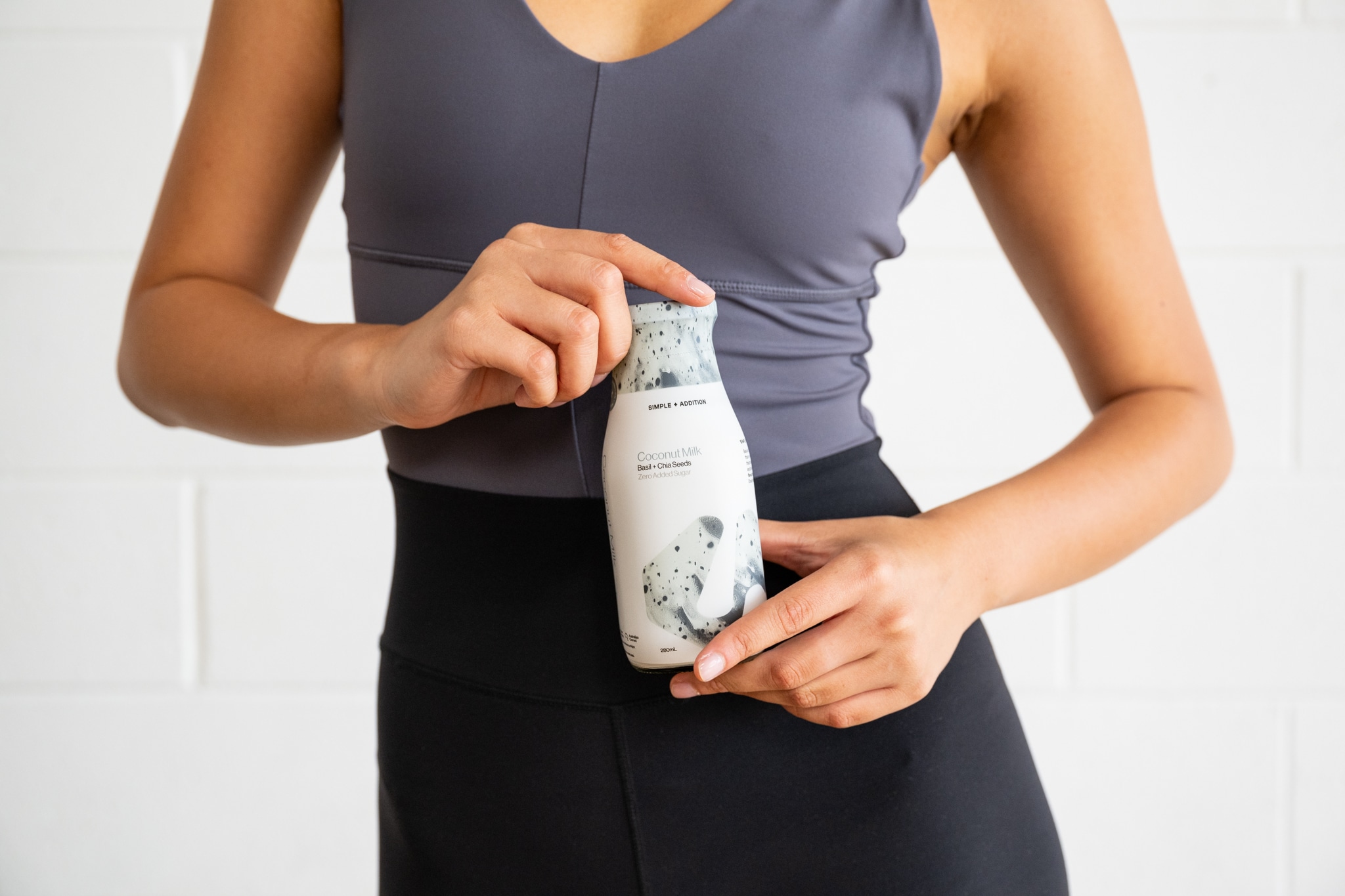
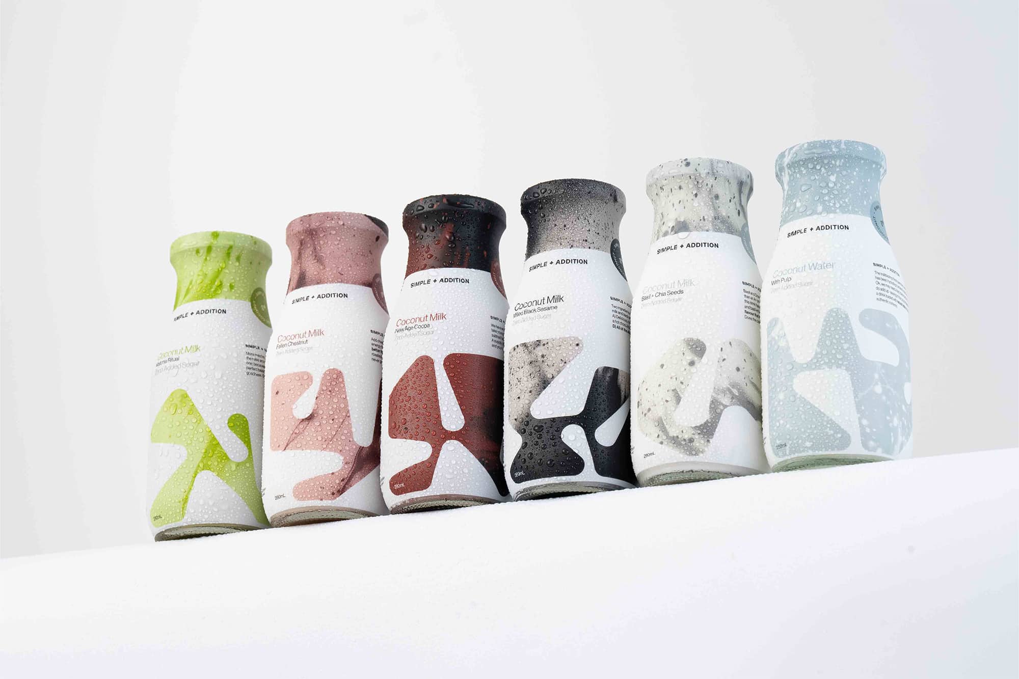
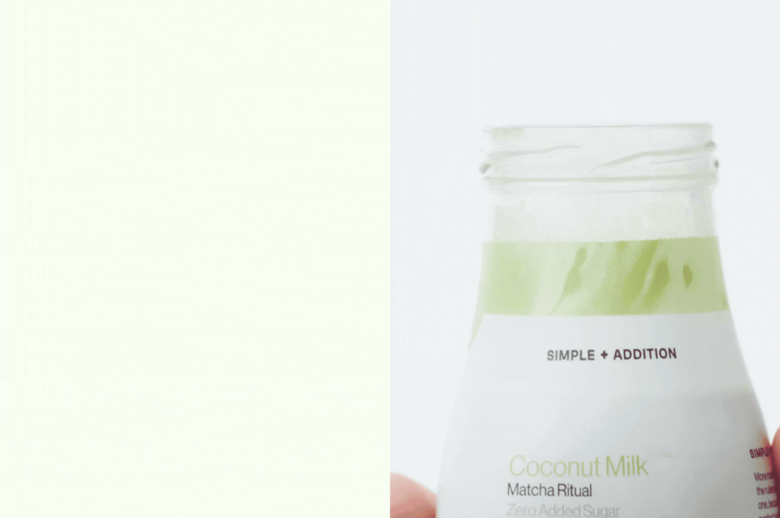
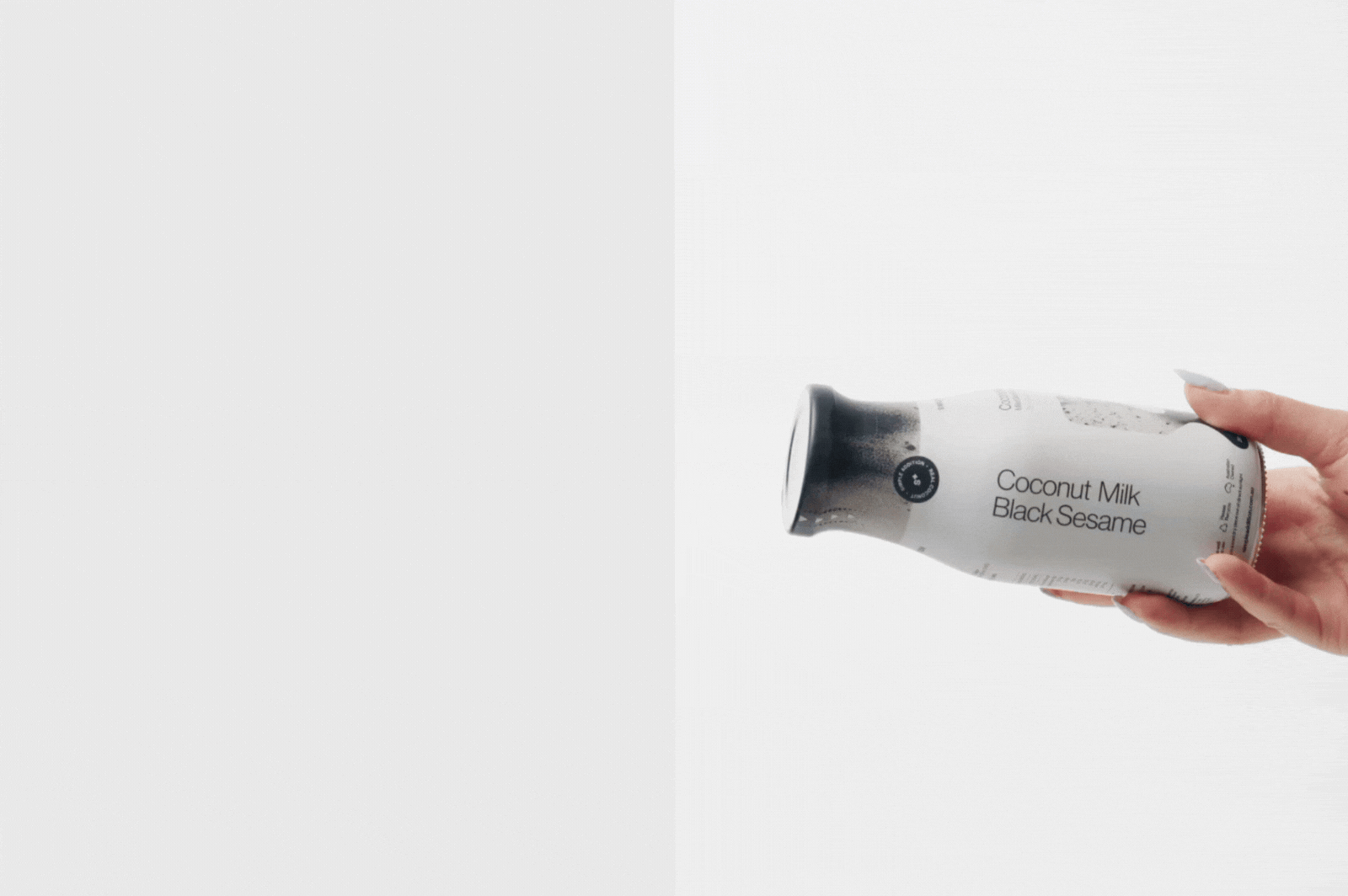
The brand strategy centred around honesty, purity and visual clarity. With a concept inspired by flowing milk, slow moments and soft shapes, we developed a visual identity grounded in calm, organic form. Each product features its own unique ‘lazy shape’ – a subtle silhouette that gently spills across the packaging to evoke its individual flavour and mouthfeel. From deep black for Milled Black Sesame to grounded green for Matcha, each colour choice reflects the character and sensory experience of the product.
We kept the design intentionally minimal. Raw textures on the pack reference the whole ingredients within, while the matte finish of the printed wrap elevates the product, giving it a sense of refinement and quiet luxury. Nothing is overworked, just like the ingredients themselves. No additives, no noise.

Digitally, we extended the brand through targeted ad creatives that brought the strategy to life. From motion-led ads to static placements, our designs remained visually clean and flavour-led, always true to the visual language of the packaging while adding fresh brand moments across channels