We’d love to hear from you.
/
Chunky Town Branding Branding & Marks / Digital Design /Packaging, Print & Editorial
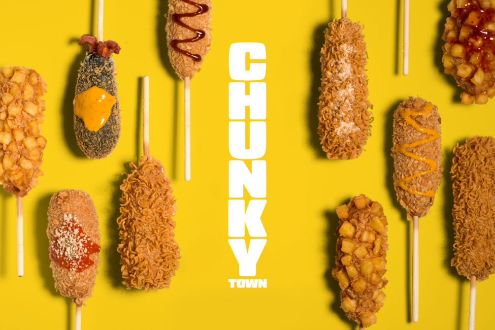
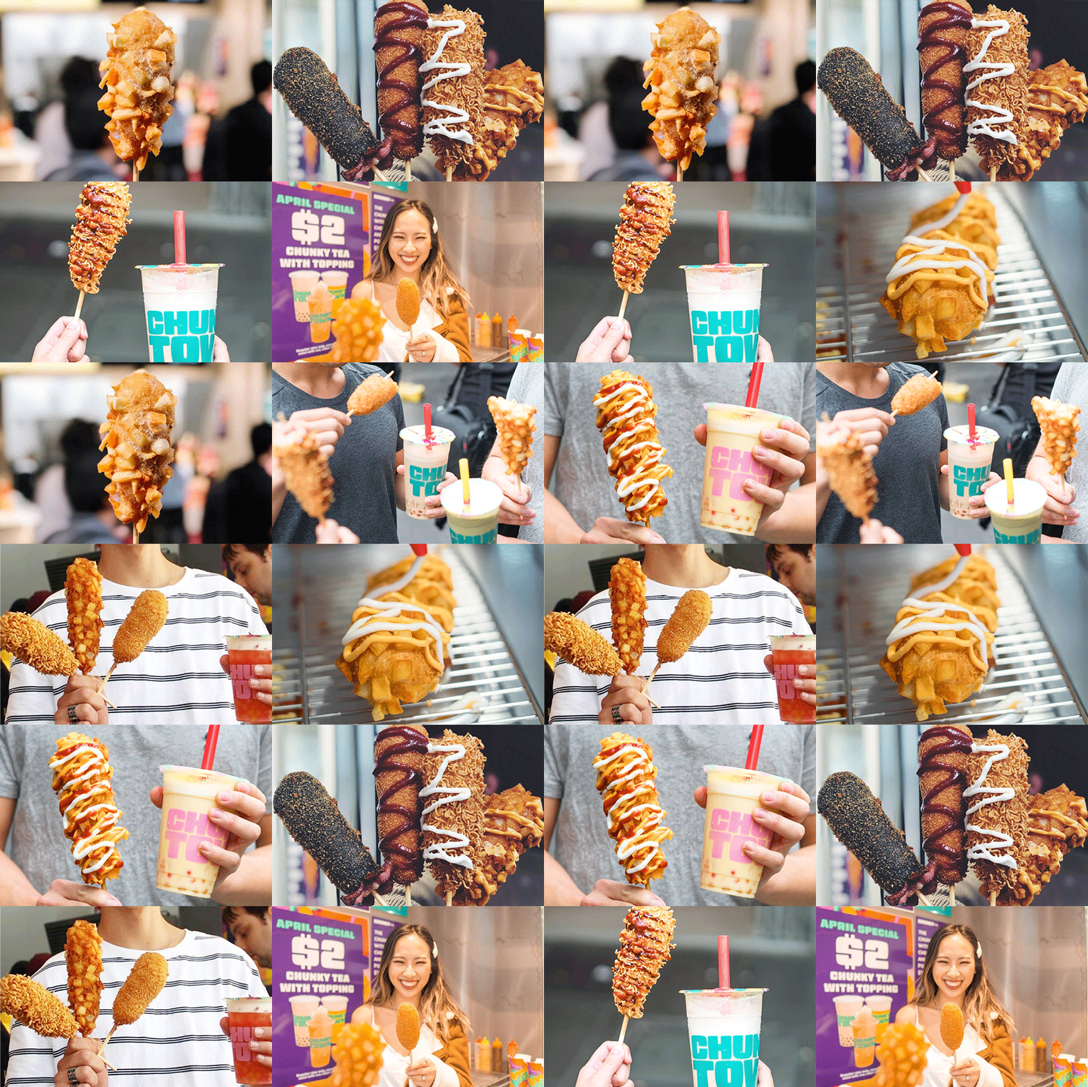
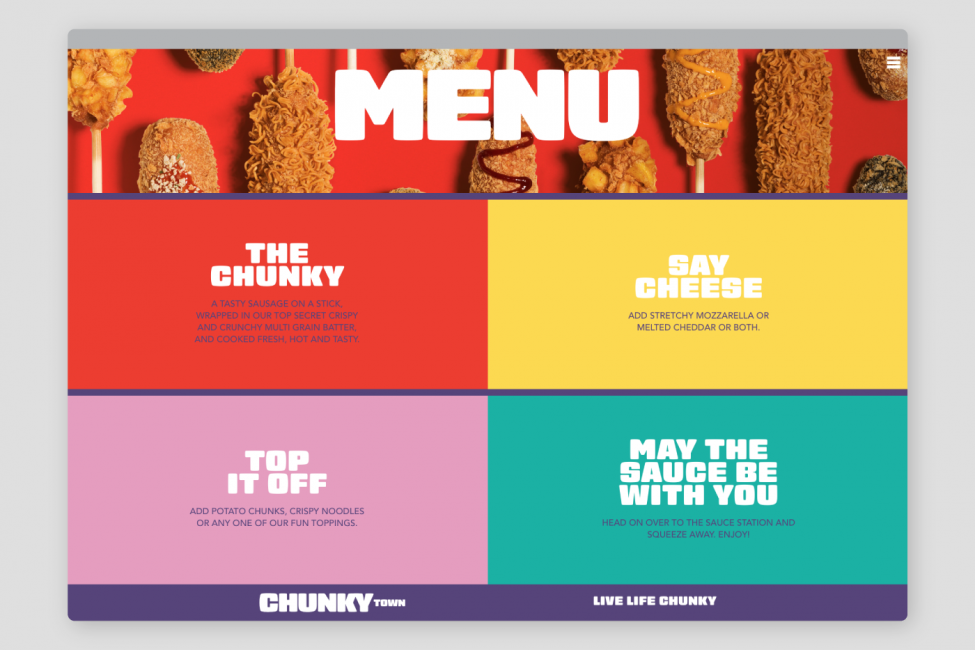
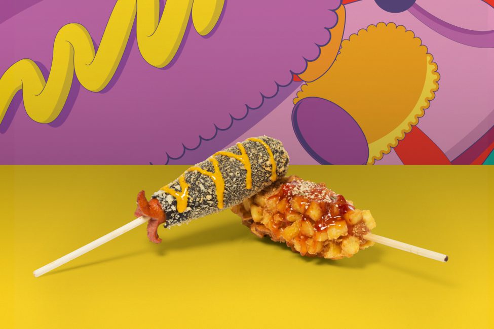
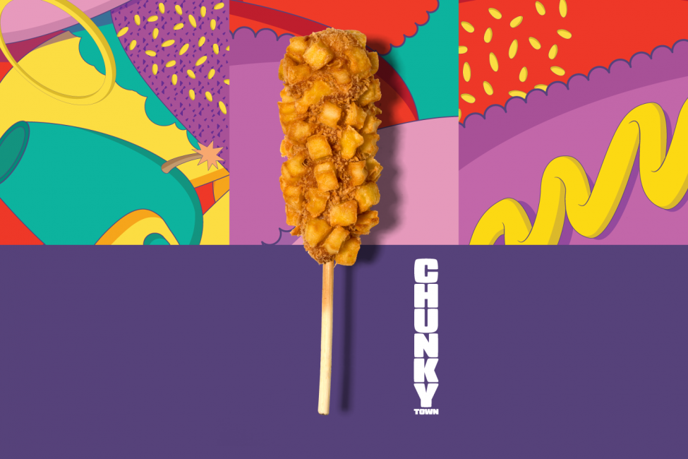
‘From small beginnings come chunky things’ captures the rise and rise of this tasty South Korean vendor, who have brought an irresistibly fun snack to the streets of Melbourne. Serving up a compelling combination of ‘chunky’ hotdogs on a stick alongside a range of thirst-quenching teas, Chunky Town are making their mark as a bold newcomer in the fast food scene.
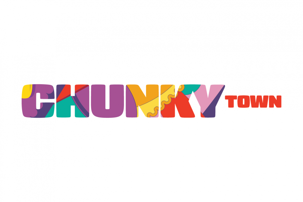
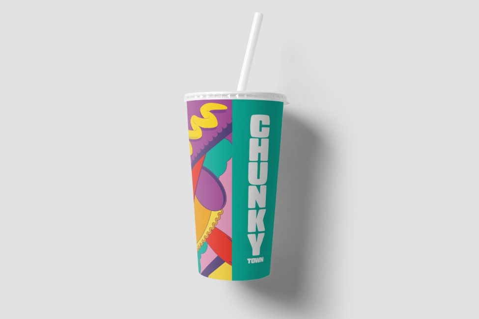
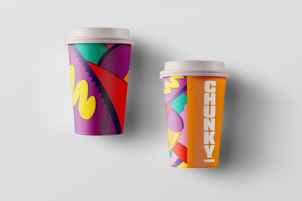
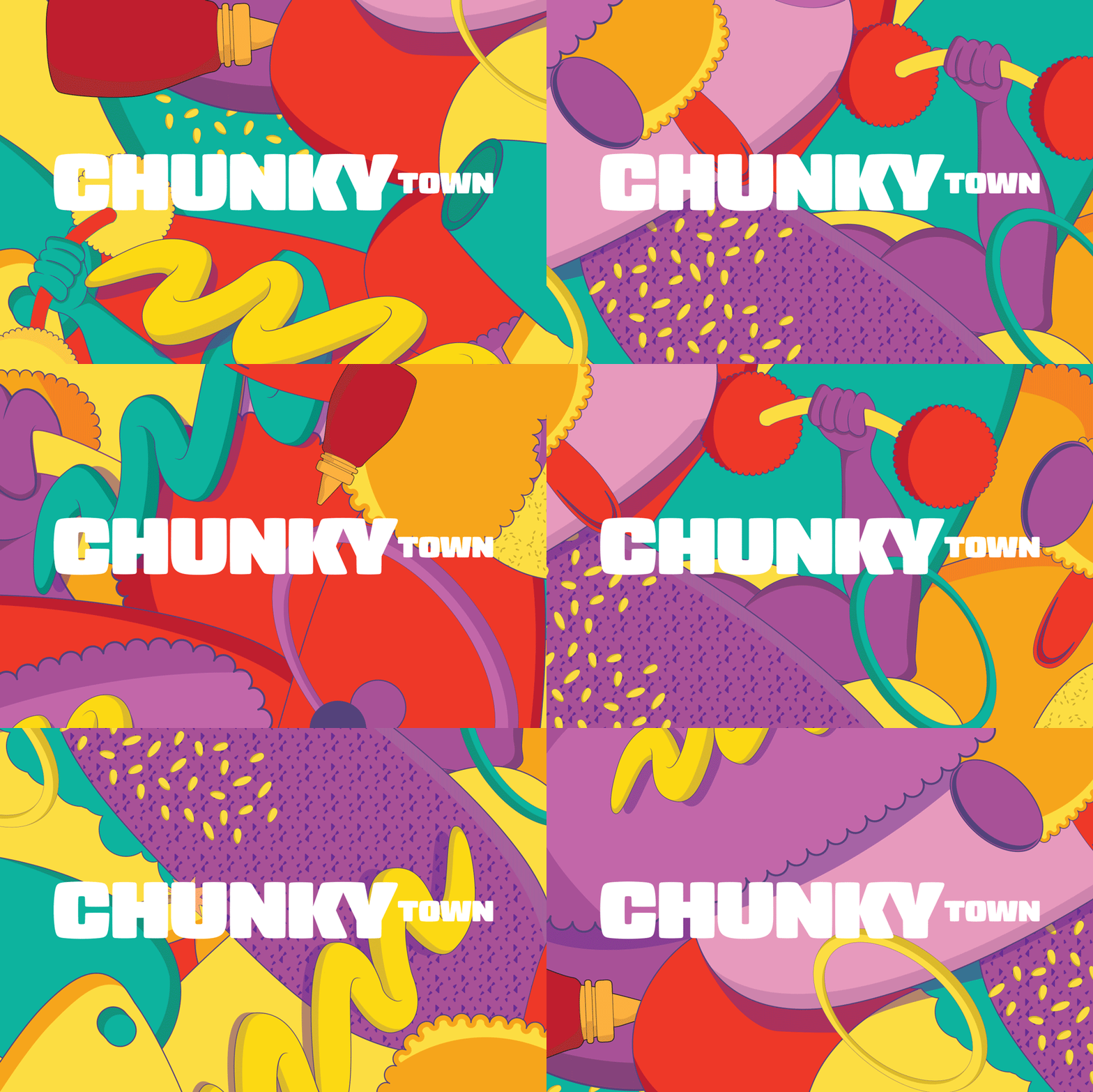
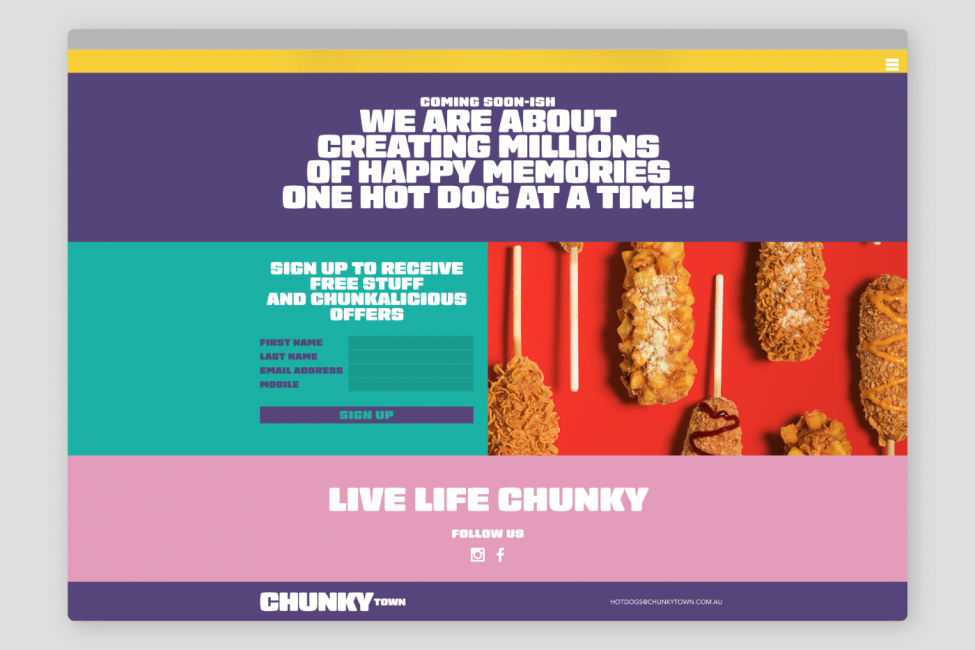
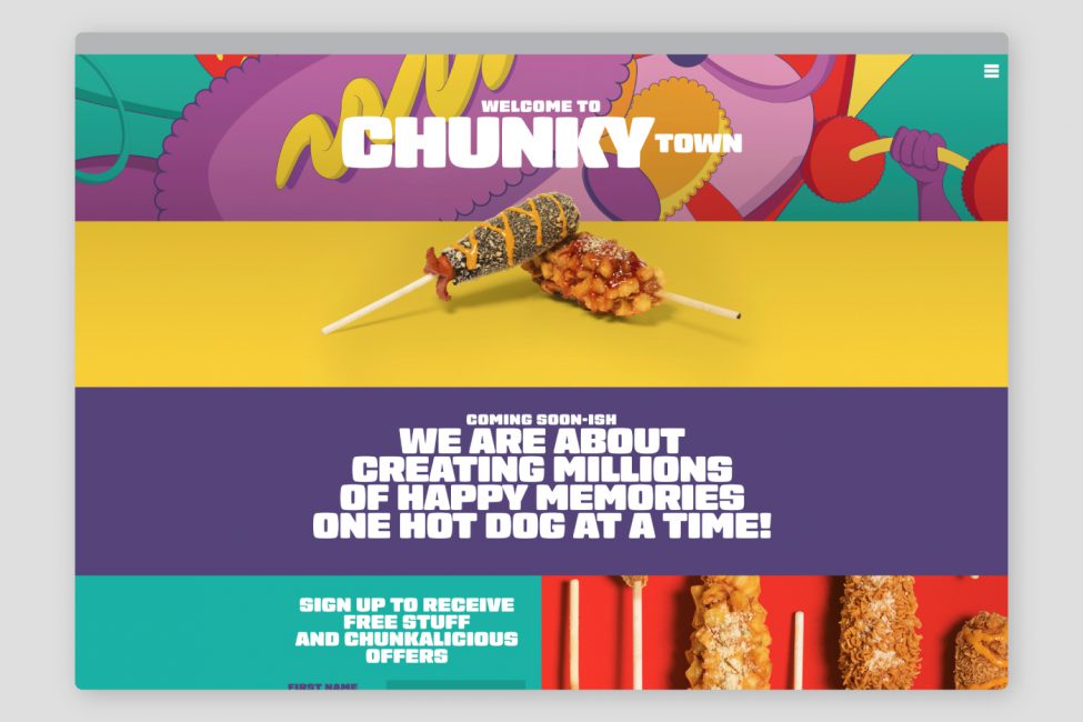
Translating this unique food offering to the Australian market required a brand naming process, that went hand in hand with our visual concept. Never letting grammar get in the way of creativity, we redefined the phrase ‘chunkify’ to mean ‘to make something chunky’ and applied this to our design process. The result is a brand mark consisting of ‘chunkified’ typography that oozes out over the edges of the page with inflated letterforms.
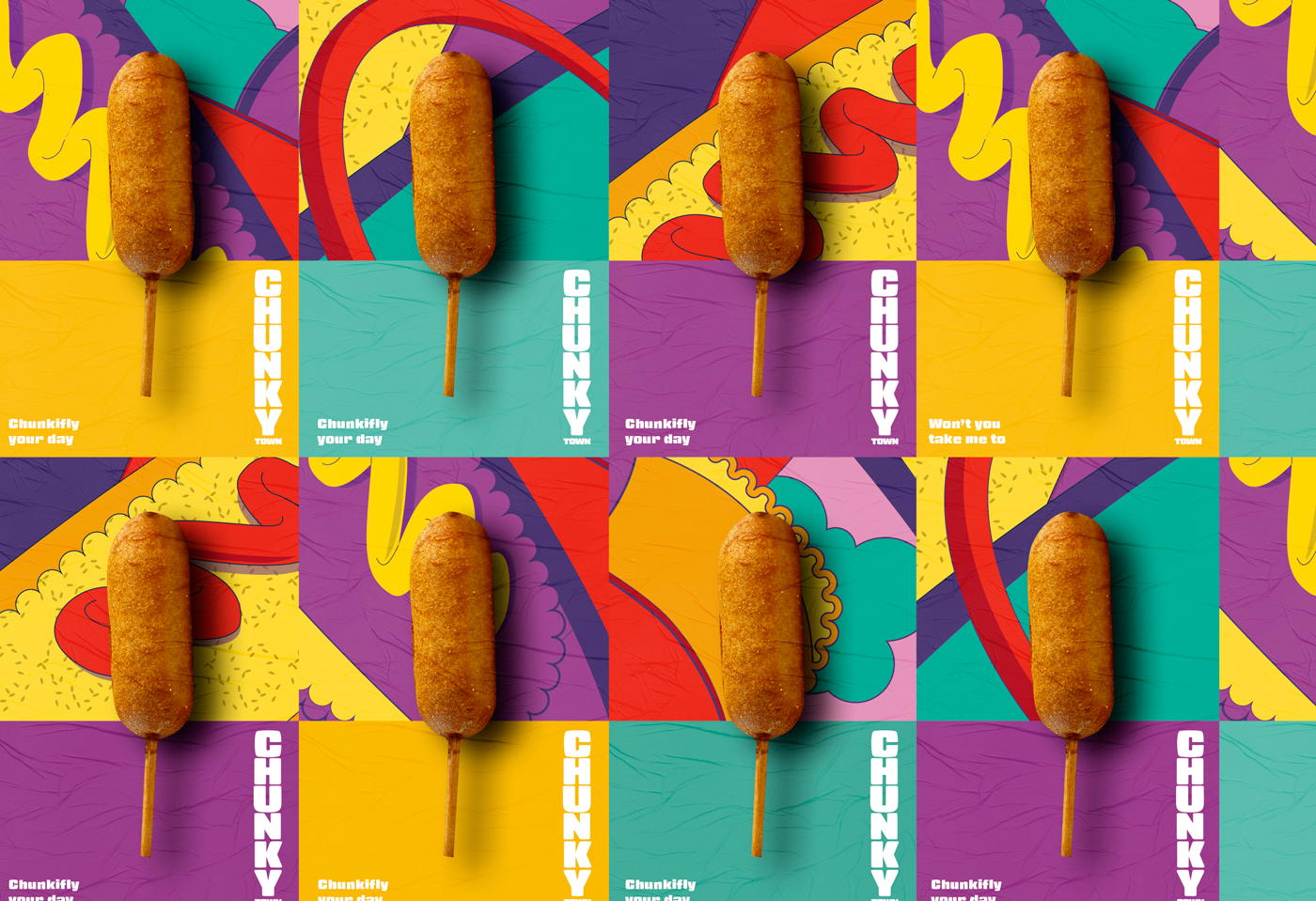
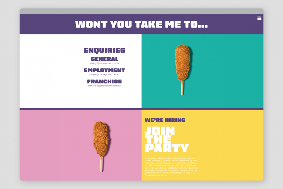
The name also alludes to a retro 70’s vibe, expressed in the colour palette; mustard and teal colour blocked next to hues of purple and vivid red certainly convey an energy to the brand identity. And we’d be lying if we said we could sing ‘Funky Town’ without the occasional slip up. There’s something a little bit K-pop meets 70’s disco about Chunky Town that conveys a sense of fun with the kiosk style street eats.
