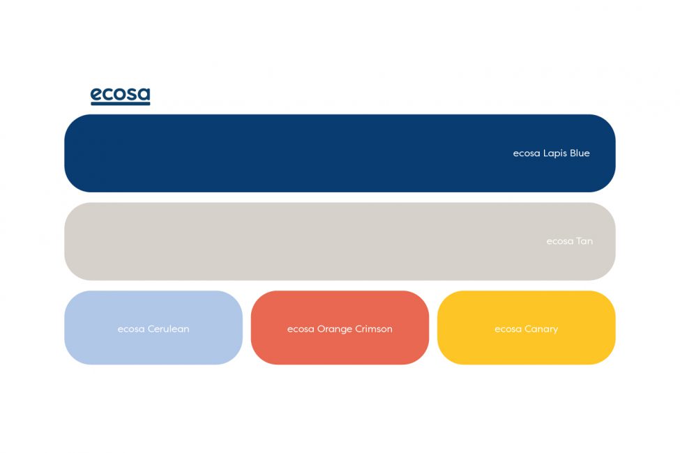
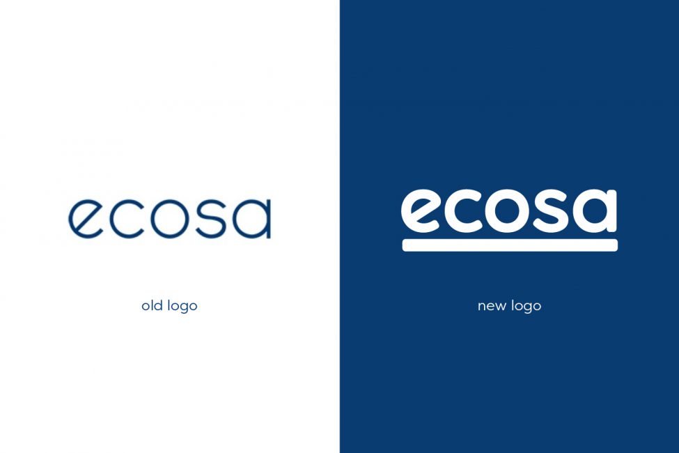
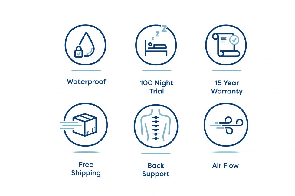
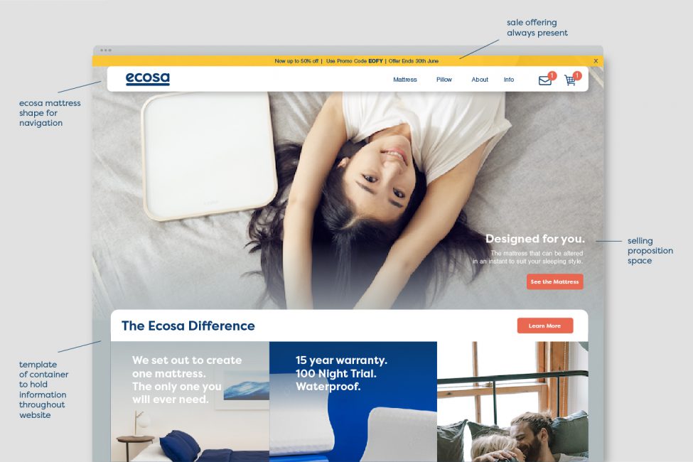
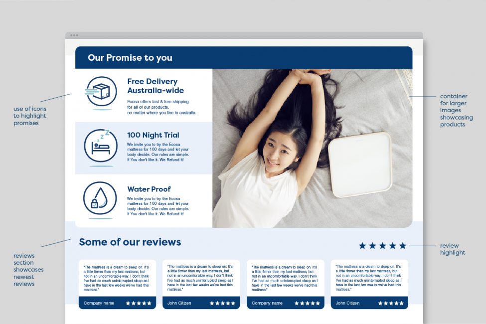
As one of Australia’s fastest growing businesses, Ecosa approached us with their eyes set firmly on the future. To keep on top of this rapid growth, a clean and stylish suite of branding tools, website and product packing was required.
We began by designing collateral that romanticised the new way people shop for beds. The almost unbelievably small size the mattress can pack down to and that satisfying feeling of unrolling a new mattress, purchased online, for the first time. Shopping for a new mattress no longer needs to be a hassle. It can be easy. It can be relaxing.
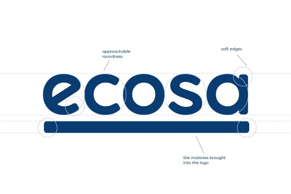
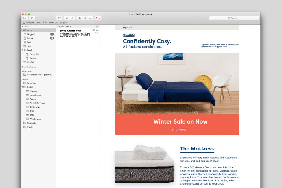
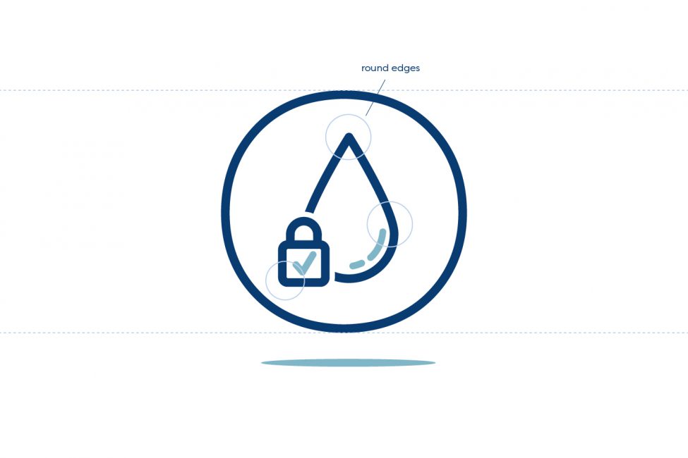
The collateral would reflect this mindset as well. Smoothed off edges for text boxes and website buttons filled with a typeface that is both calming and sophisticated.
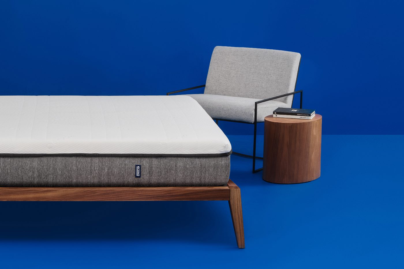
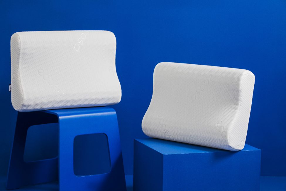
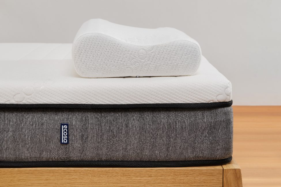
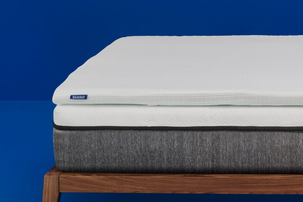
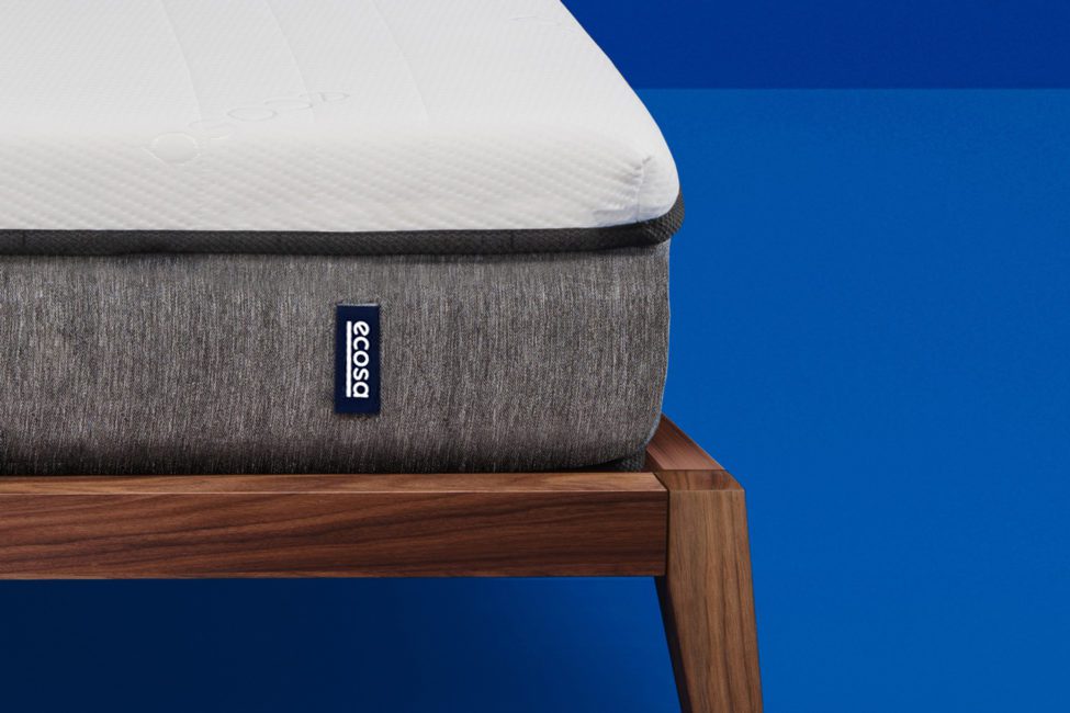
To help tie the visual language and product together, our team was brought on to manage the creative direction of the product shoot. The photography utilises the bold blue already established throughout the branding to create an instantly recognisable look and feel for the brand.
