Fernwood Brand Strategy
Branding & MarksPackaging, Print & Editorial
Fernwood is more than just a gym, it’s a community that promotes women’s wellness and provide an inclusive and non-judgmental space for women to come together to enrich their physical and mental health.
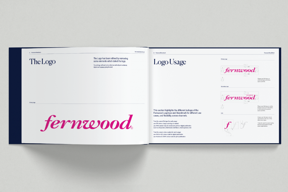
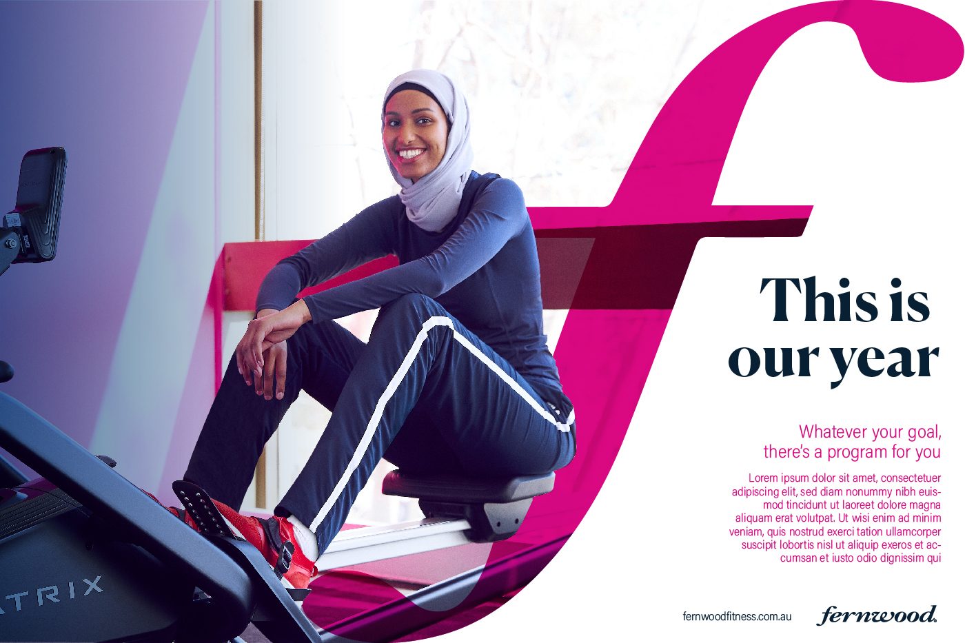
Principle Design collaborated with Fernwood to modernise their campaign identity whilst retaining the existing brand equity in the iconic brand mark. In a review of their existing campaign materials they cited issues such as cluttered and unclear hierarchy of information, outdated use of colour fades and a misalignment with the message conveyed through some of the more ‘fitness’ style stock imagery that over-emphasised the physical component of wellness. It was also remarked that these materials were heavily promotional rather than inspirational, highlighting the ‘sell’ of services at the detriment of the overall message of promoting wellbeing for women.
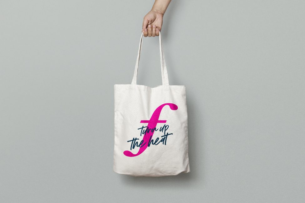
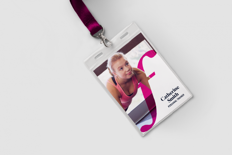
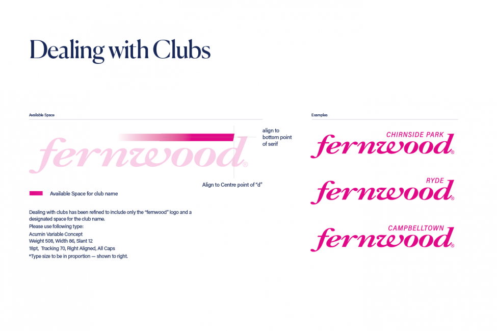
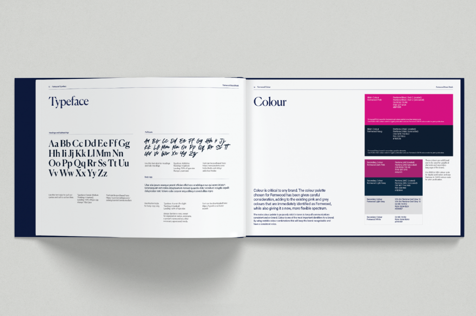
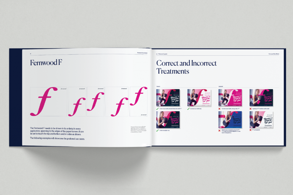
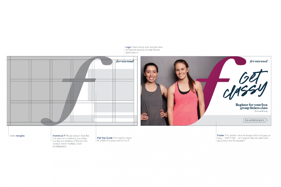
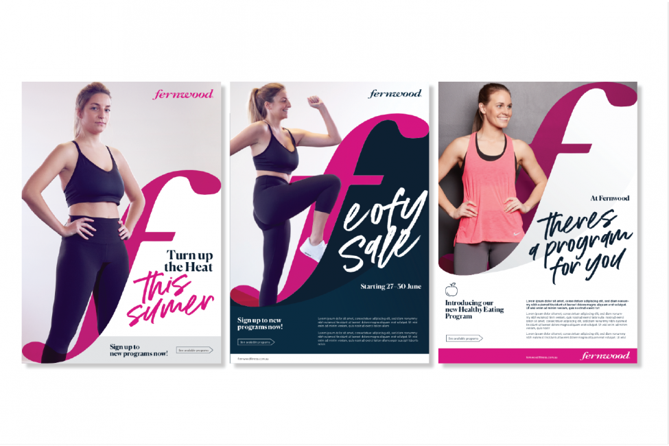
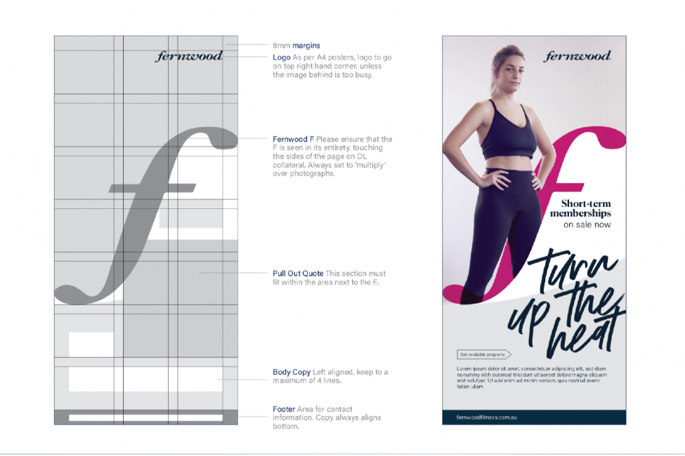
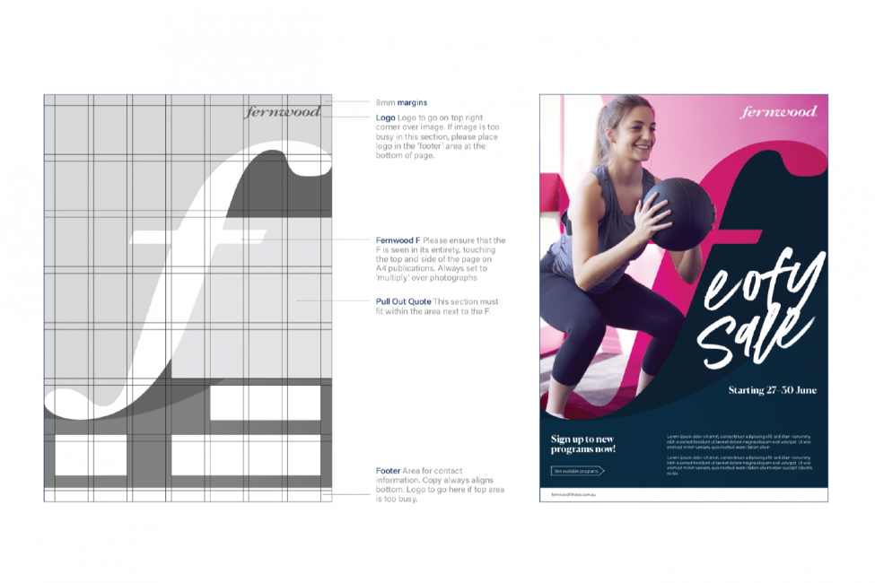
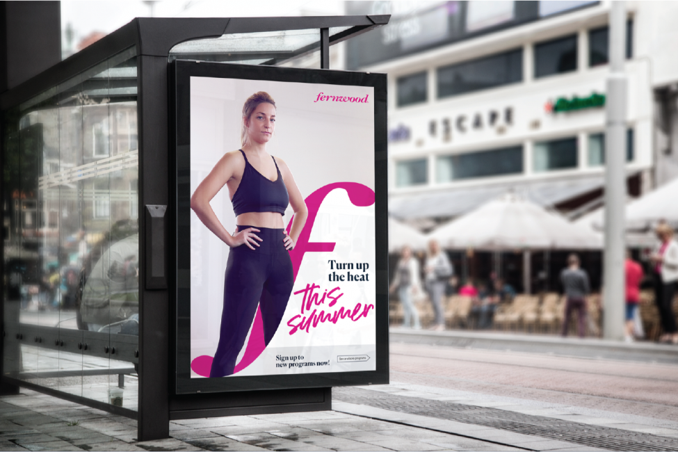
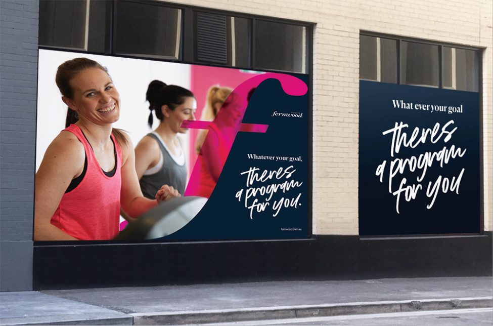
Equipped with these insights, we set about preserving the brand recognition with the continued use of vibrant pink hue. The key graphic forms were extracted from the feminine curvature of the Fernwood ‘F’ that serves as the key feature throughout their campaign materials. Integrated with a photoshoot of ‘real’ women, the campaign established guidelines for the integration of an on-brand photography style, brand recognition with the creative application of the logo features and key messaging communicated through the hierarchy of typography and copywriting. Whilst the core brand identity remains intact, we were able to develop a structured secondary brand system with clearly documented guidelines that ensure the consistent application of the revitalised brand identity across outlets nationwide.
The Fernwood campaign promotes the combined characteristics of femininity and strength and showcases authentic, ‘real’ women in an effort to inspire women to take charge of their own wellness journey.
