When you are a “communications studio devoted to reinventing and growing design practices who strive to have more impact” it’s imperative that you practice what you preach.
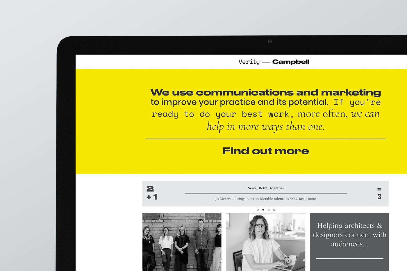
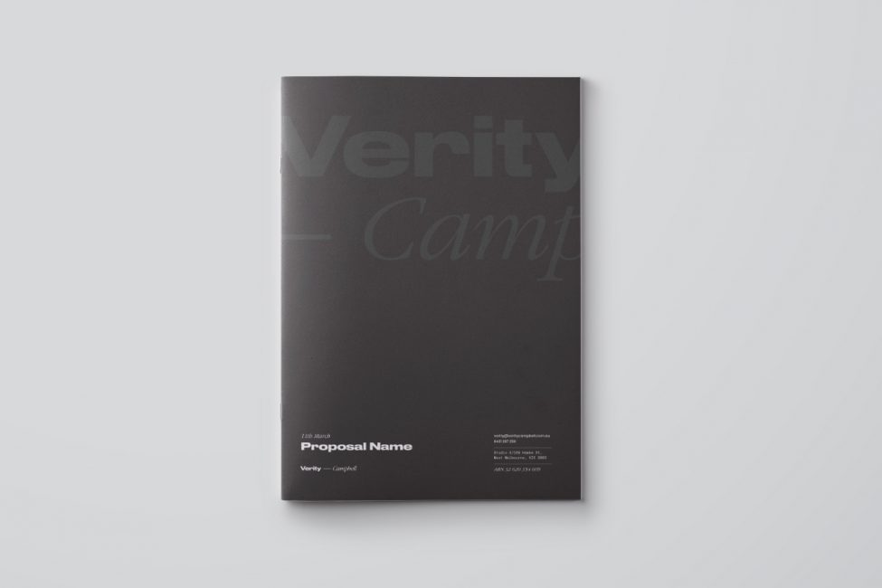
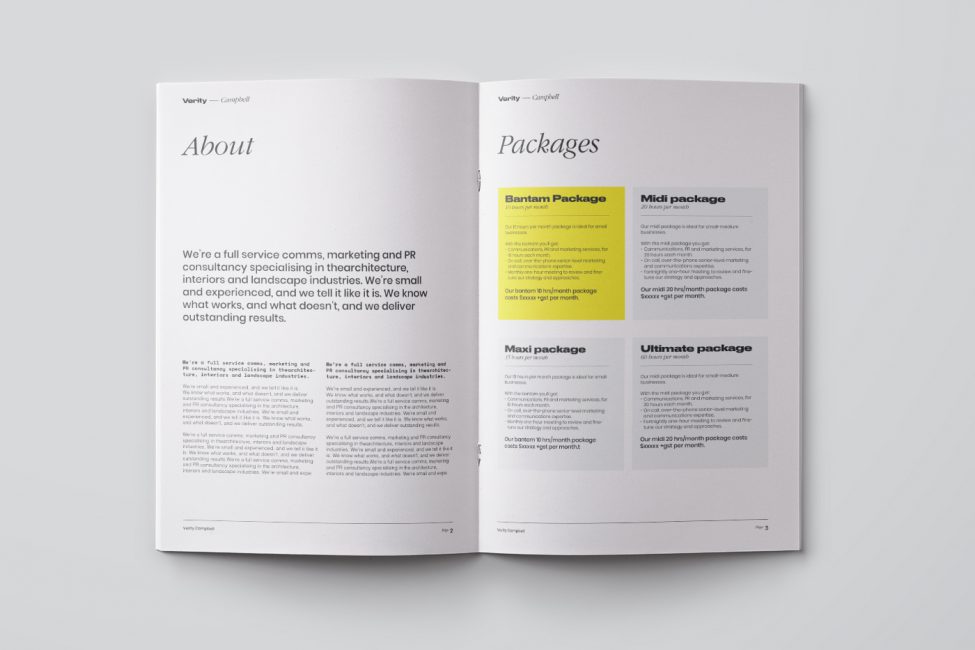
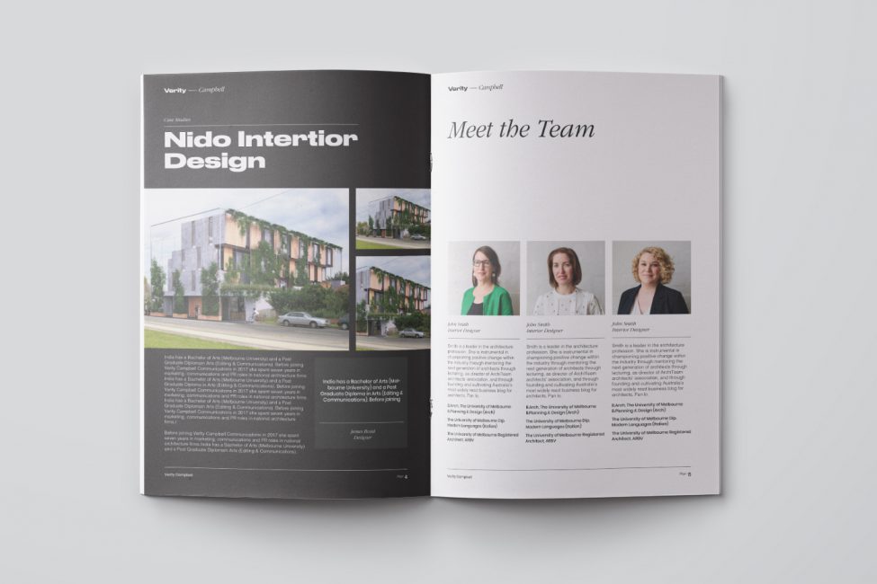
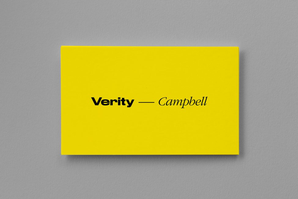
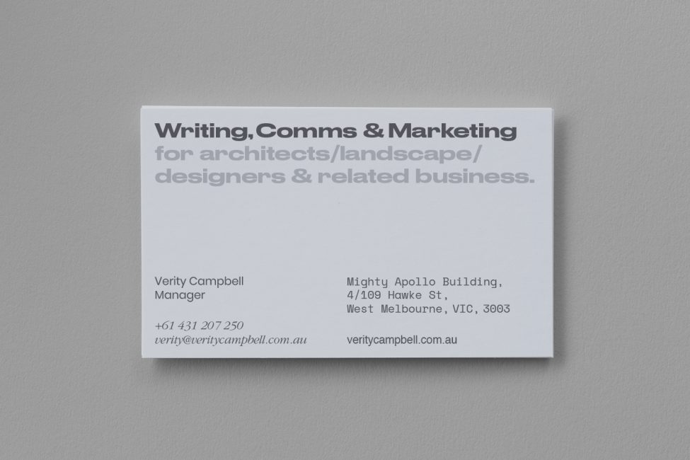
Verity Campbell approached our team of designers to do just that – Create a suite of branding and corresponding website which was clean, diverse and impactful.
Once we sat down with the Verity Campbell team, a communications and marketing agency with a focus on the architecture industry, it was obvious that a clear and diverse tone of voice was key.
Verity Campbell deals with a wide variety of clientele. Some are loud and outgoing. Others are more subdued and serious. Because of this we developed a number of typefaces that could be called upon to serve those different audiences.
The vibrant and infectious personality of Verity Campbell herself was something that was key to convey in the finished suite of branding. This was conveyed through the bold yellow accents that can be found throughout the website and branding touch points.
